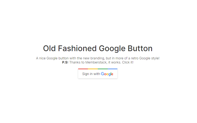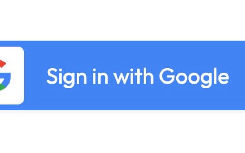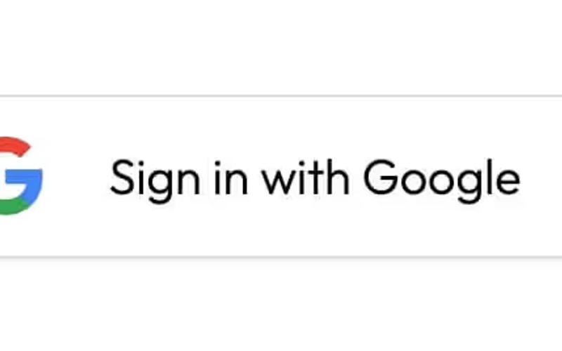
Animated Google Auth Button
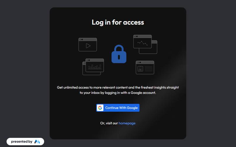
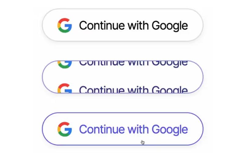
The Animated Google Auth Button is a visually appealing component designed to facilitate Google authentication on websites. It features an engaging animation that enhances user interaction. Key Features Google authentication integrationAnimated hover effectsResponsive designCustomizable stylesDesign Elements: Flexbox layout for alignmentRounded corners with a shadow effectColor scheme featuring Google colorsPotential Use Cases: Web applications requiring user loginE-commerce sites needing secure authentication Portfolio websites showcasing projects with Google login SaaS platforms offering Google integration Mobile-friendly websites needing quick access Conclusion: The Animated Google Auth Button is a versatile and stylish component that enhances user experience while providing essential authentication functionality.