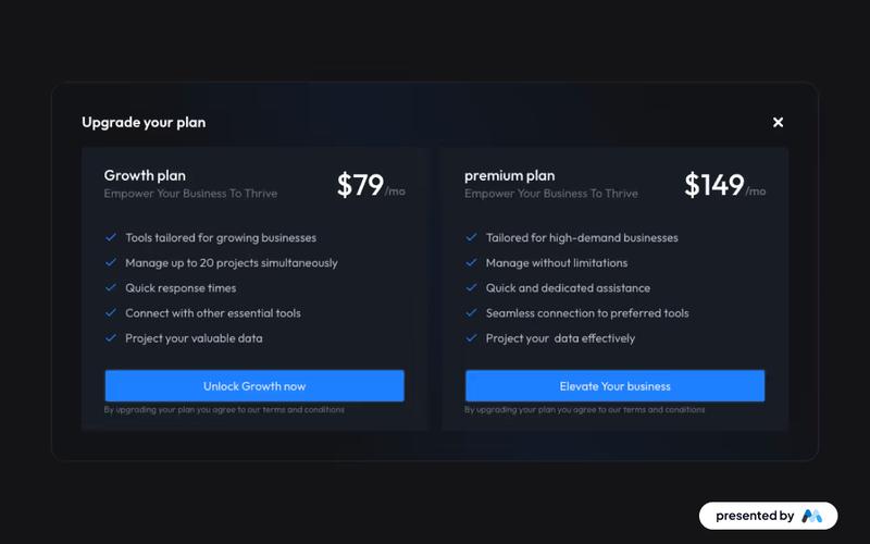
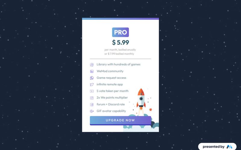
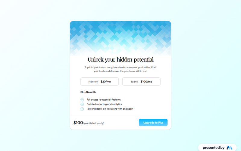
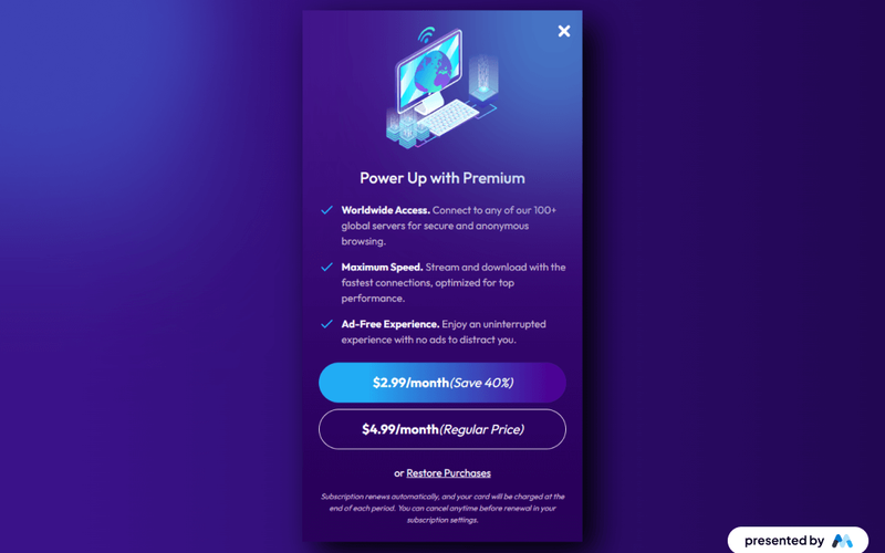
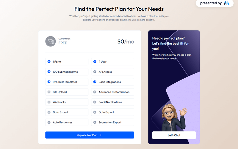
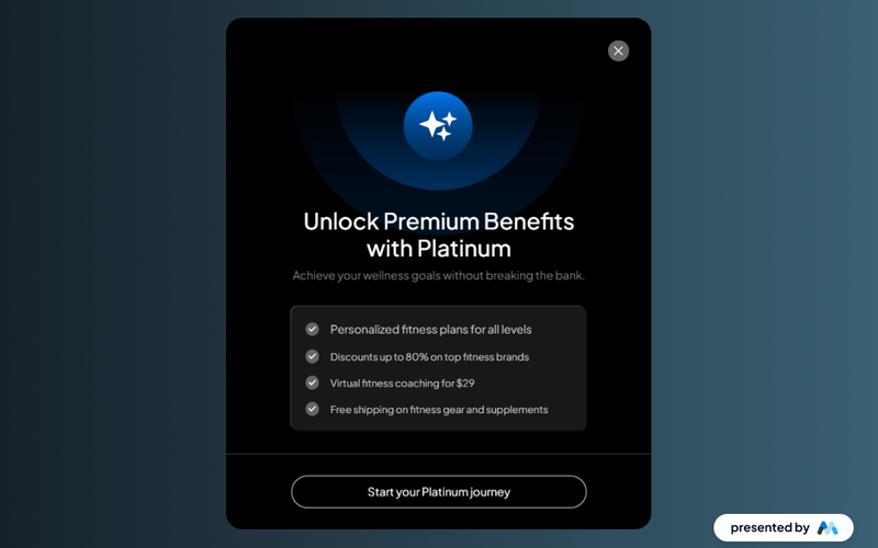
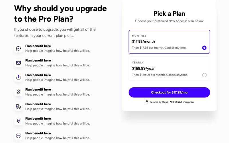
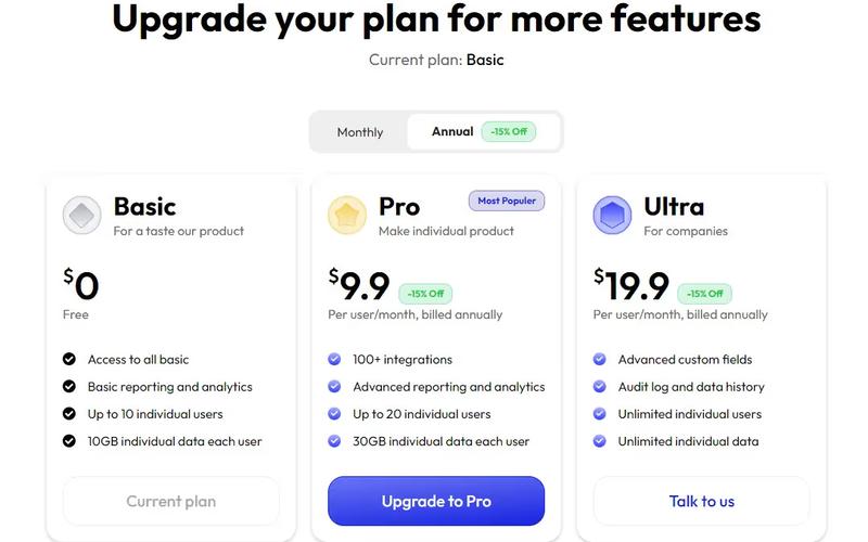
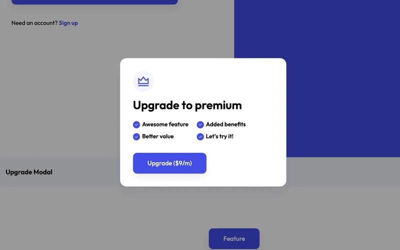
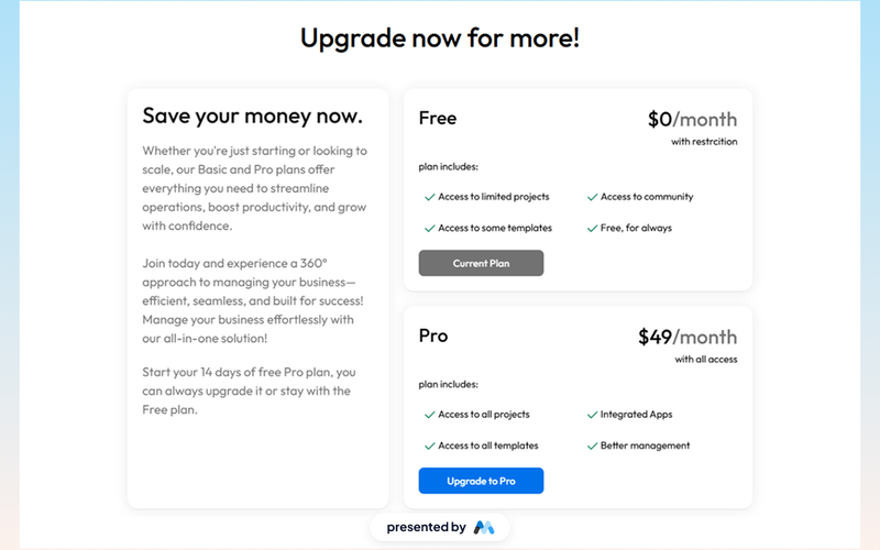
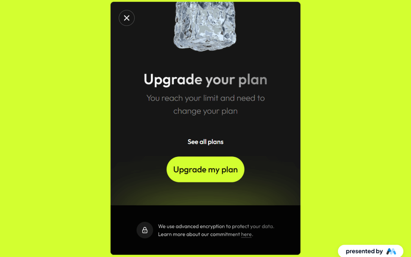
2 Tier Upgrade Modal
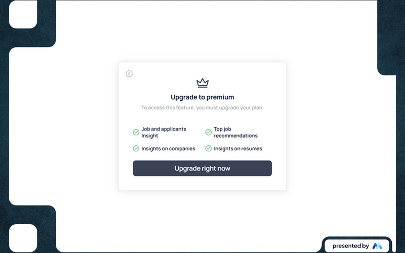
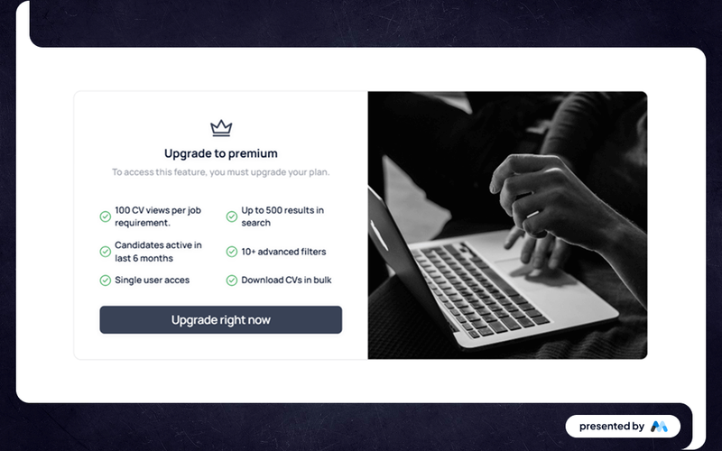
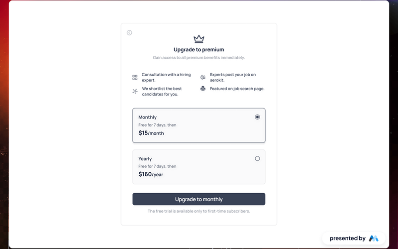
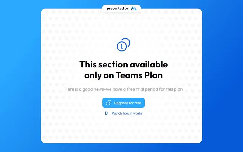
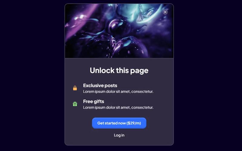
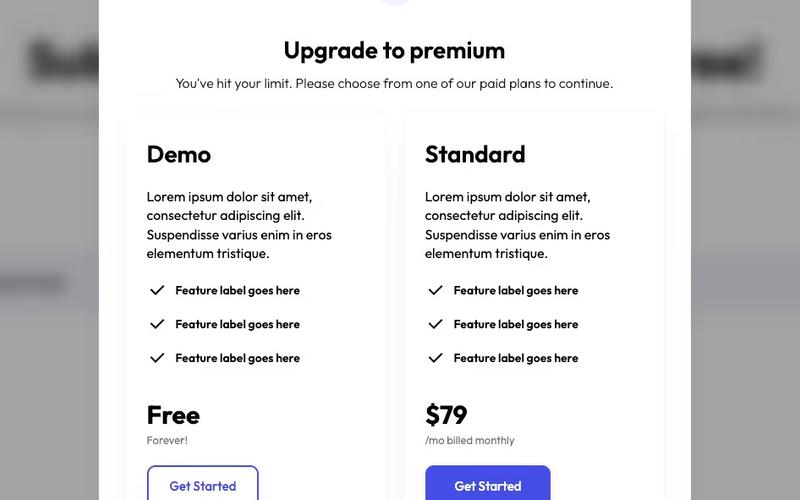
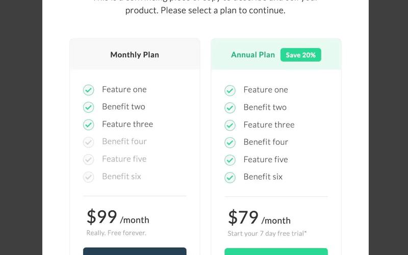
The 2 Tier Upgrade Modal is designed to prompt users to upgrade their subscription plans with a visually appealing interface. It features a two-tab layout for monthly and annual pricing options. Key Features Two pricing tiers: Monthly and Annual Interactive tabs for easy navigation Customizable modal design Includes icons for visual appeal Responsive design suitable for various devices User-friendly upgrade prompts Design Elements: Modern and clean layout Soft color palette with a transparent background Rounded corners and subtle shadows for depth Clear typography for readabilityicons integrated for enhanced visual communication Potential Use Cases: SaaS companies looking to encourage subscription upgradesE-commerce platforms offering premium memberships Online services with tiered pricing models Mobile applications needing in-app upgrade prompts Websites aiming to enhance user engagement through subscription offers Conclusion: The 2 Tier Upgrade Modal is a versatile and visually appealing component that effectively encourages users to upgrade their plans, making it a valuable addition for any subscription-based service.