Loading Component...
this project ASAP.
.png)
About this component
Component Description (Generated by AI)
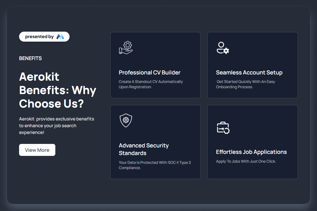
The AeroKit UI Feature02 Icon card is designed to showcase various features and benefits in a visually appealing card format. It includes sections for headings, descriptions, and images, making it suitable for presenting information in a structured manner. For example, it highlights benefits with headings like 'Aerokit Benefits: Why Choose Us?' and includes call-to-action buttons.
Key Features:
- Flexible grid layout for content organization, allowing for responsive design.
- Includes sections for images, headings, and descriptive text to convey information effectively.
- Call-to-action buttons for user engagement, such as 'View More'.
- Customizable styles for different screen sizes, ensuring adaptability.
Design Elements:
- Dark background with contrasting white text for readability.
- Grid-based layout that allows for organized presentation of content.
- Use of images alongside text to enhance visual interest and engagement.
- Rounded corners and subtle borders for a modern card appearance.
Potential Use Cases:
- Tech companies showcasing product features.
- Service providers highlighting benefits to potential clients.
- Educational platforms presenting course features.
- E-commerce websites displaying product advantages.
- Portfolio sites for freelancers to outline services offered.
Conclusion: The AeroKit UI Feature02 Icon card is a versatile component that effectively presents information in a structured and visually engaging manner, making it suitable for various applications across different industries.
Start building your dreams
Memberstack is 100% free until you're ready to launch - so, what are you waiting for? Create your first app and start building today.