Community Discussion

Back

Component Description(Generated by AI)

The Community Discussion component is a Webflow commenting section designed to facilitate user engagement through comments and discussions, inspired by Pawel Kadysz on Dribbble.

Key Features

  • User login and registration prompts
  • Comment posting with success and error messages
  • Threaded replies with moderation features
  • Real-time typing indicators
  • Like and dislike functionality for comments
  • Load more comments and replies feature

Design Elements

  • Clean and modern layout
  • Responsive design suitable for various devices
  • Use of icons for actions like edit and delete
  • Color scheme that emphasizes user interaction

Potential Use Cases

  • Online forums and community websites
  • Blogs that encourage reader interactionE-commerce sites with product reviews
  • Educational platforms for student discussions
  • Social media platforms for user engagement

Conclusion: The Community Discussion component is versatile and user-friendly, making it an excellent choice for any website looking to enhance user interaction and community engagement.

Related Components

More components you might find useful

Comment Notification Selector
View Component
Commenting

Comment Notification Selector

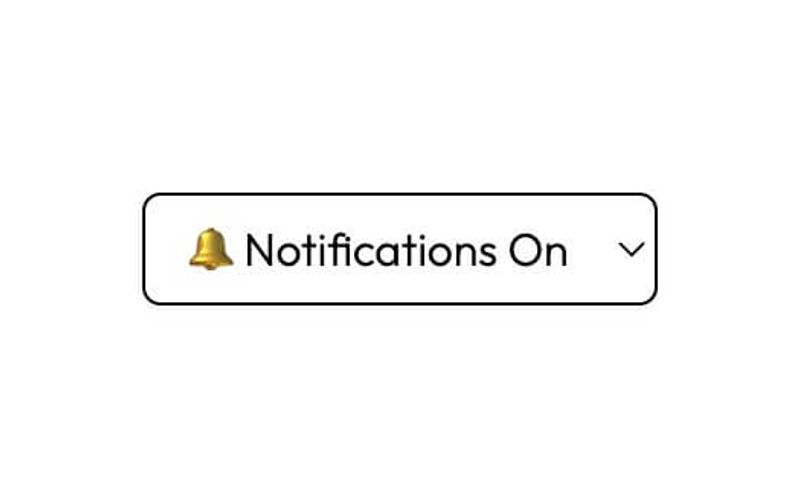
The Comment Notification Selector is a user-friendly form component designed to allow users to manage their notification preferences for comments. It features options for subscribing or unsubscribing from notifications. Key Features Dropdown selection for notification preferences: Unsubscribed or Notifications On Success and error messages for form submission feedback Customizable form attributes for integration with various backends Responsive design suitable for various devices Design Elements Clean and modern aesthetic with a white background Rounded corners and subtle box shadows for a polished look Consistent use of color for borders and text to enhance readability Minimalistic design that avoids clutter Potential Use Cases Blogs and content websites looking to engage users with comment notificationsE-commerce platforms wanting to keep customers informed about product reviews Community forums that require user interaction and feedback management Educational websites where students can subscribe to updates on discussions Conclusion: The Comment Notification Selector is a versatile and visually appealing component that enhances user engagement by allowing customizable notification preferences, making it an excellent addition for various web applications.

BETA - Commenting UI
View Component
Commenting

BETA - Commenting UI

This component serves as a starter UI for a beta commenting feature by Memberstack, enabling users to create comments and reply to others' comments. Key Features User-friendly interface for commenting and replying Real-time updates for active users Supports user authentication with login and registration links Includes functionality for editing and deleting comments Responsive design suitable for various devices Design Elements Modern and clean layout Color scheme primarily in shades of blue and white Interactive elements with hover effects Use of icons for actions like edit and delete Potential Use Cases Online forums and discussion boardsE-commerce product reviews Educational platforms for student feedback Social media applications for user engagement Blogs and content sites to facilitate discussions Conclusion: The BETA - Commenting UI is a versatile and engaging component that enhances user interaction on websites, making it ideal for any platform that values community feedback and discussion.

Commenting UI
View Component
Commenting

Commenting UI

The Commenting UI is a dynamic commenting section designed for user interaction, featuring a card layout with chronological sorting of comments. It is powered by Memberstack for user authentication and management. Key Features Chronological sorting of comments (oldest to newest)User authentication via Memberstack Comment editing and deletion options Real-time typing indicators Responsive design suitable for various devices Design Elements Clean and modern card layout White background with subtle shadows for depth Colorful icons for actions (like, reply, edit, delete)User profile images displayed alongside comments Interactive elements with hover effects Potential Use Cases Blogs and content websites looking to enhance user engagement Community forums for discussions and feedbackE-commerce sites for product reviews and customer interactions Educational platforms for student feedback and discussions News websites for reader comments and discussions Conclusion: The Commenting UI is a versatile and user-friendly component that enhances interactivity on websites, making it ideal for various applications where user feedback and engagement are essential.

Course Comments
View Component
Commenting

Course Comments

The Course Comments component is a commenting section designed for online courses, allowing instructors to moderate discussions with a dedicated badge. Comments are displayed in a chronological order, with the option to sort them from oldest to newest. Key Features Instructor moderation with a badge Chronological comment display Customizable sorting options Responsive design Integration with Memberstack for user authentication Design Elements Clean and modern layout Use of soft colors for backgrounds Distinct visual indicators for moderators Interactive buttons for submitting comments and replies Potential Use Cases Online education platformsE-learning websitesCourse management systemsCommunity forums for educational contentWebinars and virtual workshops Conclusion: The Course Comments component is a versatile and user-friendly solution for fostering engagement in online courses, making it suitable for various educational platforms.