Custom Checkbox Dropdown

Back
Custom Checkbox Dropdown

Component Description(Generated by AI)

The Custom Checkbox Dropdown is a fully customizable select field designed for Webflow, integrating seamlessly with Memberstack. It allows users to select multiple options.

Key Features

  • Fully customizable designIntegration with MemberstackMultiple selection capabilityResponsive and user-friendly interfaceDesign Elements:
  • Modern and clean aesthetic
  • Soft color palette with shades of green and white
  • Rounded corners and subtle shadows for depth
  • Interactive dropdown toggle with smooth animations
  • Potential Use Cases:
  • E-commerce websites for product filtering
  • Surveys and feedback forms for data collection
  • Event registration forms requiring multiple selections
  • Portfolio sites for selecting project categories
  • Membership sites for user preferences
  • Conclusion: The Custom Checkbox Dropdown is a versatile component that enhances user experience through its customizable features and seamless integration, making it suitable for various applications across different industries.

Related Components

More components you might find useful

Custom Checkbox Buttons
View Component
Checkbox

Custom Checkbox Buttons

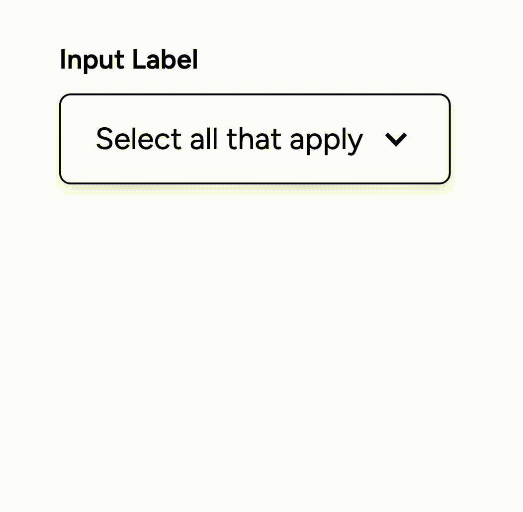
The Custom Checkbox Buttons component allows users to create a visually appealing group of checkboxes for forms, enhancing user interaction and experience. Key Features Multiple checkbox options for user selection Customizable styles and colors Responsive design suitable for various devices Includes labels for each checkbox for clarity Supports various input types and configurations Design Elements: Flexbox layout for easy alignment Custom icons for checkboxes Color scheme includes shades of green and grey Modern font styles with adjustable weights Potential Use Cases: Surveys and feedback forms for businesses Job application forms requiring skill selectionE-commerce sites for product feature selection Event registration forms with multiple options Educational platforms for course selection Conclusion: The Custom Checkbox Buttons component is versatile and user-friendly, making it an excellent choice for any web form requiring multiple selections.

Custom Multi-Select Input
View Component
Checkbox

Custom Multi-Select Input

The Custom Multi-Select Input is a versatile form component that allows users to select multiple options. It is designed to enhance user interaction and streamline data collection. Key Features Supports multiple selectionsCustomizable styles for brandingResponsive design for various devicesDesign Elements: Flexbox layout for easy alignment and spacing Soft color palette with a light background and contrasting text Rounded corners and subtle borders for a modern look Hover effects for enhanced user experience Potential Use Cases: E-commerce sites for product customization options Surveys and feedback forms requiring multiple responses Event registration forms with selectable activities Real estate listings for selecting property features Conclusion: The Custom Multi-Select Input is a highly adaptable component that can improve user engagement across various applications, making it an excellent choice for designers and developers looking to enhance their forms.

Custom Multi-select with Search
View Component
Checkbox

Custom Multi-select with Search

This component allows users to select multiple options from a list while providing a search functionality to filter through the options efficiently. Key Features Customizable multi-select Instant search functionality to filter options Always visible selections for user convenience Responsive design suitable for various screen sizes Design Elements: Minimalistic and clean layout Soft color palette with grey, green and white tones Rounded corners for input fields Hover effects for better user interaction Potential Use Cases: E-commerce websites for product filtering Survey forms requiring multiple selections Event registration forms with multiple options Content management systems for categorizing items Conclusion: The Custom Multi-select with Search component is a versatile tool that enhances user experience by simplifying the selection process while maintaining a clean and modern design.

Multi-Select, Search, and Save
View Component
Checkbox

Multi-Select, Search, and Save

This component allows users to perform multi-select actions with checkboxes, conduct instant searches, and maintain visibility of selected items, enhancing user interaction and data management. Key Features Custom multi-select using checkboxes Instant search functionality Always keeps selections visible Responsive design suitable for various devices Design Elements: Flexbox layout for easy item arrangement Minimalistic style with a focus on usability Color scheme featuring soft grey, green and white for a clean look Hover effects for interactive elements Potential Use Cases: E-commerce websites for product filtering Data management systems for selecting multiple entries Survey forms where users can select multiple options Inventory management tools for categorizing items Conclusion: The Multi-Select, Search, and Save component is versatile and user-friendly, making it an excellent choice for any application requiring efficient data selection and management.