Kanban View (Data Tables)

Back

Component Description(Generated by AI)

This component requires an accompanying script. Update the following attribute values in the HTML to match your data table and fields before use:

  • ms-code-table — set on the board wrapper to your data table name (default: "todos")
  • ms-code-status-field — set on the board wrapper to the option/text field the board groups by (default: "status")
  • ms-code-status-value — set on each column to the exact option value records in that column should have (e.g. "To Do", "In Progress", "Done"); must match the values configured on the field in your data table. Use __unassigned to turn a column into a catch-all for records with no matching status
  • ms-code-sort — set the field and direction for ordering cards within each column (e.g. createdAt:desc). Server-managed fields are createdAt / updatedAt; custom fields use the field key from your table
  • ms-code-detail-page — set to the URL of the detail/edit page (e.g. /edit)
  • ms-code-id-param — set to the URL query parameter name for the record ID (default: id)
  • ms-code-owner-field — (optional) set on the board wrapper to filter records by the logged-in member; omit it to show every record on the board
  • data-ms-field on each card display element — set to the matching field key in your table
  • ms-field on each card display element — set to the field type: text, number, date, checkbox, html, image, or link
  • draggable="true" must remain on the card template so drag-and-drop works on desktop
  • data-ms-code="card-move-trigger" — (optional but recommended) on a button inside the card template; opens a tap-to-move menu for touch/mobile users

Unassigned Column

Add a column with ms-code-status-value="__unassigned" to catch any record whose status value is null, empty, or doesn't match any other column (e.g. a stale option that was renamed). When a card is moved into the unassigned column, the script sets the status field to null. When a card is moved out of it, the script sets the new status value as expected. If you don't include an unassigned column, records with no matching status are silently skipped on render.

Mobile / Touch Support

HTML5 drag-and-drop is unreliable on phones, so the component also ships with a tap-to-move fallback. Each card has a data-ms-code="card-move-trigger" button; tapping it opens a small popover listing all other columns as buttons. Tapping a column moves the card and updates the record — the same code path as drag-and-drop. The popover is styled with minimal inline styles out of the box; customize its look via the .ms-card-menu class on the <body>.

You can hide the move button on desktop and only show it on mobile with a simple CSS rule if you'd rather keep the desktop UI drag-only:

@media (min-width: 768px) {
.kanban_card-move { display: none; }
}

Record Limits

Memberstack caps take at 100 records per query, so the script paginates internally — fetching 100 at a time with skip until every record is loaded or MAX_RECORDS (default 1000) is reached. If you have a large board, raise MAX_RECORDS in the CUSTOMIZE block at the top of the script. A console.warn fires whenever the ceiling is hit so you'll know when records are being clipped.

Key Features

  • Fetches all records from the specified Memberstack data table on page load, paginating through the 100-record cap automatically
  • Groups records into columns by matching their status-field value against each column's status-value
  • Unassigned catch-all column for records with null, empty, or stale status values
  • Native HTML5 drag-and-drop — no external libraries required
  • Tap-to-move popover menu for touch devices — same logic as drag-drop, works on phones and tablets
  • Dropping or tapping a card into a different column calls updateDataRecord to persist the new status value automatically (sets to null when moved to unassigned)
  • Optimistic UI: the card moves instantly and reverts to its original column if the update fails
  • Live column counts and per-column empty states update whenever a card is moved
  • Type-aware card rendering: text sets textContent, number formats with locale separators, date formats to a readable string, checkbox displays "Yes" or "No", html sets innerHTML, image sets src, link sets href
  • Optional owner filtering to show only the logged-in member's records
  • Customizable drag/drop class names (is-dragging / is-drop-target) and menu label for styling and copy
  • Four top-level UI states using the same list-* attribute roles as the Card and Table views: list-loading, list-empty, list-error (with retry), and populated board

Adding or Changing Columns

To add a new column, duplicate an existing data-ms-code="kanban-column" block and change the ms-code-status-value to match the new option value in your data table. To rename a column, update both the column's header text and its ms-code-status-value to match the exact option value in your field.

Linking from the Card List View

If you use the Card List View or Table List View alongside this board, set their ms-code-detail-page to the same edit page and the cards on both views will link to the same record detail.

Potential Use Cases

  • Any Memberstack-powered site that needs a workflow board for moving records through stages
  • Task managers, project trackers, CRM deal pipelines, content calendars, hiring pipelines, order fulfillment, and more
  • Swap the table name, status field, and column values to match any data model with a single option field.

Related Components

More components you might find useful

Edit Data Table Records
View Component
Data Tables

Edit Data Table Records

This component requires an accompanying script. Update the following attribute values in the HTML to match your data table and fields before use: ms-code-table — set to your data table name (default: "todos") ms-code-id-param — set to the URL query parameter that holds the record ID (default: id) ms-code-owner-field — set to the field that stores the member ID ms-code-redirect — (optional) set to the page URL to redirect after a successful update data-ms-field on each input — set to the matching field key in your table ms-field on each input — set to the field type: text, number, date, checkbox, html, image, or link Look for /* CUSTOMIZE */ comments in the script for additional options Linking from the Card List View The Card List View component generates a link on each card using ms-code-detail-page and ms-code-id-param. To have cards link to this edit page: Set ms-code-detail-page on the Card List View wrapper to the URL of your edit page (e.g. /edit) Make sure ms-code-id-param matches on both components (default: id) The card link will resolve to something like /edit?id=abc123, and this component reads that ID on load. Key Features Reads the record ID from the URL query string and fetches the existing record on page load Pre-populates all form fields with saved values, handling every ms-field type: text and html set the input value, number sets the value directly, date converts ISO to YYYY-MM-DD for the date picker, checkbox sets the checked state, image and link set URL values Updates the record in place via Memberstack's updateDataRecord API on submit Collects fields on submit with full type awareness: number parses to float, date converts to ISO, checkbox reads checked state, text/html/image/link pass raw strings Authenticates the current member and stamps the owner field on every save Shows loading, success, and error states with smooth fade-in transitions Gracefully handles missing or deleted records with an inline error message Supports optional redirect after successful update Potential Use Cases Any Memberstack-powered site that needs a user-facing edit form tied to a data table Task managers, project trackers, CRMs, support ticket systems, inventory updates, and more Swap the table name and fields to match any data model — the script handles the rest

Create Data Table Record
View Component
Data Tables

Create Data Table Record

This component requires an accompanying script. Update the following attribute values in the HTML to match your data table and fields before use: ms-code-table — set to your data table name (default: "todos") ms-code-owner-field — set to the field that stores the member ID ms-code-redirect — (optional) set to the page URL to redirect after success data-ms-field on each input — set to the matching field key in your table ms-field on each input — set to the field type: text, number, date, checkbox, html, image, or link Look for /* CUSTOMIZE */ comments in the script for additional options Key Features Auto-binds form inputs to data table columns via data attributes Handles every ms-field type when collecting values: text and html pass raw strings, number parses to float, date converts to ISO, checkbox reads the checked state, image and link pass URLs Authenticates the current member and stamps owner + creation date on every record Shows loading, success, and error states with smooth fade-in transitions Prevents Webflow's native form handler from hiding the form Supports optional redirect after successful creation Potential Use Cases Any Memberstack-powered site that needs a user-facing create form tied to a data table Task managers, project trackers, CRMs, support ticket systems, inventory forms, and more Swap the table name and fields to match any data model — the script handles the rest

View Data Table Records
View Component
Data Tables

View Data Table Records

This component requires an accompanying script. Update the following attribute values in the HTML to match your data table and fields before use: ms-code-table — set to your data table name (on both the wrapper and the template; default: "todos") ms-code-sort — set to the field and direction for sorting (e.g. created_at:desc) ms-code-per-page — set to the number of cards to show per page ms-code-detail-page — set to the URL of the detail/edit page (e.g. /edit) ms-code-id-param — set to the URL query parameter name for the record ID (default: id) ms-code-owner-field — (optional) set on the template to filter records by the logged-in member data-ms-field on each display element — set to the matching field key in your table ms-field on each display element — set to the field type: text, number, date, checkbox, html, image, or link Key Features Fetches all records from the specified Memberstack data table on page load Renders a card for each record using a cloneable template pattern Binds data-ms-field elements to record values with full type-aware rendering: text sets textContent, number formats with locale separators, date formats to a readable string, checkbox displays "Yes" or "No", html sets innerHTML, image sets src, link sets href Generates detail page links with the record ID as a query parameter Client-side pagination with configurable page size Numbered page buttons, previous/next navigation with disabled state styling Supports sorting by any field in ascending or descending order Optional owner filtering to show only the logged-in member's records Four distinct UI states: loading, populated list, empty, and error Retry button on error state to re-attempt the fetch Potential Use Cases Any Memberstack-powered site that needs a browsable record list with card layout Task managers, project dashboards, CRM contact lists, product catalogs, and more Swap the table name and fields to match any data model — the script handles the rest

Record Details Page (Data Tables)
View Component
Data Tables

Record Details Page (Data Tables)

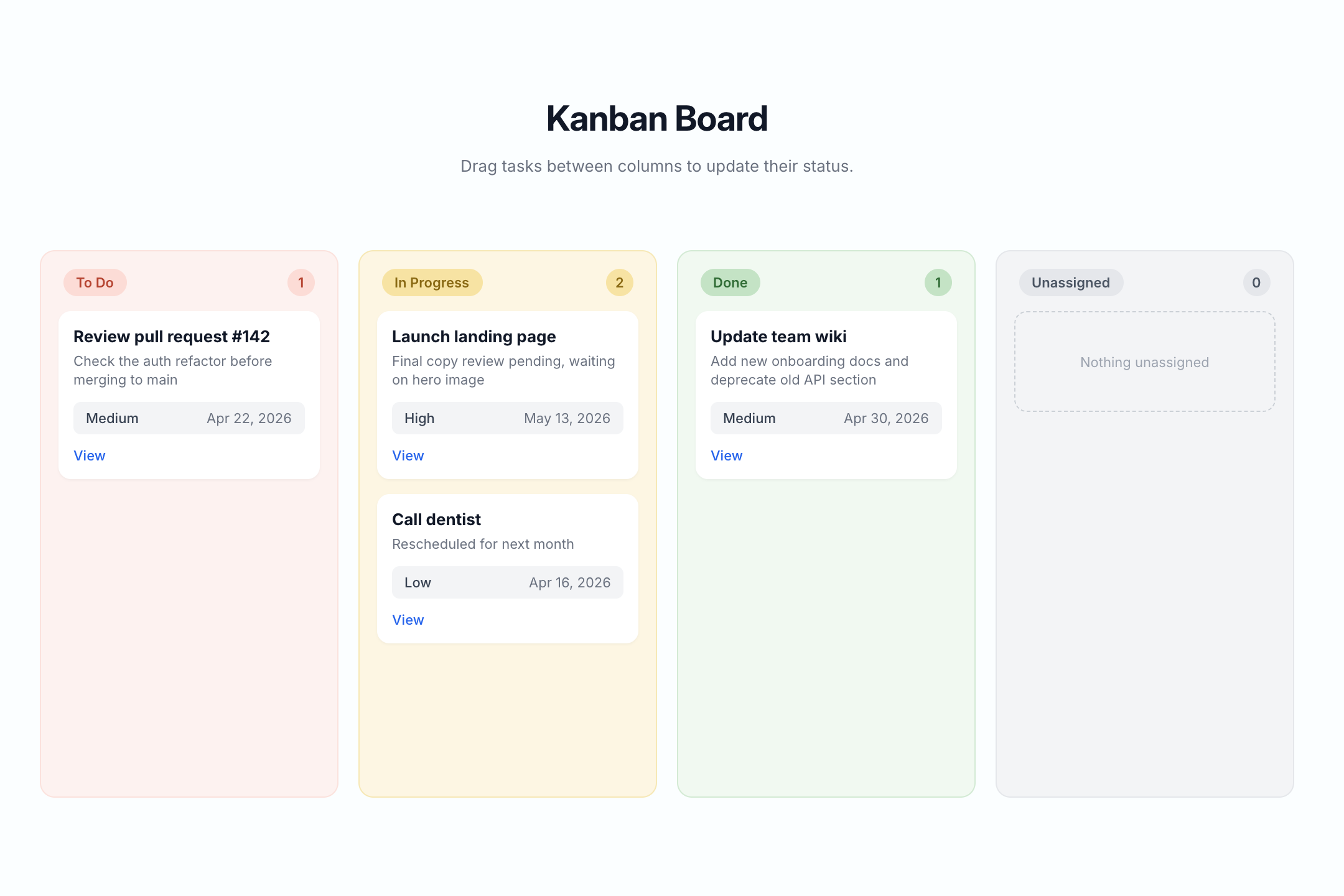
This component requires an accompanying script. Update the following attribute values on the detail wrapper to match your data table: ms-code-table — your data table name (default: "todos") ms-code-id-param — URL query parameter name for the record ID (default: id). Must match what the linking list view uses ms-code-owner-field — (optional) field that stores the owner's member ID; if set, the page only shows the record when the current member matches; otherwise the error state appears ms-code-edit-page — (optional) URL of the edit page (e.g. /edit). The script populates the Edit button's href with this URL plus ?id=... ms-code-delete-page — (optional) URL of the delete confirmation page (e.g. /delete). The script populates the Delete button's href the same way data-ms-field on each display element — set to the matching field key in your table ms-field on each display element — set to the field type: text, number, date, checkbox, html, image, or link Linking from the Card List, Table List, or Kanban The list-style components (Card List, Table List, and Kanban Board) generate per-record links using ms-code-detail-page and ms-code-id-param. To send users to this detail page when they click a card, row, or kanban card: Set ms-code-detail-page on the list/table/kanban container to the URL of this detail page (e.g. /detail) Make sure ms-code-id-param matches on both the list and the detail container (default: id) Inside each card or row, include an element with data-ms-code="detail-link" — the list scripts populate its href automatically with the record ID The card link will resolve to something like /detail?id=abc123, and this component reads that ID on load. Recommended Page Structure The detail page sits at the center of a typical CRUD flow. A clean, conventional setup looks like this: /todos — Card List or Table List view /board — Kanban Board /detail — Record Detail page (this component) /edit — Edit form /delete — Delete confirmation /new — Create form Wire each list-style page to the detail page via ms-code-detail-page="/detail". On the detail page, point Edit and Delete to their dedicated pages via ms-code-edit-page="/edit" and ms-code-delete-page="/delete". The same record ID flows through every URL as the ?id=... query parameter, so the chain works end-to-end without any custom JS. Page names are arbitrary. The slugs above (/detail, /edit, /delete, etc.) are conventions, not magic strings. Name your pages anything — /task-overview, /aufgabe-bearbeiten, /dashboard/tasks/view, etc. — and just plug those URLs into the matching ms-code-*-page attributes. The only values that actually need to line up across pages are ms-code-table (must match your data table key) and ms-code-id-param (must use the same query parameter name on every page so the record ID hands off correctly). Key Features Reads the record ID from the URL on load and fetches the record via getDataRecord Type-aware field rendering: text sets textContent, number formats with locale separators, date formats to a readable string, checkbox displays "Yes" or "No", html sets innerHTML, image sets src or background-image, link sets href Optional ownership check via ms-code-owner-field — non-owners see the error state instead of someone else's record Auto-generates Edit and Delete button URLs by combining ms-code-edit-page / ms-code-delete-page with the current record ID — no JS needed to wire navigation Three UI states: loading, populated content, and error (which doubles as "not found" and "not your record") Handles 429 rate-limit responses automatically with exponential-backoff retries Multiple detail containers supported on the same page if needed (rare, but it works) Action Buttons The default HTML includes three action buttons in the footer of the content block: Back to list — a plain <a href="/todos"> link; update the href to your list page Edit — has data-ms-code="edit-link"; the script populates the href with the edit page URL plus ?id=... Delete — has data-ms-code="delete-link"; the script populates the href the same way Remove any button you don't need by deleting it from the HTML. To skip the Edit or Delete URL population, simply omit ms-code-edit-page or ms-code-delete-page from the wrapper. Full Attribute Reference Three categories of attributes drive this component. Use this section as a complete spec when wiring up the markup. 1. Container Attributes (on the detail wrapper) data-ms-code="detail-container" — required. Marks this element as the detail wrapper. The script initializes one instance per matching element. ms-code-table — required. The Memberstack data table key to fetch from. Example: ms-code-table="todos". ms-code-id-param — optional, defaults to id. URL query parameter name that holds the record ID. Example: ms-code-id-param="recordId". ms-code-owner-field — optional. Field key that stores the owner's member ID. When set, the page only shows the record if the current member matches; non-owners see the error state. Example: ms-code-owner-field="owner". ms-code-edit-page — optional. URL of the edit page. Used to populate the Edit button's href. Example: ms-code-edit-page="/edit". ms-code-delete-page — optional. URL of the delete confirmation page. Used to populate the Delete button's href. Example: ms-code-delete-page="/delete". 2. Element Role Attributes (data-ms-code values inside the container) detail-loading — recommended. Shown while fetching the record. Add style="display:none" to the element so it doesn't flash on page load. detail-error — recommended. Shown if the fetch fails, the record can't be found, or the ownership check rejects the user. Add style="display:none". detail-content — required. Wraps everything that should appear once the record loads. The script reveals it after populating fields. Add style="display:none". edit-link — optional. An <a> button whose href the script will populate as {edit-page}?{id-param}={recordId}. Leave href="#" as a placeholder. delete-link — optional. Same behavior as edit-link, but uses ms-code-delete-page. Leave href="#" as a placeholder. 3. Field Display Attributes Use both data-ms-field (which field) and ms-field (how to render it) on each display element. ms-field defaults to text if omitted. ms-field="text" (default) — sets the element's textContent to the field value. Use on any text element: <span>, <p>, <h1>–<h6>, <div>. Example: <h1 data-ms-field="task">Loading…</h1> ms-field="number" — parses the value as a float and formats with locale separators (e.g. 1234 → "1,234"). Use on any text element. Example: <span data-ms-field="count" ms-field="number">0</span> ms-field="date" — parses the ISO date string and formats it with toLocaleDateString using DATE_OPTIONS from the script (default: "Apr 16, 2026"). Use on any text element. Example: <p data-ms-field="dueDate" ms-field="date">—</p> ms-field="checkbox" — displays the customizable BOOLEAN_TRUE / BOOLEAN_FALSE labels (default: "Yes" / "No") based on the field's truthiness. Use on any text element. Example: <span data-ms-field="is_complete" ms-field="checkbox">No</span> ms-field="html" — sets innerHTML to the field value. Use only with trusted content — does not sanitize. Use on any container: <div>, <article>, etc. Example: <div data-ms-field="bio" ms-field="html"></div> ms-field="image" — if on an <img>, sets src. On any other element, sets style.backgroundImage to url(value). Use <img> for inline images, or any <div> for background-image use cases (cards, hero banners, avatars). Example: <img data-ms-field="cover" ms-field="image" src="" alt=""> ms-field="link" — if on an <a>, sets href. On any other element, sets textContent as a fallback. Use <a> for clickable links. Example: <a data-ms-field="website" ms-field="link" href="#">Visit</a> Field display elements can live anywhere inside data-ms-code="detail-content". The script walks every [data-ms-field] descendant and populates each one based on its ms-field type. Default Values Whatever placeholder text or attribute value you put in the HTML stays visible until the script populates it. Use this as fallback content for fields that may be empty or null in the data — the script skips populating fields whose value is null or undefined. Potential Use Cases Any Memberstack-powered site that needs a per-record detail view as a navigation hub Task detail pages, project briefs, customer profiles, order summaries, content previews, member dashboards, and more Swap the table name and fields to match any data model — the script handles the rest