Outdoors Logged Out Screen

Back

Component Description(Generated by AI)

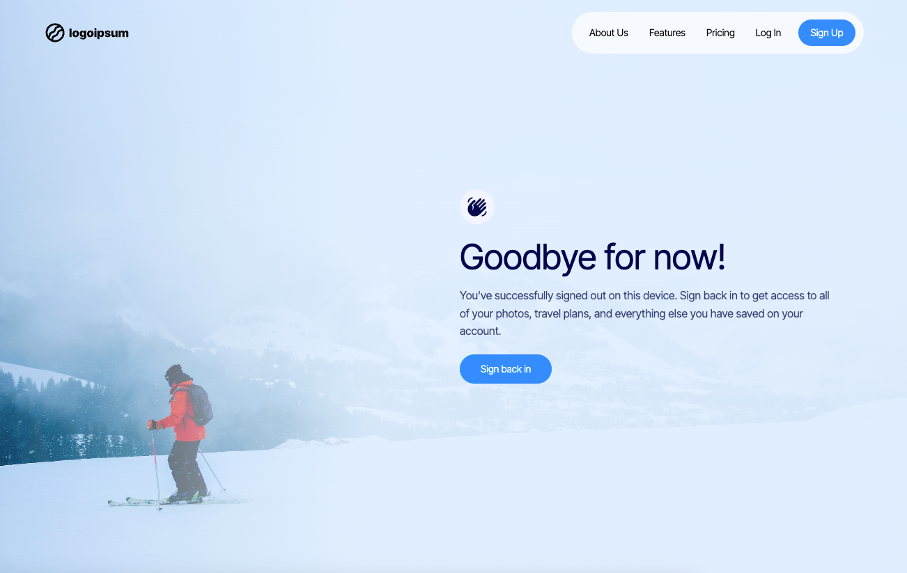
The Outdoors Logged Out Screen is designed to provide a user-friendly interface for users who have signed out of their accounts, featuring a welcoming message and a prompt to sign back in.

Key Features

  • Responsive design suitable for various devices
  • Engaging animations triggered on scroll
  • Clear call-to-action button for signing back in
  • Customizable background image and styles

Design Elements

  • Minimalist layout with a focus on user experience
  • Soft color palette with a gradient background
  • Large, readable typography for headings and paragraphs
  • Iconography to enhance visual appeal

Potential Use Cases

  • Web applications requiring user authentication
  • Travel and photo-sharing platformsE-commerce sites with user accounts
  • Social media platforms needing logout screens
  • Any service that requires user login/logout functionality

Conclusion: The Outdoors Logged Out Screen is a versatile and visually appealing component that enhances user experience by providing clear messaging and easy navigation for returning users.

Related Components

More components you might find useful

Logged Out Confirmation Page
View Component
Logged Out

Logged Out Confirmation Page

The Logged Out Confirmation Page is designed to inform users that they have successfully logged out of their account, providing a friendly message and options to log back in or sign up. Key Features Responsive design suitable for various devices Includes a navigation bar with links to login and dashboard Customizable branding with logo placement Engaging content with a welcoming message Call-to-action buttons for logging back in or signing up Design Elements: Clean and modern layout Use of whitespace for clarity Flexible grid system for responsive design Color scheme that emphasizes user engagement Potential Use Cases: Web applications requiring user authenticationE-commerce sites needing user account management Membership-based platforms for user engagement Blogs or content sites with user login features Corporate websites with user portals Conclusion: The Logged Out Confirmation Page is a versatile component that enhances user experience by providing clear communication and easy navigation options, making it an essential feature for any web application with user accounts.
Animated Matrix Logged Out
View Component
Logged Out

Animated Matrix Logged Out

The Animated Matrix Logged Out component provides a visually engaging experience for users who have logged out, featuring an animated background and clear messaging. Key Features Full-screen animated background using a canvas element Responsive design suitable for various screen sizes Clear messaging indicating the user has logged out Call-to-action button to log back in Design Elements Grid layout for structured content display Dark color scheme with white text for high contrast Rounded corners and shadow effects for a modern look Flexbox alignment for centered content Potential Use Cases Web applications requiring user authenticationE-commerce sites needing a logout confirmation page Social media platforms managing user sessions Online services with user accounts Conclusion: The Animated Matrix Logged Out component is a versatile and visually appealing solution for enhancing user experience during the logout process, making it suitable for various web applications.

Log Out Alert
View Component
Logged Out

Log Out Alert

The Log Out Alert component is designed to inform users that they have successfully logged out of an application. It features a clear message and options to log in again or return to the home page, making it user-friendly and straightforward. This component can be easily integrated into various Webflow projects. Key Features Displays a confirmation message: 'You are Logged Out' and 'You have successfully Logged Out the application'.Includes animated elements using Lottie for visual engagement.Provides buttons for 'Login Again' and 'Back to Home' with clear call-to-action.Responsive design that adjusts layout based on screen size. Design Elements Utilizes a flexbox layout for alignment and spacing of elements.Incorporates a backdrop filter for a blurred background effect, enhancing focus on the alert.Features a color scheme with a grey background and white text for readability.Includes rounded corners and border styles for a polished look. Potential Use Cases Web applications that require user authentication and session management.E-commerce platforms needing to inform users about session timeouts.Social media sites where user logout notifications are essential.Corporate intranets that manage user access and require logout alerts. Conclusion: The Log Out Alert component is a practical solution for notifying users about their logout status, enhancing user experience in applications that require authentication.

 Logged Out
View Component
AllLogged Out

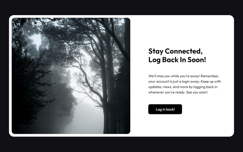
Logged Out

The 'Logged Out' component offers a stylish card design that enhances the logout experience with a classic black and white theme. Key Features Sleek card design for logout confirmation Timeless black and white color scheme Responsive layout suitable for various devices Includes engaging text to encourage users to log back in Customizable styles and animations Design Elements Minimalist aesthetic with a focus on typography Rounded corners for a modern look Use of high-quality images to enhance visual appeal Flexible layout with grid and flexbox properties Potential Use Cases Web applications requiring user authenticationE-commerce sites wanting to improve user experience during logout Blogs or content platforms encouraging user engagement Membership sites needing a professional logout interface Corporate websites aiming for a polished user experience Conclusion: The 'Logged Out' component is a versatile and visually appealing solution for enhancing user experience during the logout process, making it suitable for a wide range of web applications.