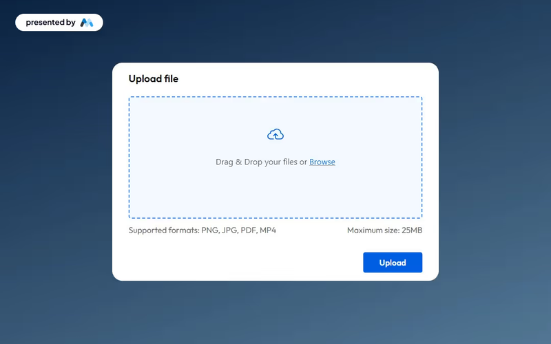
Upload File Drag and Drop
This component provides an elegant and functional interface for users to upload files seamlessly, enhancing both usability and aesthetics. Key Features Drag and drop functionality for easy file uploads Maximum file size limit of 25MBIncludes success and error messages for user feedback Customizable design elements Design Elements: Modern and clean interface Dashed border to indicate upload area Responsive design suitable for various devices Color scheme featuring soft backgrounds and contrasting button colors Potential Use Cases: Web applications requiring user file submissions Educational platforms for assignment uploads Corporate intranets for document sharingE-commerce sites for product file uploads Event registration forms requiring document attachments Conclusion: The Upload File Drag and Drop component is a versatile tool that enhances user experience while maintaining a professional appearance, making it suitable for a wide range of applications.