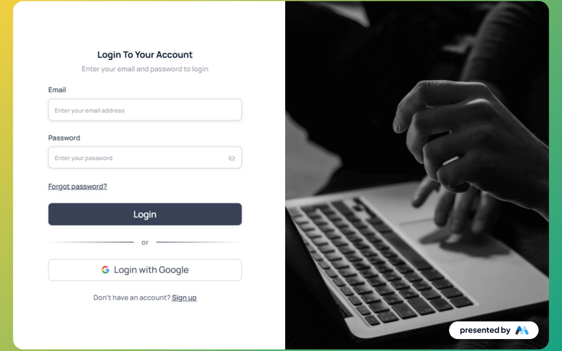
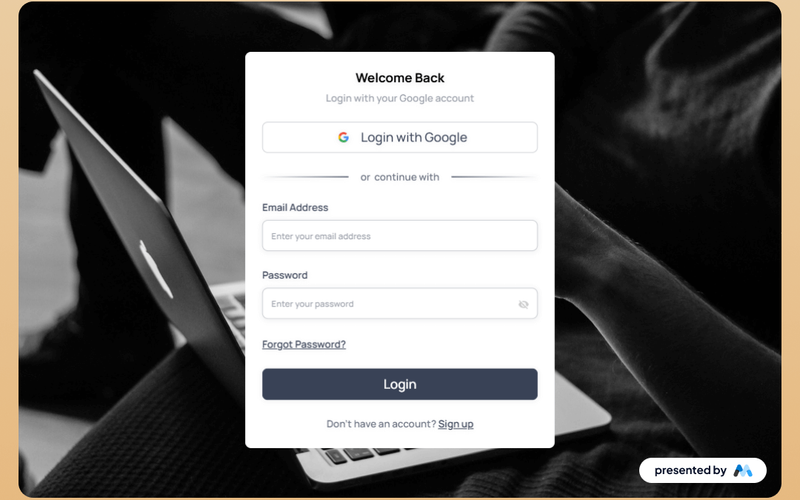
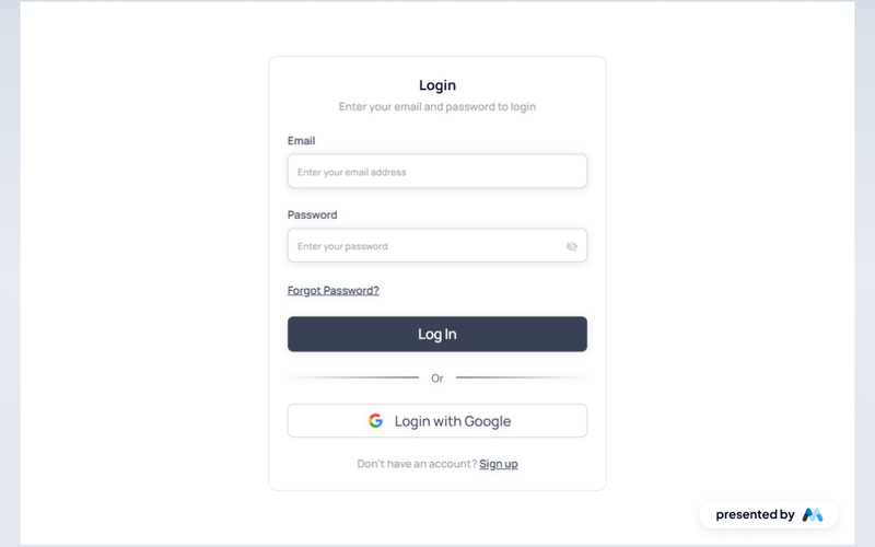
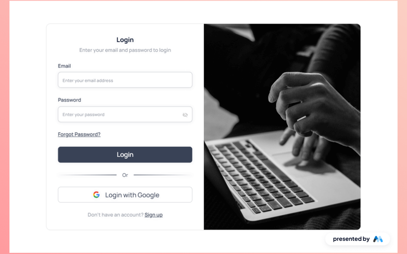
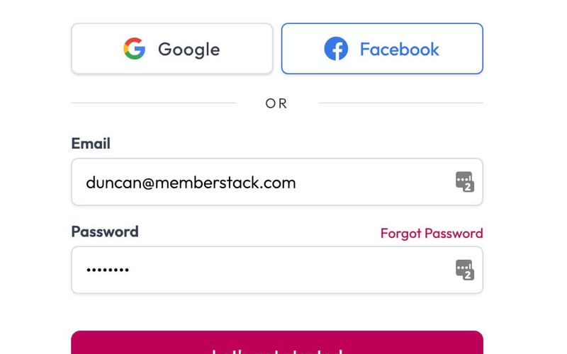
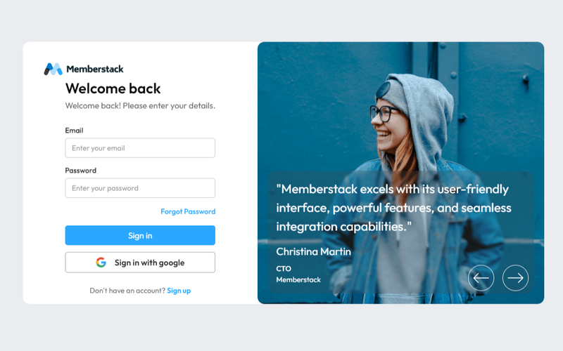
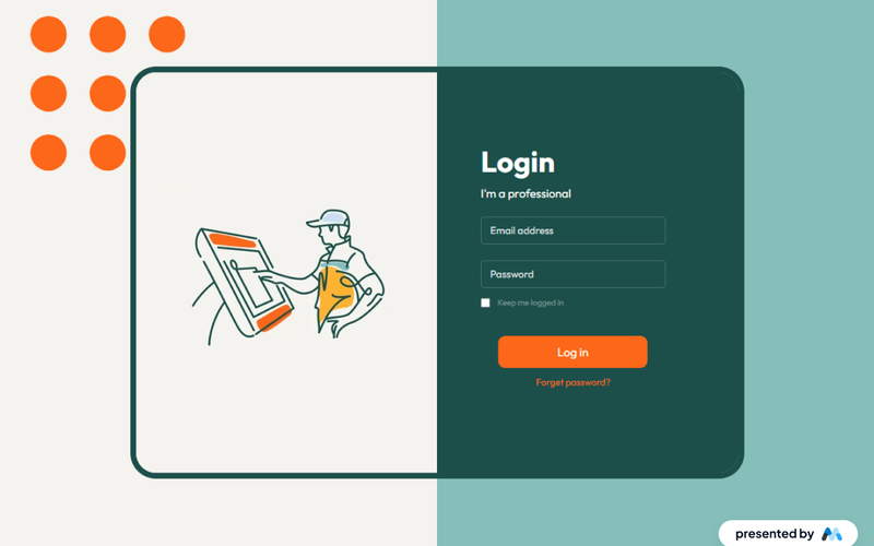
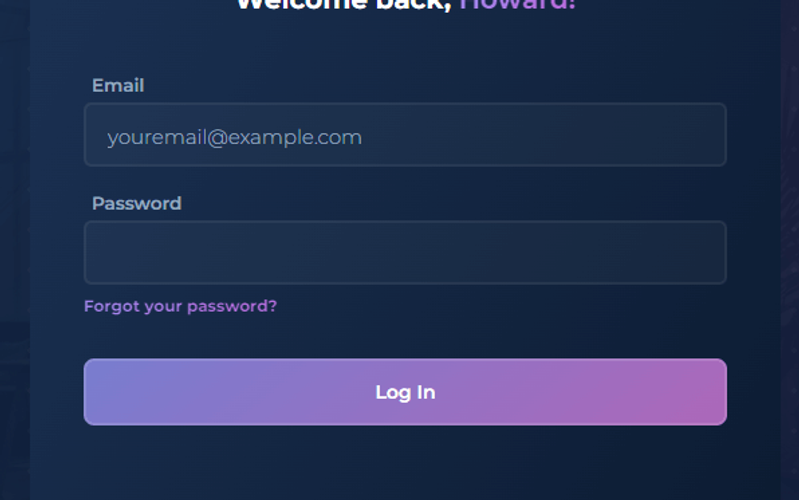
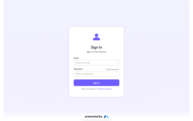
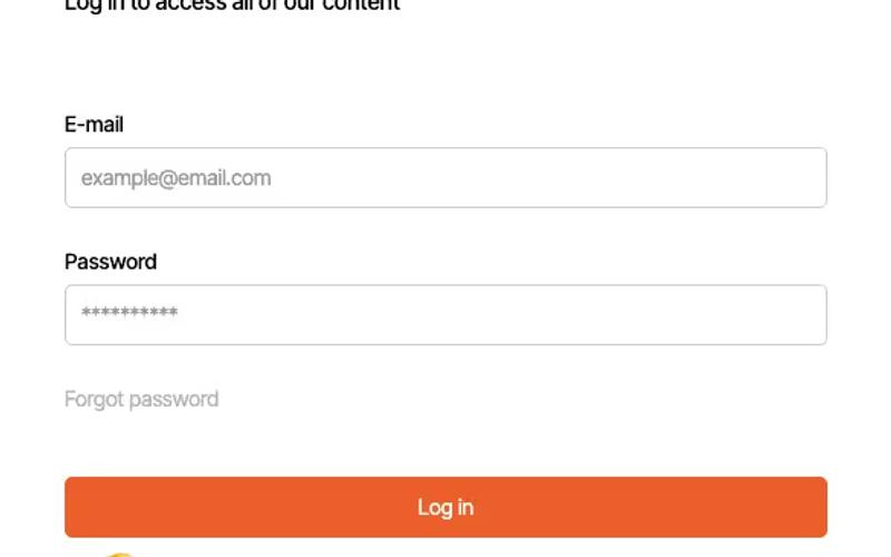
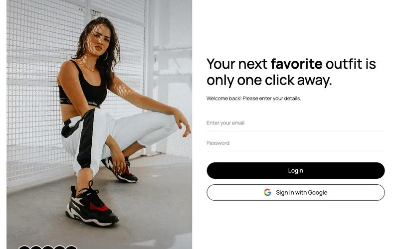
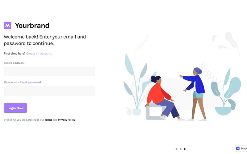
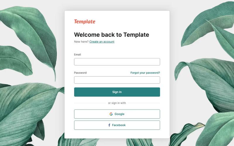
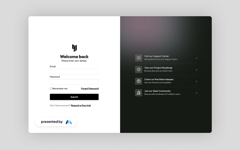
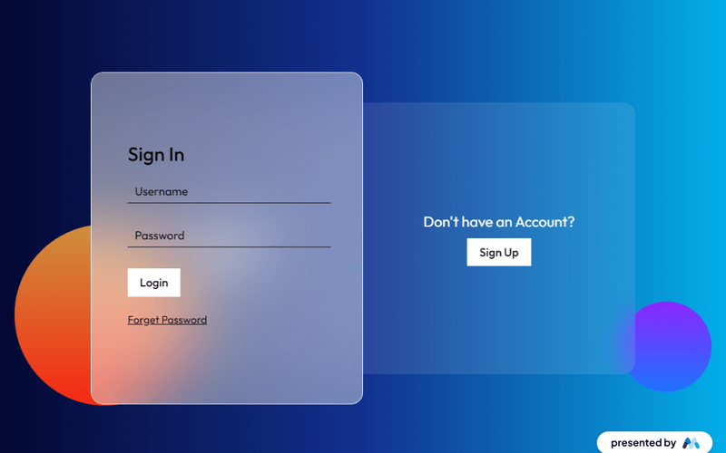
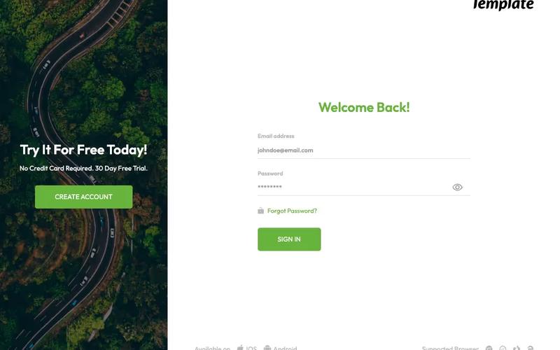
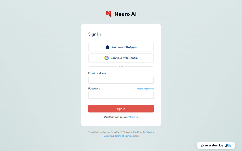
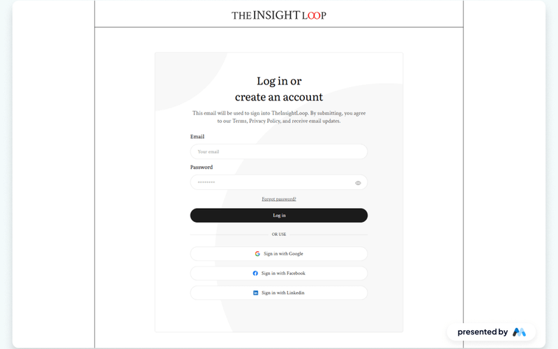
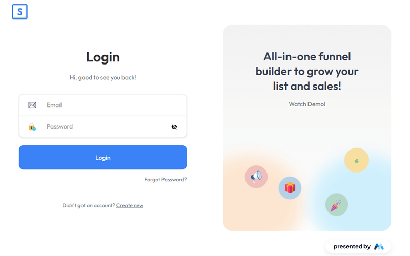
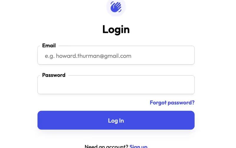
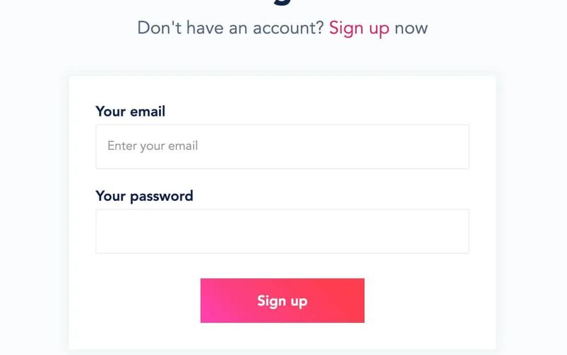
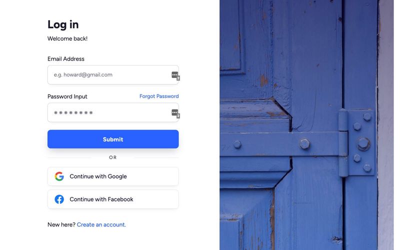
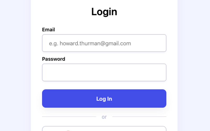
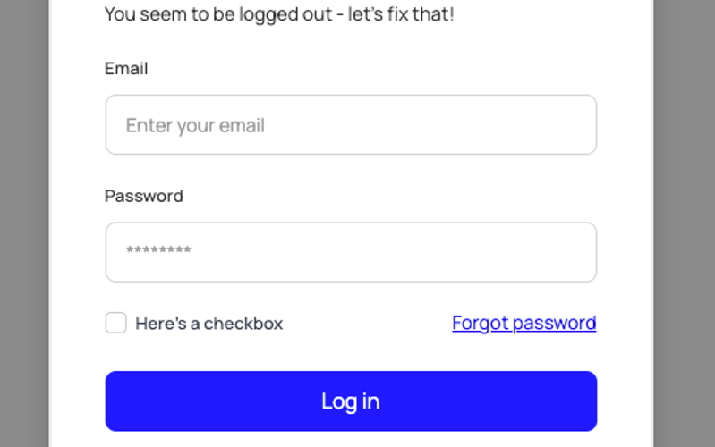
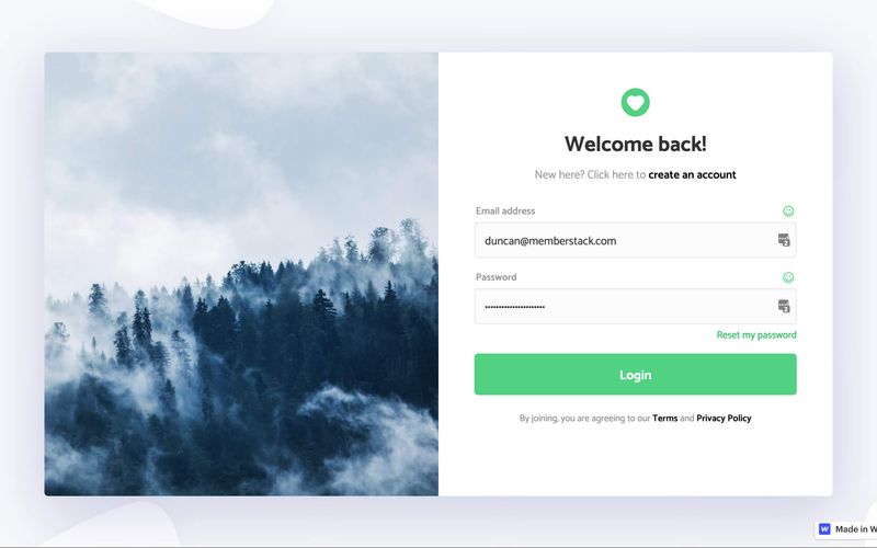
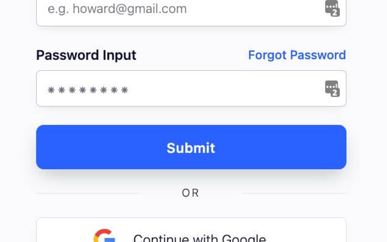
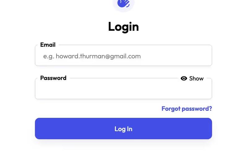
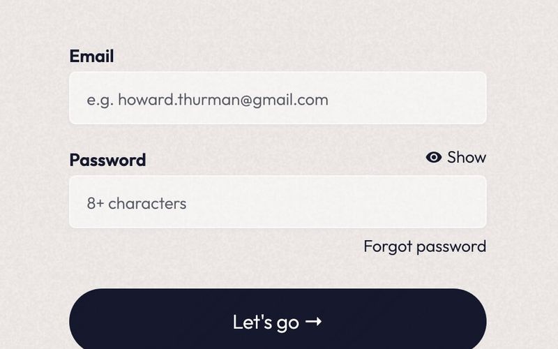
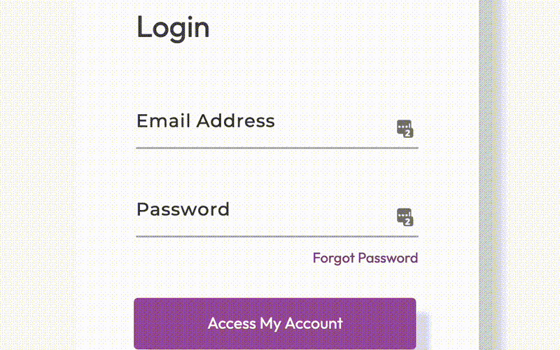
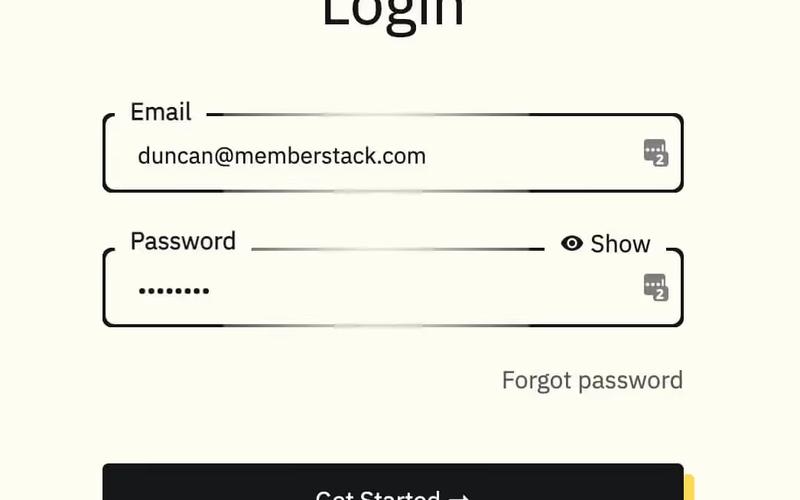
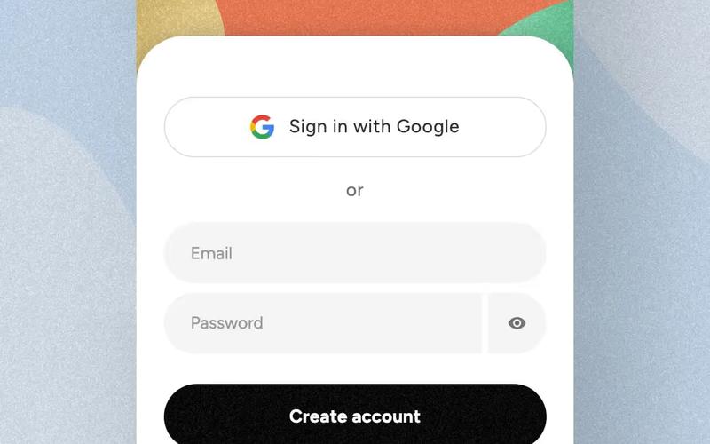
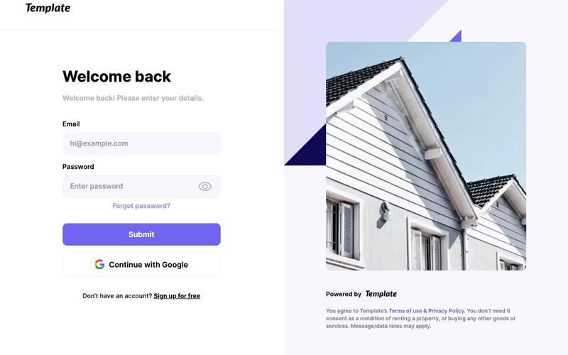
96 Components

Login Components

96 Webflow native login components with 1-click copy & paste from a library of 807+. Built for Memberstack integration.

Unstyled Login
View Component
LoginUnstyled

Unstyled Login

The Unstyled Login component is a simple and functional login form designed for easy integration into websites. It features essential fields for user authentication without any predefined styling. Key Features Includes fields for email and password input Supports form submission with success and error messages Customizable design to fit various branding needs Responsive layout suitable for different devices Integration with Memberstack for user management Design Elements: Minimalistic layout with no predefined stylesFlexbox structure for responsive designIncludes placeholder text and tooltipsPotential Use Cases: Startups needing a quick login solution Web applications requiring user authenticationE-commerce sites looking for a simple login interface Membership sites utilizing Memberstack for user management Landing pages that require user sign-in functionality Conclusion: The Unstyled Login component offers a versatile and straightforward solution for user authentication, making it ideal for developers looking to implement a login system without the constraints of a specific design.

Sign up with Email modal
View Component
LoginAll+1

Sign up with Email modal

This component provides a user-friendly modal for seamless account creation and login through email, enhancing the authentication process with intuitive forms. Key Features Intuitive email fields for easy sign-up and login Responsive design suitable for various devices Includes options for social sign-up via Google Success and error messages for user feedback Customizable styles and layout Design Elements Minimalistic layout with a clean aesthetic Soft color palette featuring light grey and dark grey tones Centered alignment for a balanced appearance Use of icons for visual appeal and clarity Potential Use Cases Startups looking to streamline user registrationE-commerce platforms needing quick account creation SaaS applications requiring user authentication Blogs or content platforms wanting to build a subscriber base Event management sites for attendee sign-ups Conclusion: The Sign up with Email modal is a versatile and visually appealing component that simplifies user registration and enhances the overall user experience.

2-Tab Auth Forms
View Component
SignupLogin

2-Tab Auth Forms

The 2-Tab Auth Forms component provides a user-friendly interface for authentication, allowing users to easily switch between 'Sign Up' and 'Log In' forms. It is designed for seamless integration into websites requiring user registration and login functionalities. Key Features Two-tab interface for easy switching between Sign Up and Log In forms Customizable form fields for email and password Google sign-in option for quick access Responsive design suitable for various devices Success and error messages for user feedback Design Elements: Modern and clean layout with a focus on usability Color scheme featuring shades of blue and white Rounded buttons and input fields for a friendly appearance Icons for social sign-in options Potential Use Cases: Web applications requiring user authenticationE-commerce sites needing user accounts for purchases Membership platforms for content access Online services offering personalized user experiences SaaS products that require user login and registration Conclusion: The 2-Tab Auth Forms component is a versatile solution for any website needing authentication features, combining functionality with an appealing design to enhance user experience.

AeroKit UI Login01 Split Screen
View Component
Login

AeroKit UI Login01 Split Screen

AeroKit UI Login01 Split Screen is a login component designed for Webflow that features a split-screen layout, allowing users to log in to their accounts efficiently. It includes fields for email and password, as well as options for social login and password recovery. Key Features Split-screen layout for a modern login experience.Form fields for email and password with validation.Social login options, including Google.Responsive design that adapts to various screen sizes.Error and success messages to inform users of their submission status. Design Elements Split-screen design that visually separates the login form from other content.Use of SVG icons for social login options, enhancing visual clarity.Clean typography with a focus on legibility.Color scheme that emphasizes the login action with contrasting buttons. Potential Use Cases Web applications requiring user authentication.E-commerce platforms needing secure login features.Membership sites that require user accounts.Mobile applications that require a web-based login interface.Corporate intranets where employee login is necessary. Conclusion: The AeroKit UI Login01 Split Screen component is a practical solution for developers looking to implement a user-friendly login interface in their Webflow projects.

AeroKit UI Login02 Centered Card
View Component
Login

AeroKit UI Login02 Centered Card

The AeroKit UI Login02 Centered Card is a user-friendly login component designed for web applications. It features a centered card layout that includes fields for email and password, as well as options for logging in with Google. The component is suitable for developers looking to implement a clean and functional login interface in their projects. Key Features Centered card layout for a focused user experience.Includes fields for email and password input.Option to log in using a Google account.Responsive design that adapts to various screen sizes.Success and error messages for form submissions. Design Elements Minimalistic design with a centered alignment.Use of clear typography for labels and buttons.Color scheme that emphasizes the login action.SVG icons for visual enhancement of the login options.Utilizes CSS for smooth transitions and focus states. Potential Use Cases Web applications requiring user authentication.E-commerce platforms needing secure login options.Social media sites looking to streamline user access.Educational platforms that require student logins.Corporate websites needing employee access portals. Conclusion: The AeroKit UI Login02 Centered Card is a practical component that simplifies the login process while providing a visually appealing interface, making it a valuable addition to any web project.

Aerokit UI Login03 Light Card
View Component
Login

Aerokit UI Login03 Light Card

The Aerokit UI Login03 Light Card is a user interface component designed for login forms, featuring a clean and structured layout. It allows users to enter their email and password, with options for logging in via Google and links for password recovery and account creation. Key Features Email and password input fields with placeholders for user guidance.Login button with a loading message for user feedback.Google login option with an icon for visual appeal.Error and success messages to inform users of their submission status.Responsive design elements that adapt to various screen sizes. Design Elements Light card layout that provides a clear focus on the login form.Use of SVG icons for the Google login option, enhancing visual clarity.Consistent spacing and alignment to maintain a structured appearance.Typography that emphasizes readability and accessibility. Potential Use Cases Web applications requiring user authentication.E-commerce platforms needing secure login functionality.Social media sites that offer user account management.Corporate intranet sites for employee access.Mobile applications that require a login interface. Conclusion: The Aerokit UI Login03 Light Card is a practical and visually appealing component suitable for various applications that require user authentication.

Aerokit UI Login04 Dual Pane
View Component
Login

Aerokit UI Login04 Dual Pane

The Aerokit UI Login04 Dual Pane is a login component designed for Webflow projects, featuring a dual-pane layout that enhances user experience during the login process. It includes fields for email and password, as well as options for social login and password recovery. Key Features Dual-pane layout for improved user interaction.Form fields for email and password with validation.Social login options, including Google authentication.Responsive design that adapts to different screen sizes.Success and error messages for user feedback. Design Elements Clean and structured layout that separates login fields and options.Use of icons for social login buttons, enhancing visual recognition.Consistent color scheme that aligns with modern UI standards.Focus state styles for accessibility, ensuring keyboard navigation is clear. Potential Use Cases Web applications requiring user authentication.E-commerce platforms needing secure login features.Membership sites that manage user accounts.SaaS products that require user sign-in.Educational platforms offering user-specific content. Conclusion: The Aerokit UI Login04 Dual Pane component is a practical solution for developers looking to implement a user-friendly login interface in their Webflow projects.

Authentication Form
View Component
Login

Authentication Form

The Authentication Form is designed to facilitate user login through email or social media accounts, providing a seamless experience for users to access their accounts. Key Features Supports email and password login Social media login options (Google and Facebook)Responsive design suitable for various devices Includes error and success messages for user feedback Customizable styling options Design Elements Clean and modern layout Use of vibrant colors for buttons and links Flexible and responsive design elements Social media icons integrated for easy access Potential Use Cases Web applications requiring user authenticationE-commerce platforms needing secure login options Membership sites that require user accounts Social networks or community platforms SaaS products that require user sign-in Conclusion: The Authentication Form is a versatile component that enhances user experience by providing multiple login options while maintaining a modern aesthetic.

Black&White Login
View Component
Login

Black&White Login

The Black&White Login component features a clean sign-up form with email, password, and OAuth options (GitHub and Google), complemented by a sleek testimonial on the left, providing a smooth user experience and visually striking design. Key Features Clean and modern designSupports email and password loginOAuth login options for GitHub and GoogleResponsive layoutIncludes a testimonial section Design Elements Black and white color schemeSleek and minimalistic layoutCentered alignment for form elementsUse of rounded corners and shadows for depth Potential Use Cases Web applications requiring user authentication Startups needing a quick login solution Portfolio websites showcasing design work SaaS products looking for a modern login interfaceE-commerce sites needing user accounts Conclusion: The Black&White Login component is a versatile and visually appealing solution for any website needing user authentication, making it suitable for various industries and applications.

Blue Bubble Login
View Component
Login

Blue Bubble Login

The Blue Bubble Login component is designed to provide a user-friendly login interface for websites. It features a visually appealing layout with a blue gradient background and includes fields for username and password, along with submission buttons. This component is suitable for integration into various web projects, enhancing user authentication processes. Key Features Includes input fields for username and password with placeholders.Features a submit button with a loading message.Displays success and error messages upon form submission.Responsive design that adapts to different screen sizes.Customizable styles for branding purposes. Design Elements Blue gradient background that transitions from light to dark shades.Rounded corners on input fields and buttons for a softer appearance.Use of flexbox for layout alignment, ensuring elements are centered.Crisp typography with a large heading for the login title.Hover effects on buttons to enhance interactivity. Potential Use Cases E-commerce websites requiring user login for account access.Membership-based platforms needing secure user authentication.Corporate intranet sites for employee login.Educational platforms for student and faculty access.Mobile applications that require user login functionality. Conclusion: The Blue Bubble Login component offers a visually appealing and functional solution for user authentication, making it a valuable addition to any web project that requires login capabilities.

Blue Gradient Log In
View Component
Login

Blue Gradient Log In

A visually appealing login form featuring a blue gradient background and a blur effect, designed for seamless user authentication with Google integration. Key Features Blue gradient background with blur effect Google authentication option Responsive design suitable for various devices User-friendly input fields for email and password Success and error messages for form submissions Design Elements Modern and clean layout Rounded corners for input fields and buttons Centered alignment for a balanced appearance Use of vibrant blue colors to enhance visibility Potential Use Cases Tech startups needing a login interfaceE-commerce websites requiring user accounts SaaS platforms for user authentication Mobile applications with web-based login Educational platforms for student access Conclusion: The Blue Gradient Log In component is a versatile and stylish solution for any website or application requiring user authentication, combining aesthetic appeal with functional design.

Blue Sign in & Sign Up
View Component
SignupLogin

Blue Sign in & Sign Up

The Blue Sign in & Sign Up component provides an elegant user interface for sign-up and sign-in forms, ensuring a seamless and professional user experience. Key Features Responsive design suitable for various devices Customizable fields for user input including name, email, and password Integrated success and error messages for form submissions Tabbed interface for switching between sign-in and sign-up formsCSS styles for improved legibility and focus states Design Elements Modern blue color scheme Clean and minimalistic layout Rounded input fields with subtle shadows Centered text alignment for headings and messages Use of flexbox for responsive design Potential Use Cases Web applications requiring user authenticationE-commerce sites needing user account creation Membership platforms for exclusive content access Service-based websites offering user accounts Event registration platforms Conclusion: The Blue Sign in & Sign Up component is versatile and visually appealing, making it an excellent choice for any website that requires user authentication functionalities.

Carousel Login Panel
View Component
AllLogin

Carousel Login Panel

The Carousel Login Panel is an engaging login interface that features an image slider, enhancing the visual appeal and functionality of the authentication process. Key Features Image slider for dynamic visual engagement User-friendly login form Responsive design for mobile and desktop Integration with membership platforms like Memberstack Customizable styles and layouts Design Elements Modern and clean aesthetic Soft color palette with a focus on usability Rounded corners and padding for a friendly look Use of images and testimonials to build trust Potential Use Cases Web applications requiring user authentication Membership sites looking to enhance user experienceE-commerce platforms needing secure login options Educational platforms for student and teacher logins Corporate websites for employee access Conclusion: The Carousel Login Panel is a versatile and visually appealing component that can significantly improve user engagement during the login process, making it suitable for various applications.

ColorShift Login
View Component
Login

ColorShift Login

ColorShift Login is a customizable login component designed for Webflow projects. It features a visually engaging layout with a gradient background and a structured form for user authentication. The component includes fields for email and password, a checkbox for 'Keep me logged in', and links for password recovery. Key Features Responsive design with a two-column grid layout for optimal user experience.Includes form validation and success/error messages for user feedback.Customizable styles for input fields, buttons, and labels.Accessibility features such as focus states for keyboard navigation. Design Elements Gradient background transitioning from light to dark colors, enhancing visual depth.Use of flexbox for layout alignment, ensuring elements are centered and spaced appropriately.Rounded corners on buttons and input fields for a softer appearance.Crisp typography with varying sizes for headings and body text. Potential Use Cases Web applications requiring user authentication, such as membership sites.E-commerce platforms needing secure login for customer accounts.Corporate intranets where employee access is managed through a login system.Educational platforms that require student and teacher logins. Conclusion: ColorShift Login is a well-structured component that provides essential login functionalities while offering customization options to fit various project needs.

Creative Login Panel
View Component
Login

Creative Login Panel

The Creative Login Panel is designed to provide a visually engaging and functional login interface for websites. It includes essential elements such as input fields for name, email, and password, along with a submit button. The panel also features success and error messages to enhance user experience. Key Features Includes input fields for name, email, and password with appropriate placeholders.Features a submit button labeled 'LOG IN' for user authentication.Displays success message upon successful form submission.Shows error message if there is an issue with form submission.Utilizes responsive design principles for optimal viewing on various devices. Design Elements Utilizes a clean layout with a focus on usability and accessibility.Incorporates a color scheme that enhances readability and user engagement.Includes icons and images to visually support the login process.Employs CSS for styling elements, ensuring a polished appearance across browsers. Potential Use Cases Web applications requiring user authentication, such as social media platforms.E-commerce websites needing secure login for customer accounts.Corporate intranets where employees need to access secure resources.Educational platforms for student and faculty login.Membership sites that require user registration and login functionalities. Conclusion: The Creative Login Panel is a practical solution for developers looking to implement a user-friendly login interface, suitable for a variety of applications and industries.

Dark Purple Login Form
View Component
Login

Dark Purple Login Form

The Dark Purple Login Form is a stylish and modern login interface designed to enhance user experience with its visually appealing gradient design and user-friendly layout. Key Features Responsive design suitable for various devices Includes fields for email and password input Features a 'Forgot your password?' link Success and error messages for form submission feedback Customizable styles with a dark purple color scheme Design Elements Gradient background with shades of purple Rounded corners for input fields and buttons Centered heading with welcoming text Clear and legible font choices Potential Use Cases Web applications requiring user authenticationE-commerce sites needing secure login access Membership platforms for user account management Online services offering personalized user experiences Corporate websites with employee login sections Conclusion: The Dark Purple Login Form is a versatile and visually appealing component that can enhance the login experience for various web applications, making it an excellent choice for developers and designers alike.

Elevate Login Box
View Component
Login

Elevate Login Box

The Elevate Login Box is a user-friendly component designed for secure user authentication. It features a clean layout with fields for email and password, a 'Sign In' button, and links for password recovery and account creation. This component is a free resource for Webflow developers to use in their projects. Key Features Includes input fields for email and password with placeholders.Features a 'Sign In' button that submits the form.Provides links for 'Forgot Password?' and 'Create an Account'.Displays success and error messages upon form submission. Design Elements Utilizes a clean and simple layout with a white background and rounded corners.Incorporates a gradient background for the login section.Employs a modern font (Outfit) for text elements.Includes responsive design elements that adjust for different screen sizes. Potential Use Cases Web applications requiring user authentication.E-commerce platforms needing secure login functionality.Membership sites that require user accounts.Online services offering personalized user experiences. Conclusion: The Elevate Login Box is a practical and visually appealing solution for developers looking to implement user authentication in their Webflow projects.

Emoji Pop Log In Form
View Component
Login

Emoji Pop Log In Form

The Emoji Pop Log In Form is a user-friendly login interface designed to facilitate easy access to content with a playful emoji theme. It includes essential fields for email and password input, along with options for password recovery and social media login. Key Features Responsive design suitable for various devices Email and password fields with placeholders Forgot password link for user convenience Social media login option (Google)Success and error messages for form submission feedback Design Elements: Vibrant color scheme with orange accents Rounded corners for input fields and buttons Clear typography with a focus on readability Use of emojis to enhance user engagement Potential Use Cases: Web applications requiring user authenticationE-commerce sites needing secure logins Content platforms offering exclusive access Social media applications with user accounts Membership sites for community engagement Conclusion: The Emoji Pop Log In Form is a versatile and visually appealing component that enhances user experience while providing essential login functionalities, making it suitable for a wide range of applications.

Fashion Themed Log In
View Component
Login

Fashion Themed Log In

The Fashion Themed Log In component is designed to provide a stylish and user-friendly login interface tailored for fashion-related websites. It features a modern aesthetic with customizable elements to enhance user experience. Key Features Responsive design suitable for various devices Includes fields for email and password input Social login option with Google integration Success and error messages for user feedback Customizable styles to match brand identity Design Elements: Elegant color scheme with a focus on white and black Rounded corners for input fields and buttons Icons for social media login options Flexible grid layout for optimal content arrangement Potential Use Cases: Fashion e-commerce websites looking to enhance user login experience Online clothing stores wanting a modern and stylish login interface Fashion blogs that require user authentication for comments or subscriptions Membership sites focused on fashion content and resources Event registration platforms for fashion shows or exhibitions Conclusion: Overall, the Fashion Themed Log In component is a versatile and visually appealing solution for any fashion-related website, ensuring a seamless and engaging user experience.

Flat Login with Slider
View Component
Login

Flat Login with Slider

The Flat Login with Slider component provides a modern and interactive login experience with a sliding visual element, enhancing user engagement. It features a clean design suitable for various applications. Key Features Responsive design for mobile and desktop Integrated slider for visual appeal Form fields for email and password with validation Success and error messages for user feedback Links for account creation and password reset Design Elements Minimalistic layout with a white background Use of vibrant colors for buttons and links Flexbox layout for alignment and spacing Customizable slider images Potential Use Cases Web applications requiring user authenticationE-commerce platforms needing a login interface Membership sites for user account management SaaS products looking for a modern login solution Landing pages that require user sign-up Conclusion: The Flat Login with Slider component is a versatile and visually appealing solution for any website needing a login interface, making it ideal for various industries.

Food Themed Login Form
View Component
LoginSignup

Food Themed Login Form

This login form combines seamless functionality with enticing food imagery, creating an appealing online experience for users. Key Features Responsive design suitable for various devices Tempting food imagery to enhance user engagement User-friendly form fields for email and password entry Includes options for password recovery and sign-up Customizable styles to fit different branding needs Design Elements Vibrant food-themed imageryClean layout with ample white spaceModern typography for readabilityColor scheme incorporating warm tones and contrasts Potential Use Cases Restaurants and food delivery services looking to enhance user registration Food blogs or recipe websites wanting to create a community Catering services that require user accounts for bookings Food-related apps needing a stylish login interfaceE-commerce sites focused on food products Conclusion: The Food Themed Login Form is a versatile and visually appealing component that can significantly enhance user experience for food-related websites and applications.

Forgot Password Success (Login)
View Component
Forgot PasswordLogin

Forgot Password Success (Login)

This component provides a user-friendly interface for notifying users that their password has been successfully reset, along with a prompt to log in with new credentials. Key Features Responsive design suitable for various devices Includes form for email and password input Success and error messages for user feedback Customizable styles and classes Interactive elements with scroll animations Design Elements Clean and modern layout Soft color palette with a focus on usability Rounded corners and shadow effects for depth Centered alignment for a balanced appearance Potential Use Cases Web applications requiring user authenticationE-commerce platforms for account management Membership sites needing secure login processes SaaS products with user account functionalities Conclusion: The Forgot Password Success component is versatile and visually appealing, making it an excellent choice for any application that requires user authentication and account recovery features.

Free Glassmorphism Login Page
View Component
Login

Free Glassmorphism Login Page

This component features a stylish glassmorphism design for a login page, providing a modern and visually appealing user interface for authentication purposes. Key Features Responsive design suitable for various devices Includes form elements for email and password input Features a 'Remember me' checkbox and a link for password recovery Success and error messages for form submission feedback Customizable styles and classes for easy integration Design Elements Glassmorphism effect with a blurred background Soft color palette with a focus on transparency Rounded corners and smooth transitions for buttons Flexbox layout for responsive design Potential Use Cases Web applications requiring user authenticationE-commerce sites needing secure login functionality Membership platforms with user accounts SaaS products looking for a modern login interface Portfolio websites showcasing design skills Conclusion: The Free Glassmorphism Login Page is a versatile and visually striking component that enhances user experience while providing essential login functionalities.

Free Light Sign In Screen
View Component
Login

Free Light Sign In Screen

The Free Light Sign In Screen is a visually appealing login interface designed for web applications, featuring a clean layout and user-friendly form elements. Key Features Responsive design suitable for various devices Includes fields for email and password input Customizable form success and error messages Link for password recovery Design Elements: Light color schemeRounded button design for a modern lookCentered layout for easy navigationUse of logo for brandingPotential Use Cases: Web applications requiring user authentication Startups looking for a quick sign-in solution Businesses in need of a professional login interface Educational platforms for student loginsE-commerce sites needing secure customer access Conclusion: This Free Light Sign In Screen is a versatile and attractive solution for any web application needing a login interface, combining functionality with modern design.

Fun Log In Screen
View Component
Login

Fun Log In Screen

The Fun Log In Screen enhances the user login experience with a vibrant and picturesque design, making it visually appealing and engaging. Key Features Responsive design suitable for various devices Includes social media login options (Google and Facebook)Customizable form fields for email and password Success and error messages for user feedback Attractive background image to enhance aesthetics Design Elements Bright color scheme with a focus on green hues Use of images for logos and social media icons Flexible layout with padding and margins for a clean look Interactive elements such as buttons and links Potential Use Cases Web applications requiring user authenticationE-commerce platforms needing a user-friendly login interface Social media sites that prioritize user engagement Online services offering subscription-based models Educational platforms for student and teacher logins Conclusion: The Fun Log In Screen is a versatile and visually appealing component that can significantly enhance user engagement and satisfaction during the login process.

Gaming Themed Log In
View Component
Login

Gaming Themed Log In

This component provides a visually engaging login interface tailored for gaming enthusiasts, featuring vibrant graphics and a user-friendly layout. Key Features Responsive design suitable for various devices Includes email and password input fields Option to log in with Google Success and error messages for form submissions Customizable styles to match gaming aesthetics Design Elements Bold color scheme with dark backgrounds and bright accents Dynamic images related to popular games Modern typography with a gaming flair Grid layout for organized content presentation Potential Use Cases Gaming websites looking to enhance user engagement Online gaming platforms requiring user authentication Game development studios needing a login interface for testersE-sports organizations managing player accounts Gaming communities and forums for member logins Conclusion: The Gaming Themed Log In component is a versatile and visually appealing solution for any gaming-related website, ensuring a seamless user experience while maintaining a strong thematic presence.

Gaming Themed Login Form
View Component
LoginAll

Gaming Themed Login Form

This login form is designed with a dark gaming theme, providing a seamless and immersive experience for users, particularly appealing to gaming enthusiasts. Key Features Dark themed design suitable for gaming websites Responsive layout for various devices Includes social login options (Google and Facebook)User-friendly interface with clear input fields Success and error messages for form submissions Design Elements Dark color palette with contrasting text Use of gaming-related imagery Modern typography with focus on legibility Rounded corners for input fields and buttons Grid layout for organized structure Potential Use Cases Gaming websites and platforms Online gaming communitiesE-sports tournament registration sites Game development company websites Gaming merchandise stores Conclusion: The Gaming Themed Login Form is a versatile component that effectively combines functionality with an engaging design, making it ideal for any gaming-related website.

Glossy Login
View Component
Login

Glossy Login

A sleek, split-screen login interface designed for modern applications, featuring user login fields on the left and quick access to support and community resources on the right. Key Features Minimalist design with a split-screen layout User-friendly login fields Quick access links for support and community resources Responsive design suitable for various devices Customizable styles and components Design Elements Cohesive modern layoutSoft color palette with gradientsRounded corners and shadow effectsClear typography for improved readability Potential Use Cases Web applications requiring user authenticationE-commerce platforms needing secure login features SaaS products looking for a modern user interface Community-driven websites with support resources Mobile applications needing a responsive login solution Conclusion: The Glossy Login component offers a stylish and functional solution for user authentication, making it an excellent choice for various web applications and services.

Google "One Tap"
View Component
Login

Google "One Tap"

Google 'One Tap' offers a seamless login/signup experience with just a single tap, designed to enhance user convenience and streamline the authentication process. Key Features Effortless login/signup with a single tapUser-friendly interfaceIntegration with Google authenticationResponsive design suitable for various devices Design Elements Fixed position layout for easy accessClean and modern aesthetic with rounded cornersUse of Google branding colorsIncludes icons for visual appeal Potential Use Cases E-commerce websites looking to simplify user registration Mobile applications aiming for quick user onboarding SaaS platforms that require secure and fast login options Blogs or content sites wanting to enhance user engagement through easy sign-in Conclusion: Google 'One Tap' is a versatile and efficient component that significantly improves user experience by simplifying the login process, making it an excellent choice for various digital platforms.

Gradient Tab Login
View Component
Login

Gradient Tab Login

The Gradient Tab Login component is designed to facilitate user authentication through a visually engaging interface. It features a tabbed layout for sign-in and sign-up forms, enhancing user experience by providing clear navigation between the two options. This component is a free resource for Webflow developers to use in their projects. Key Features Tabbed interface for easy switching between Sign In and Sign Up forms.Responsive design that adapts to various screen sizes.Includes form validation messages for successful and failed submissions.Customizable input fields for username, email, and password.Focus state styling for improved accessibility. Design Elements Gradient background that adds visual interest and depth.Clean layout with clear typography for readability.Use of grid layout to organize form elements effectively.Interactive elements such as buttons and links styled for user engagement. Potential Use Cases Web applications requiring user authentication.E-commerce platforms needing user registration and login.Membership sites where users need to sign in or create accounts.SaaS products that require user onboarding through login forms.Portfolio websites that allow user sign-up for updates or newsletters. Conclusion: The Gradient Tab Login component offers a stylish and functional solution for user authentication, making it suitable for a variety of web applications and services.

Green Webflow Sign In Component
View Component
Login

Green Webflow Sign In Component

A free sign-in screen component for Webflow, designed to integrate seamlessly with Memberstack, providing a user-friendly interface for account access. Key Features Integrates with Memberstack for user authenticationResponsive design suitable for various devicesCustomizable styles and elementsDesign Elements: Green color scheme Modern and clean layout Includes icons for visual appeal Flexible form fields for email and password Buttons with hover effects Potential Use Cases: Startups looking for a quick sign-in solutionE-commerce websites requiring user accounts Membership sites needing secure access Educational platforms with user login features Blogs or content sites offering premium content Conclusion: The Green Webflow Sign In Component is a versatile and visually appealing solution for any website needing user authentication, making it an excellent choice for various industries.

Guest-User: Login Banner
View Component
AllLogin+1

Guest-User: Login Banner

The Guest-User Login Banner provides an intuitive interface for users to log in using Google or Facebook, facilitating easy access to GPT-powered meeting notes. Key Features Supports login via Google and Facebook Responsive design for various devices Includes a form for email login Displays success and error messages upon form submission Customizable styles and layout Design Elements Clean and modern layout Soft color palette with a white background and grey accents Rounded corners and subtle shadow effects for buttons Centered text alignment for a balanced appearance Use of SVG icons for social media login options Potential Use Cases Web applications requiring user authentication Business websites offering access to exclusive content Educational platforms providing resources to registered users Event management sites for attendee login Corporate intranets for employee access Conclusion: The Guest-User Login Banner is a versatile component that enhances user experience by simplifying the login process while maintaining an appealing design.

Identity Login Panel
View Component
Login

Identity Login Panel

The Identity Login Panel is a customizable login interface designed for web applications. It includes features for user authentication, such as email and password fields, social media login options, and error/success messages. This component is a free resource for Webflow developers to use in their projects. Key Features User authentication form with email and password fields.Social media login options for Facebook and Google.Error and success messages displayed upon form submission.Responsive design that adapts to various screen sizes.Customizable styles for branding purposes. Design Elements Clean layout with a focus on usability.Use of icons for social media login buttons.Consistent typography and spacing for a cohesive look.Color scheme that can be easily adjusted to match branding. Potential Use Cases Web applications requiring user login functionality.E-commerce sites needing secure customer authentication.Membership platforms that require user registration and login.Corporate websites with restricted access areas.Mobile applications that require user sign-in. Conclusion: The Identity Login Panel is a practical solution for developers looking to implement user authentication features in their Webflow projects, offering flexibility and ease of customization.

Insight Loop UI Kit Login
View Component
Login

Insight Loop UI Kit Login

The Insight Loop UI Kit Login is a sleek and modern login interface designed to enhance user experience and streamline the authentication process. Key Features Responsive design for mobile and desktop devices Customizable components to fit various branding needs User-friendly interface with clear call-to-action buttons Integration capabilities with various authentication systems Live preview available for immediate testing Design Elements Minimalistic layout with a focus on usability Soft color palette that promotes a calming user experience Clear typography for easy readability Well-structured input fields and buttons Potential Use Cases Web applications requiring user login functionalityE-commerce platforms needing secure customer access Corporate websites with employee login areas Social media platforms for user account management Educational platforms for student and faculty access Conclusion: The Insight Loop UI Kit Login offers a versatile and aesthetically pleasing solution for any project requiring a login interface, making it suitable for a wide range of applications.

Instant Access Gate
View Component
Login

Instant Access Gate

The Instant Access Gate component is designed for user authentication, featuring a login form that includes fields for email and password, as well as options for password recovery and account creation. This component is a free resource for Webflow developers to use in their projects. Key Features Login form with email and password fields.Success and error messages for form submissions.Tabs for showing and hiding password input.Responsive design with mobile-friendly elements.Includes links for password recovery and account creation. Design Elements Utilizes a clean layout with a focus on form usability.Incorporates SVG icons for visual enhancement.Employs a color scheme that emphasizes accessibility and readability.Responsive design elements that adapt to various screen sizes. Potential Use Cases Web applications requiring user authentication.Membership sites that need secure login functionality.E-commerce platforms with user accounts.Online services offering personalized user experiences.Educational platforms requiring student or teacher logins. Conclusion: The Instant Access Gate component provides essential functionalities for user authentication, making it suitable for a variety of web applications that require secure access.

Invest UI Login
View Component
Login

Invest UI Login

The Invest UI Login component is designed to facilitate user login processes in web applications. It includes essential elements such as input fields for email and password, a login button, and options for password recovery and account creation. This component serves as a free resource for Webflow developers to enhance their projects. Key Features Email and password input fields with validation requirements.Login button with a loading state message.Links for password recovery and account creation.Responsive design elements that adapt to various screen sizes.Success and error messages for form submission feedback. Design Elements Utilizes a clean layout with centered alignment for form elements.Incorporates a color scheme that emphasizes usability, with focus states for accessibility.Includes icons for visual appeal, enhancing user interaction.Text styles that ensure legibility across different devices. Potential Use Cases Web applications requiring user authentication, such as e-commerce sites.Membership platforms that need secure login functionalities.Corporate intranets where employee access is managed through login forms.Educational platforms for student and faculty access. Conclusion: The Invest UI Login component is a practical solution for developers looking to implement user authentication features efficiently, offering a straightforward design that meets common login requirements.

LinkedIn Sign In Modal
View Component
Login

LinkedIn Sign In Modal

The LinkedIn Sign In Modal allows users to sign in to view profiles on your Webflow site, enhancing user engagement and access control. Key Features User-friendly sign-in interface Integration with Linked In for profile access Responsive design for mobile and desktop Customizable appearance to match site branding Includes options for Google sign-in Design Elements: Modern and clean layout Overlay background for focus on modal content Profile image display for personalization Flexible spacing and alignment for visual appeal Potential Use Cases: Professional networking sites Job boards and recruitment platforms Personal branding websites Online portfolios for freelancers Corporate websites with employee profiles Conclusion: The Linked In Sign In Modal is a versatile component that enhances user interaction by providing a seamless sign-in experience, making it ideal for various professional and networking applications.

Log In After Password Reset
View Component
LoginForgot Password

Log In After Password Reset

This component provides a user-friendly interface for logging in after a password reset, ensuring a smooth transition for users who have recently updated their credentials. Key Features Form for email and password input Success and error messages for form submission Responsive design suitable for various devices Customizable styles and classes Includes a visual emoji element for a friendly touch Design Elements Minimalistic layout with a focus on usability Color scheme featuring soft backgrounds and contrasting text Rounded corners and subtle shadows for a modern look Use of an emoji to enhance user engagement Potential Use Cases Web applications requiring user authenticationE-commerce sites needing secure login processes Membership platforms for user account management SaaS products that require user login after password resets Blogs or content sites with user accounts Conclusion: The 'Log In After Password Reset' component is versatile and easy to integrate, making it an excellent choice for any web application that prioritizes user experience and security.

Login #1
View Component
Login

Login #1

Login #1 is a user-friendly login form designed to facilitate user authentication with a clean and modern interface. Key Features Includes fields for email and password input Features a 'Continue' button for form submission Provides links for password recovery Displays success and error messages upon form submission Responsive design suitable for various devices Design Elements: Modern styling with rounded corners and subtle shadows Color scheme includes a primary blue for buttons and links Clear typography with a focus on readability Potential Use Cases: Web applications requiring user login functionalityE-commerce sites needing secure customer access Membership platforms for user account management Corporate websites with employee login sections Educational platforms for student and faculty access Conclusion: Login #1 is a versatile and visually appealing login form that can enhance user experience across various web applications.

Login #10
View Component
Login

Login #10

Login #10 is a user-friendly login form designed for seamless user authentication. It features both email and password fields, along with social media login options. Key Features Email and password input fields Social login options for Google and Facebook Responsive design suitable for various devices Success and error messages for user feedback Customizable styles and classes Design Elements: Modern and clean layout Use of icons for social media buttons Flexible form container with a maximum width Clear typography with emphasis on labels Subtle color scheme with contrasting elements Potential Use Cases: Web applications requiring user authenticationE-commerce sites needing secure login features Membership platforms for user access control Social media applications facilitating quick sign-ins Corporate websites with employee login portals Conclusion: Login #10 is a versatile and aesthetically pleasing login component that enhances user experience while providing essential authentication features.

Login #7
View Component
Login

Login #7

Login #7 is a customizable login component designed for user authentication, featuring social media login options and a clean, modern interface. Key Features Supports email and password login Includes social login options for Google, Facebook and Linked In Responsive design suitable for various devices Customizable form fields and buttons Success and error messages for user feedback Design Elements: Minimalist layout with a focus on usability Dark color scheme with contrasting white text Rounded input fields and buttons for a modern look Social media icons integrated for easy access Potential Use Cases: E-commerce websites requiring user accounts Membership sites with exclusive content Web applications needing secure user authentication Blogs or content platforms that allow user comments Corporate websites with employee login portals Conclusion: Login #7 is a versatile and visually appealing component that enhances user experience while providing essential login functionalities.

Login 11
View Component
Login

Login 11

Login 11 is a customizable login form component designed for seamless user authentication. It features a clean layout with essential fields for email and password input, along with a user-friendly interface. Key Features Responsive design suitable for various devices Includes fields for email and password with validation Customizable success and error messages Option for password recovery with a 'Forgot password?' link Integration with Memberstack for enhanced user management Design Elements: Modern and minimalistic style Color scheme featuring shades of blue and white Use of icons for visual appeal Flexbox layout for responsive alignment Potential Use Cases: Web applications requiring user login functionalityE-commerce sites needing secure customer authentication Membership platforms for user account management SaaS products that require user registration and login Blogs or content sites with gated content access Conclusion: Login 11 is a versatile and visually appealing login form that can be easily integrated into various web projects, making it an excellent choice for developers and designers looking to enhance user authentication experiences.

Login Card
View Component
Login

Login Card

The Login Card is a user-friendly component designed for secure user authentication, featuring a clean layout for email and password input fields along with action prompts for account creation and password recovery. Key Features Responsive design suitable for various screen sizes Includes input fields for email and password with validation Links for account creation and password recovery Customizable success and error messages Integration with Member Stack for user management Design Elements: Modern and minimalistic style Centered layout for easy accessibility Use of Avenir font for a clean look Hover effects on buttons and links Potential Use Cases: Web applications requiring user authenticationE-commerce sites needing secure login for customers Membership platforms for user account management Educational platforms for student and instructor logins SaaS products that require user sign-in Conclusion: The Login Card is a versatile and visually appealing component that enhances user experience while ensuring secure access to applications, making it an essential addition for any web project.

Login Form
View Component
Login

Login Form

The Login Form component is designed to facilitate user authentication on websites, providing a streamlined interface for users to log in using their email and password or social media accounts. Key Features Email and password fields with validation Social login options for Google and Facebook Responsive design suitable for various devices Success and error messages for user feedback Customizable styles and classes Design Elements Modern and clean layout Use of rounded corners and shadows for input fields Color scheme featuring blue and white tones Flexbox layout for responsive design Social media icons integrated into the form Potential Use Cases E-commerce websites requiring user accounts Membership sites with restricted content Online services offering personalized experiences Web applications needing user authentication Blogs or content platforms encouraging user engagement Conclusion: The Login Form component is versatile and user-friendly, making it an essential tool for any website that requires user authentication, enhancing both functionality and user experience.

Login Form With Instant Email Validation
View Component
Login

Login Form With Instant Email Validation

This component is a simple login form that provides instant validation for email entries, ensuring users input a valid email address before submission. Key Features Instant email validationUser-friendly designResponsive layoutIncludes social login option with GoogleSuccess and error messages for user feedback Design Elements Clean and modern aesthetic Centered layout with ample white space Soft color palette with a focus on usability Rounded corners and shadow effects for depth Potential Use Cases Web applications requiring user authenticationE-commerce sites needing secure login options Membership platforms for user management Online services offering personalized experiences Blogs or content sites with user registration Conclusion: The Login Form With Instant Email Validation is a versatile and visually appealing component that enhances user experience by ensuring valid email entries, making it suitable for various online platforms.

Login Form With Large Image
View Component
Login

Login Form With Large Image

This component features a full login screen that integrates Google Authentication alongside a prominent image on the right side, enhancing user engagement. Key Features Includes Google Authentication option Responsive design suitable for various devices User-friendly layout with clear input fields Success and error messages for form submissions Customizable image background Design Elements: Flexbox layout for optimal alignmentRounded corners for a modern aestheticLarge, engaging images to capture user attentionPotential Use Cases: Web applications requiring user loginE-commerce sites needing secure access Membership platforms for user registration Educational platforms for student logins Corporate websites with employee access Conclusion: The Login Form With Large Image component is versatile and visually appealing, making it an excellent choice for any website that requires user authentication while maintaining a strong visual presence.

Login Modal
View Component
Login

Login Modal

The Login Modal is a user-friendly component designed to facilitate user authentication on websites. It provides a clean and efficient interface for users to log in using their email and password or through Google. Key Features Responsive design suitable for various devices Email and password input fields with validation Option to log in using Google Includes a 'Forgot password' link Success and error messages for user feedback Design Elements Fixed position modal with a semi-transparent background Modern and clean layout with rounded corners Color scheme featuring shades of blue and white Clear typography for headings and labels Potential Use Cases E-commerce websites requiring user accounts Social media platforms for user authentication Online services with subscription models Blogs or content platforms needing user login Corporate intranets for employee access Conclusion: The Login Modal is a versatile and visually appealing component that enhances user experience by simplifying the login process, making it an excellent choice for various web applications.

Login Page w/ GSAP Marquee Testimonials
View Component
Login

Login Page w/ GSAP Marquee Testimonials

This login page features a dynamic vertical GSAP marquee that enhances user engagement while providing a stylish entry point for users. Key Features Dynamic GSAP marquee for testimonials Responsive design suitable for various devices Social login options (Google, Facebook, Microsoft, Git Hub, Linked In, Dribbble)User-friendly form with validation messages Customizable styles and layouts Design Elements Modern and clean layout Vibrant color scheme with gradients Rounded buttons and input fields Use of images and icons for social logins Background noise effect for depth Potential Use Cases Job boards and recruitment platformsE-commerce websites requiring user authentication Membership sites with social login features Online services needing a sleek login interface Web applications focused on user engagement Conclusion: The Login Page w/ GSAP Marquee Testimonials is a versatile and visually appealing component that enhances user experience and can be adapted for various online platforms.

Login UI
View Component
Login

Login UI

A clean and minimalist login page that offers options for Google and Facebook sign-in, along with password reset functionality and form submission feedback. Key Features Minimalist designGoogle and Facebook sign-in optionsPassword reset functionalityForm submission feedbackResponsive layout Design Elements Soft color palette with a focus on usability Centered layout for form elements Use of gradients for buttons and headings Clear typography for readability Potential Use Cases E-commerce websites needing user authentication Online learning platforms requiring user logins Membership sites that require secure access Apps that integrate social media logins Corporate websites with user account features Conclusion: The Login UI component is versatile and user-friendly, making it suitable for various applications that require secure user authentication.

Login With Password
View Component
Login

Login With Password

The 'Login With Password' component provides a user-friendly interface for users to log into their accounts using email and password credentials. It includes essential features like form validation and error handling. Key Features Email and password input fieldsSubmit button with loading stateForgot password linkSuccess and error messagesResponsive design Design Elements Modern and clean layoutColor scheme featuring shades of blueRounded input fields and buttonsClear typography for labels and headings Potential Use Cases E-commerce websites requiring user authentication Membership sites with restricted content Online services offering personalized user experiences Web applications needing secure login functionality Blogs or forums that require user registration and login Conclusion: This component is versatile and essential for any web application that requires user authentication, providing a seamless login experience for users.

Login screen
View Component
AllLogin

Login screen

The Login Screen component provides a user-friendly interface for logging in, enhanced by a dynamic dashboard picture slider for visual appeal. Key Features User-friendly login formDynamic dashboard picture sliderResponsive designSocial login options (Google and LinkedIn)Customizable styles and layouts Design Elements Modern and clean layout Flexible grid system Use of vibrant colors and images Clear typography for readability Interactive elements for enhanced user experience Potential Use Cases Web applications requiring user authenticationE-commerce platforms needing secure login Membership sites for user access control SaaS products with user accounts Community forums or social networks Conclusion: The Login Screen component is versatile and visually appealing, making it an excellent choice for any web application that requires user authentication.

Login w/ Slider
View Component
Login

Login w/ Slider

The Login w/ Slider component provides a visually engaging login interface with a slider feature, allowing users to navigate through different slides while logging in. It combines form elements with a dynamic background slider for an enhanced user experience. Key Features Integrated slider for dynamic visual appeal User-friendly login form with email and password fields Responsive design suitable for various devices Customizable styles and animations Includes success and error messages for form submissions Design Elements Modern and clean layout Flexible color scheme with a light background Use of images and icons to enhance visual interest Smooth transitions and animations for slider functionality Potential Use Cases Web applications requiring user authenticationE-commerce platforms needing a login interface Membership sites offering exclusive content Service-based websites with user accounts Educational platforms for student and instructor logins Conclusion: The Login w/ Slider component is a versatile and visually appealing solution for any website needing a login feature, making it an excellent choice for enhancing user engagement.

Login with Social Auth
View Component
Login

Login with Social Auth

This component provides a user-friendly interface for logging in using either a password or social authentication methods like Google and Facebook. It streamlines the login process for users by offering multiple options. Key Features Supports login via email and password Integrates social authentication with Google and Facebook Includes a 'Forgot Password' link Responsive design suitable for various devices Customizable styles and classes Design Elements Clean and modern layout Use of social media icons for authentication options Colorful buttons with hover effects Clear typography for labels and headings Dividers to separate login methods Potential Use Cases E-commerce websites needing user accounts Membership platforms requiring secure logins Social media applications with user authentication Online services offering personalized experiences Blogs or content sites that require user registration Conclusion: The Login with Social Auth component is versatile and enhances user experience by simplifying the login process, making it ideal for a wide range of web applications.

Login | Show Password 11
View Component
Login

Login | Show Password 11

This component provides a user-friendly login form with a 'show password' feature, enhancing usability and security for users. It includes fields for email and password, along with social login options. Key Features Email and password input fields Show/hide password toggle functionality Social login options (e.g., Google)Responsive design suitable for various devices Success and error messages for form submission Design Elements: Clean and modern layout Flexible section with padding for better spacing Use of icons for visual enhancement Color scheme that emphasizes usability and accessibility Potential Use Cases: Web applications requiring user authenticationE-commerce platforms needing secure login Membership sites with user accounts Online services offering personalized experiences Mobile applications that require user sign-in Conclusion: The Login | Show Password 11 component is versatile and user-friendly, making it an excellent choice for any web application that requires secure user authentication.

Membership Login
View Component
Login

Membership Login

The Membership Login component is designed to facilitate user authentication through email and social media accounts, providing a seamless login experience. Key Features Email and password login functionality Social login option with Google Responsive design suitable for various devices Success and error messages for user feedback Customizable styles and classes Design Elements Modern and clean layout Use of SVG icons for social login options Flexible input fields with placeholder text Visual feedback for input focus and hover states Potential Use Cases E-commerce websites requiring user accounts Membership-based platforms for exclusive content Online communities and forums Educational platforms with user registration Event registration sites needing user authentication Conclusion: The Membership Login component is versatile and user-friendly, making it an excellent choice for any website that requires user authentication.

Membership Login Label Animation
View Component
Login

Membership Login Label Animation

This component features an animated label for a membership login form, enhancing user interaction with stylish visual effects. Key Features Animated label that moves upon input focus Responsive design suitable for various screen sizes Includes email and password input fields with validation Success and error messages for form submission feedback Design Elements: Modern and clean layoutSoft color palette with contrasting text colorsSmooth transitions and animations for labelsPotential Use Cases: Membership-based websitesE-commerce platforms requiring user login Online learning portals with user accounts Community forums and social networks Subscription services needing secure access Conclusion: The Membership Login Label Animation component is a versatile and visually appealing solution for any website requiring user authentication, making it an excellent choice for enhancing user experience.

Membership-Logins
View Component
Login

Membership-Logins

The Membership-Logins component is designed to facilitate user login functionality for websites, allowing users to access their accounts securely. It includes options for email and password login, as well as social media login integration. Key Features Email and password login fields Social login options (e.g., Google)Responsive design Success and error messages for form submissions Customizable styling Design Elements: Modern and clean layout Use of icons for social login Color scheme featuring soft backgrounds and contrasting text Rounded input fields and buttons for a friendly appearance Potential Use Cases: E-commerce websites requiring user accounts Membership-based platforms (e.g., online courses)Social networks or community forums Subscription services needing secure access Corporate intranets for employee login Conclusion: The Membership-Logins component is versatile and user-friendly, making it an excellent choice for any website that requires user authentication.

Mobile First Login
View Component
Login

Mobile First Login

The Mobile First Login component features an onboarding slider that allows users to choose their login method without distractions. It is designed to be user-friendly and is powered by Memberstack, making it versatile for various applications. Key Features Onboarding slider for user-friendly navigation Open source and customizable Integration with Memberstack for authentication Responsive design optimized for mobile devices Includes social login options (e.g., Google) Design Elements Bright color scheme with a focus on white and pastel backgrounds Rounded corners for input fields and buttons Use of icons from an open-source Figma project Clean and modern layout with ample whitespace Potential Use Cases E-commerce websites needing a streamlined login process SaaS applications requiring user authentication Mobile applications looking for a responsive login solution Membership sites that want to enhance user onboarding Blogs or content platforms that require user registration Conclusion: The Mobile First Login component is a versatile and visually appealing solution for any website or application that requires user authentication, particularly on mobile devices.

Modal Style Login & Signup
View Component
LoginSignup

Modal Style Login & Signup

This template provides a sleek and modern modal interface for user login and signup, set against a striking black and white industrial backdrop, ensuring a professional and user-friendly experience. Key Features Responsive design suitable for all devices Includes both login and signup forms in a tabbed interface Customizable styles and colors User-friendly form validation messages Background image support Design Elements Bold black and white color scheme Industrial aesthetic with a broken mill backdrop Clean typography with focus on legibility Rounded corners and soft shadows for a modern look Potential Use Cases E-commerce websites needing user accounts SaaS platforms requiring user registration Membership sites for community access Event registration platforms Portfolio sites for creative professionals Conclusion: The Modal Style Login & Signup template is versatile and visually appealing, making it an excellent choice for any website looking to enhance user engagement through a streamlined authentication process.

Modern Log In Screen
View Component
Login

Modern Log In Screen

The Modern Log In Screen is a stylish and functional login interface designed for seamless user authentication. It features integration with Memberstack and Google Auth, along with customizable branding options. Key Features Memberstack integration for user management Google authentication option Customizable image and color block for branding Responsive design for various devices User-friendly form layout Design Elements: Clean and modern aesthetic Use of vibrant colors for branding Rounded corners for input fields Visual cues for password visibility toggle Well-structured layout Potential Use Cases: Web applications requiring user loginE-commerce platforms needing secure sign-in Membership sites for exclusive content access SaaS products with user accounts Community forums or social networks Conclusion: The Modern Log In Screen is a versatile and visually appealing component that enhances user experience while providing essential authentication features, making it suitable for a wide range of applications.

Showing 160 of 96 componentstagged with Login

No website yet? Check out our free & paid pre-built template websites!

View templates