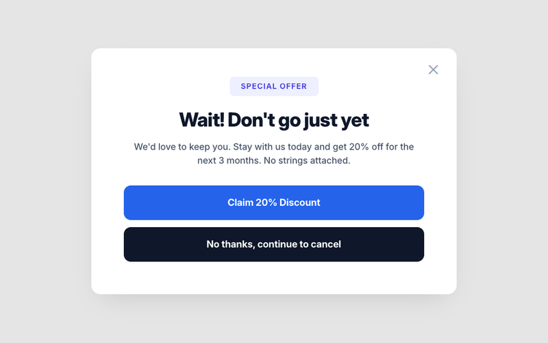
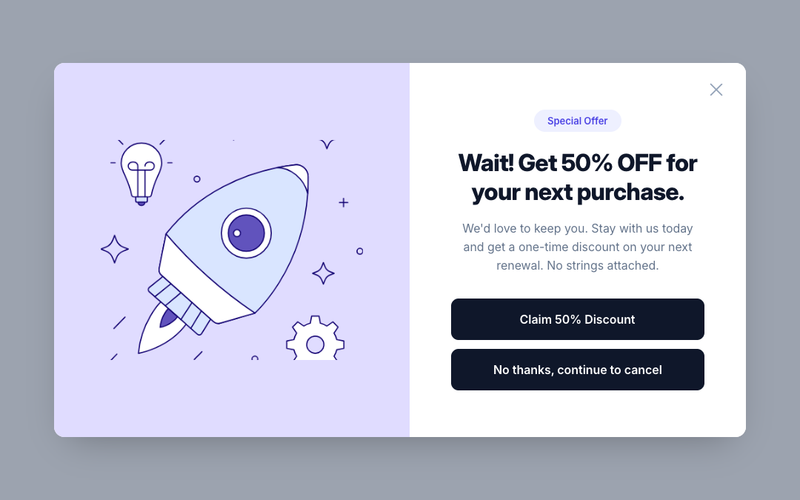
12 Components

Modal Components

12 Webflow native modal components with 1-click copy & paste from a library of 807+. Built for Memberstack integration.

Copy & Paste
100% Free
Native Webflow
Referral Link Box
View Component
Modal

Referral Link Box

The Referral Link Box is a Webflow component designed to encourage users to invite friends by sharing a unique referral link, offering bonuses for successful referrals. Key Features Includes a prominent heading and descriptive text.Interactive elements that copy referral link upon clicking.Customizable styles for branding consistency.Responsive design suitable for various devices.Live preview available at https://invite-friends-link.webflow.io/Design Elements: Modern and clean layout with rounded corners.Color scheme featuring soft blues and whites.Dashed borders for visual separation.Includes icons for enhanced visual appeal.Potential Use Cases: E-commerce websites looking to boost customer referrals.SaaS platforms wanting to incentivize user sign-ups.Affiliate marketing programs to track and reward referrals.Online communities aiming to grow their user base.Mobile apps promoting user sharing features.Conclusion: The Referral Link Box is a versatile and visually appealing component that effectively promotes user engagement through referrals, making it an excellent addition for businesses focused on growth.

Back Blur Signup Modal
View Component
Modal

Back Blur Signup Modal

The Back Blur Signup Modal is a visually appealing component designed for user sign-up, featuring a blurred background effect that enhances focus on the form elements. Key Features Responsive design suitable for various screen sizes Includes fields for email and password input Success and error messages for user feedback Customizable styles and animations Design Elements: Blurred background effect for a modern look Centered layout with ample padding Rounded corners and subtle borders for a polished appearance Potential Use Cases: E-commerce websites looking to enhance user registration SaaS platforms requiring user account creation Event registration pages needing a streamlined sign-up process Membership sites that want to attract new users Conclusion: The Back Blur Signup Modal is a versatile and stylish component that effectively captures user attention while providing a seamless sign-up experience.

Exit Intent Popup
View Component
Modal

Exit Intent Popup

The Exit Intent Popup is designed to engage visitors who are about to leave a website, offering them a discount to encourage them to stay. It features a visually appealing layout with countdown timers and promotional messages. Key Features Engages users with exit intent detection Includes a countdown timer for urgency Customizable design elements Responsive and mobile-friendly Design Elements: Modern and clean layoutColor scheme includes shades of blue and whiteDashed borders for a distinctive lookPotential Use Cases: E-commerce websites looking to reduce cart abandonment SaaS platforms aiming to retain potential subscribers Blogs or content sites wanting to increase newsletter sign-ups Any business that offers discounts or promotions Conclusion: The Exit Intent Popup is a versatile tool for enhancing user engagement and conversion rates, making it an essential component for various online businesses.

Join the waitlist
View Component
AllModal+1

Join the waitlist

The 'Join the waitlist' component offers an engaging way for users to sign up for updates, featuring a dynamic image slider and a sleek dark theme for an immersive experience. Key Features Dynamic image slider for visual engagement Sleek dark theme for modern aesthetics Email capture form with success and error messages Responsive design suitable for various devices Social media icons for sharing Design Elements Dark color palette with contrasting text Crisp typography for readability Rounded corners on buttons and input fields Flexible grid layout for content organization Potential Use Cases Tech startups launching new products Event registration for conferences or webinarsE-commerce sites promoting upcoming sales Non-profit organizations collecting volunteer sign-ups Blogs or content creators building an audience Conclusion: This component is versatile and visually appealing, making it an excellent choice for businesses looking to enhance user engagement and streamline email collection.

Passwordless Login Modal
View Component
ModalLogin+1

Passwordless Login Modal

The Passwordless Login Modal is a user-friendly component designed to facilitate secure logins without the need for traditional passwords. It streamlines the authentication process by sending a code to the user's email for verification. Key Features Email-based authentication for enhanced security Responsive design suitable for various devices Includes a 'Continue with Google' option for convenience Customizable success and error messages Easy integration with existing Webflow projects Design Elements Modern and clean layout with a lightbox modal style Soft color palette with a focus on usability Clear typography for easy readability Interactive elements with hover effects Potential Use Cases E-commerce websites requiring secure user logins SaaS platforms that prioritize user experience and security Membership sites that need to streamline user access Mobile applications looking for quick authentication methods Blogs or content sites that offer exclusive content to registered users Conclusion: The Passwordless Login Modal is a versatile and secure solution for modern web applications, making it an excellent choice for businesses looking to enhance user experience while maintaining security.

Passwordless Signup Modal
View Component
ModalSignup+1

Passwordless Signup Modal

The Passwordless Signup Modal is a user-friendly component designed to facilitate account creation without the need for a password, enhancing security and user experience. It allows users to sign up by entering their email and receiving a verification code. Key Features Passwordless signup process Email verification with a 6-digit code Responsive design suitable for various devices Integration with Google for quick sign-up Customizable success and error messages Design Elements Modern modal design with a clean layout Light and dark color schemes for flexibility Rounded corners and subtle shadows for depth Clear typography for readability Interactive elements with hover effects Potential Use Cases Web applications requiring secure user registrationE-commerce platforms looking to streamline account creation SaaS products aiming to reduce friction in user onboarding Mobile apps needing a quick sign-up process Membership sites that prioritize user security Conclusion: The Passwordless Signup Modal is a versatile and secure solution for modern web applications, making it easier for users to create accounts while maintaining a high level of security.

Profile Modal with Profile Image
View Component
Modal

Profile Modal with Profile Image

This component provides a user-friendly modal for displaying and editing profile information, including a profile image and various user details. Key Features Customizable profile image upload Tabs for easy navigation between profile, email, and password settings Responsive design suitable for various devices Form integration for updating user information Success and error messages for user feedback Design Elements: Modern and clean layout Soft color palette with white backgrounds and subtle borders Rounded corners for buttons and profile image Use of icons for visual appeal Potential Use Cases: Personal websites for freelancers or creativesE-commerce platforms with user accounts Online education platforms for student profiles Social media applications for user management Membership sites requiring user profile management Conclusion: The Profile Modal with Profile Image is a versatile and visually appealing component that enhances user experience by simplifying profile management.

Report Feedback
View Component
AllModal

Report Feedback

A user-friendly component designed for reporting feedback, featuring sections for feature requests, bug reports, and user experience submissions with clear forms. Key Features Simple and accessible user interface Dedicated sections for feature requests and bug reports Clear submission forms for user feedback Responsive design for various devices Includes success and error messages for form submissions Design Elements Clean and modern layout Soft color palette with white backgrounds and dark grey text Rounded corners and shadow effects for form elements Interactive tabs for organizing feedback types Potential Use Cases Software applications seeking user feedback Websites wanting to improve user experience through suggestions Companies looking to gather bug reports from users Startups needing a simple feedback mechanismE-commerce platforms wanting to enhance customer service Conclusion: The Report Feedback component is versatile and essential for any business looking to engage users and improve their services through structured feedback.

Simple Login Modal
View Component
ModalLogin

Simple Login Modal

The Simple Login Modal is a user-friendly component designed to facilitate user authentication through a clean and intuitive interface. It includes fields for email and password, as well as options for social login. Key Features Responsive design for mobile and desktop Includes fields for email and password input Social login option with Google integration Error and success messages for user feedback Customizable styles and animations Design Elements Modern and minimalistic layoutSoft color palette with a focus on usabilityClear typography for readabilityInteractive elements with hover effects Potential Use Cases E-commerce websites requiring user accounts Membership sites needing secure logins Web applications with user-specific features Blogs or content sites with subscriber-only content SaaS platforms offering user dashboards Conclusion: The Simple Login Modal is a versatile and essential component for any website or application that requires user authentication, providing a seamless experience for users.

Simple Signup Modal
View Component
ModalSignup

Simple Signup Modal

The Simple Signup Modal is a user-friendly component designed to facilitate user registration through a clean and interactive interface. It includes essential fields for email and password, along with options for social sign-in. Key Features Responsive design suitable for various devices Includes fields for email and password input Social sign-in option with Google Success and error messages for user feedback Customizable styles and animations Design Elements: Modern and minimalistic layout Soft color palette with a focus on usability Clear typography for headings and labels Interactive elements with hover effects Potential Use Cases: Web applications requiring user registrationE-commerce sites needing customer accounts Membership platforms for exclusive content access Event registration pages SaaS products looking to onboard users easily Conclusion: The Simple Signup Modal is a versatile and visually appealing component that enhances user experience during the registration process, making it an excellent choice for various online platforms.

Small Upgrade Modal
View Component
ModalPaywall+1

Small Upgrade Modal

The Small Upgrade Modal is a user-friendly component designed to prompt users to upgrade to a premium version of a service or product. It features a clean layout with interactive elements to enhance user engagement. Key Features Responsive design suitable for various screen sizes Includes an upgrade button with a clear pricing indication Grid layout for displaying features and benefits Easy integration with existing Webflow projects Design Elements: Lightbox modal style with a semi-transparent background Rounded corners and shadow effects for a modern look Color scheme featuring shades of blue and white for a clean aesthetic Flexbox layout for alignment and spacing of elements Potential Use Cases: SaaS companies looking to promote premium subscriptionsE-commerce websites offering upgraded product features Online services wanting to encourage users to upgrade their plans Mobile applications needing a simple upgrade prompt Membership sites aiming to convert free users to paid members Conclusion: The Small Upgrade Modal is a versatile and visually appealing component that effectively encourages users to consider upgrading, making it a valuable addition to any Webflow project.

Upgrade To Premium Modal
View Component
Modal

Upgrade To Premium Modal

The Upgrade To Premium Modal is designed to prompt users to upgrade their accounts for premium features, enhancing user engagement and conversion rates. Key Features Interactive modal with clear call-to-action buttons Includes icons for visual appeal Responsive design suitable for various screen sizes Customizable content and styles Supports external links for further actions Design Elements: Modern and clean layoutSoft color palette with contrasting buttonsFlexible grid layout for content organizationPotential Use Cases: SaaS platforms looking to convert free users to paid plansE-commerce sites promoting premium membership benefits Online services offering exclusive features for subscribers Educational platforms encouraging upgrades for additional resources Mobile applications needing in-app purchase prompts Conclusion: The Upgrade To Premium Modal is a versatile component that effectively encourages users to consider premium options, making it an essential tool for businesses aiming to increase their subscription rates.

Showing 1–12 of 12 componentstagged with Modal

No website yet? Check out our free & paid pre-built template websites!

View templates