5 Components

Pre-built Modals Components

5 Webflow native pre-built modals components with 1-click copy & paste from a library of 807+. Built for Memberstack integration.

Copy & Paste
100% Free
Native Webflow
2 Tier Upgrade Modal
View Component
Pre-built ModalsUpgrade

2 Tier Upgrade Modal

The 2 Tier Upgrade Modal is designed to prompt users to upgrade their subscription plans with a visually appealing interface. It features a two-tab layout for monthly and annual pricing options. Key Features Two pricing tiers: Monthly and Annual Interactive tabs for easy navigation Customizable modal design Includes icons for visual appeal Responsive design suitable for various devices User-friendly upgrade prompts Design Elements: Modern and clean layout Soft color palette with a transparent background Rounded corners and subtle shadows for depth Clear typography for readabilityicons integrated for enhanced visual communication Potential Use Cases: SaaS companies looking to encourage subscription upgradesE-commerce platforms offering premium memberships Online services with tiered pricing models Mobile applications needing in-app upgrade prompts Websites aiming to enhance user engagement through subscription offers Conclusion: The 2 Tier Upgrade Modal is a versatile and visually appealing component that effectively encourages users to upgrade their plans, making it a valuable addition for any subscription-based service.

Dropdown Form UI
View Component
CheckboxPre-built Modals

Dropdown Form UI

The Dropdown Form UI is a sleek and user-friendly component designed to enhance website interactivity by allowing users to submit forms through a dropdown interface. It is easily cloneable and integrates seamlessly into existing Webflow projects. Key Features Cloneable and easy to integrate Built with Client-First methodology Includes various input types: text fields, text areas, checkboxes, and radio buttons Responsive design suitable for various devices Success and error messages for user feedback Design Elements Modern and clean visual style Color scheme primarily featuring white backgrounds with blue accents Rounded corners and subtle shadows for depth Consistent padding and spacing for a polished look Potential Use Cases Contact forms for businessesFeedback collection for websitesEvent registration formsNewsletter sign-up formsUser surveys and polls Conclusion: The Dropdown Form UI is a versatile and visually appealing component that can significantly improve user experience on any website, making it an excellent choice for various applications.

Join the waitlist
View Component
AllModal+1

Join the waitlist

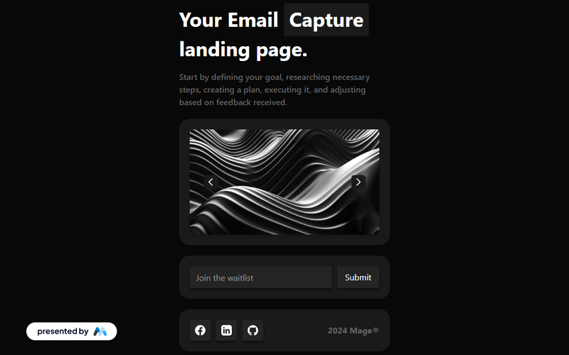
The 'Join the waitlist' component offers an engaging way for users to sign up for updates, featuring a dynamic image slider and a sleek dark theme for an immersive experience. Key Features Dynamic image slider for visual engagement Sleek dark theme for modern aesthetics Email capture form with success and error messages Responsive design suitable for various devices Social media icons for sharing Design Elements Dark color palette with contrasting text Crisp typography for readability Rounded corners on buttons and input fields Flexible grid layout for content organization Potential Use Cases Tech startups launching new products Event registration for conferences or webinarsE-commerce sites promoting upcoming sales Non-profit organizations collecting volunteer sign-ups Blogs or content creators building an audience Conclusion: This component is versatile and visually appealing, making it an excellent choice for businesses looking to enhance user engagement and streamline email collection.

Profile Modal
View Component
ProfilePre-built Modals

Profile Modal

The Profile Modal is a versatile Webflow component designed for user profile management, allowing users to view and edit their personal information seamlessly. Key Features Responsive design for mobile and desktop Tabs for easy navigation between profile sections Form elements for updating user details Social media login options Success and error messages for form submissions Design Elements: Modern and clean layout Use of icons for visual clarity Flexible grid system for content arrangement Soft color palette with a focus on usability Potential Use Cases: User account management for e-commerce websites Profile settings for social media platforms Membership sites requiring user data updates Online learning platforms for course management Subscription services needing user information updates Conclusion: The Profile Modal is a highly functional and visually appealing component that enhances user experience by simplifying profile management tasks.

Satisfaction Survey Modal
View Component
Pre-built ModalsAll

Satisfaction Survey Modal

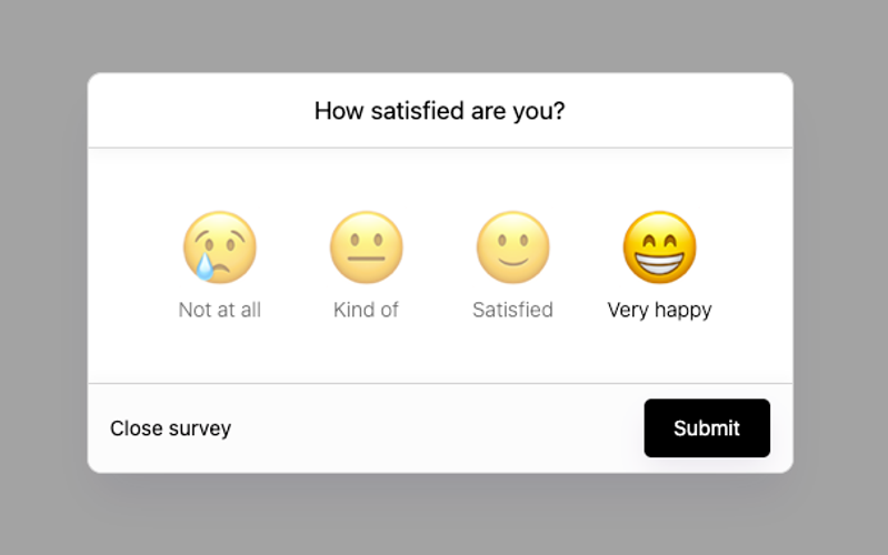
The Satisfaction Survey Modal is an interactive component designed to collect user feedback through a simple and engaging survey format. It features a user-friendly interface with radio buttons for satisfaction ratings. Key Features Responsive design for various screen sizes Includes radio buttons for satisfaction ratings (1-4)Customizable success and error messages Submit button with a loading state Easy integration into existing Webflow projects Design Elements Modern modal layout with a semi-transparent background Use of emojis to represent satisfaction levels Clean and minimalistic design with rounded corners Soft color palette with contrasting text for readability Potential Use Cases E-commerce websites seeking customer feedback on products Service-based businesses wanting to gauge client satisfaction Event organizers collecting attendee feedback post-event SaaS platforms assessing user experience and satisfaction Educational institutions gathering student feedback on courses Conclusion: The Satisfaction Survey Modal is a versatile and visually appealing component that can enhance user engagement and provide valuable insights for businesses across various industries.

Showing 15 of 5 componentstagged with Pre-built Modals

No website yet? Check out our free & paid pre-built template websites!

View templates