Error and Success Boxes
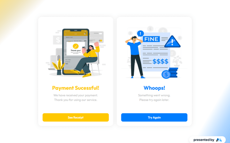
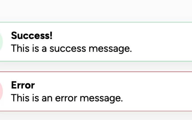
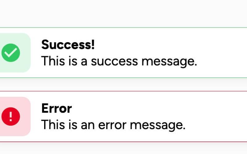
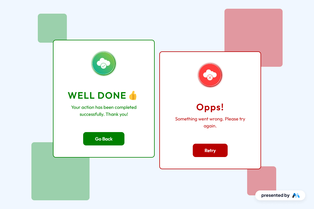
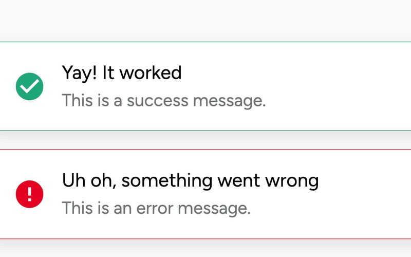
The Error and Success Boxes component provides a visually appealing way to display feedback messages to users, indicating success or error states in a web application. Key Features Customizable success and error messages Includes icons for visual representation Responsive design suitable for various screen sizes Fixed position for consistent visibility Easy to integrate with forms and user interactions Design Elements Clean and modern aesthetic Color-coded borders for success (green) and error (red) messages Rounded corners and shadow effects for depth Flexbox layout for easy alignment of content Potential Use Cases Web applications requiring user feedback on form submissionsE-commerce sites to confirm order success or notify of errors Content management systems for alerting users of status changes Customer support portals for displaying ticket status updates Conclusion: The Error and Success Boxes component is versatile and user-friendly, making it an essential tool for enhancing user experience through clear feedback mechanisms.