9 Components

Error / Success Components

9 Webflow native error / success components with 1-click copy & paste from a library of 807+. Built for Memberstack integration.

Copy & Paste
100% Free
Native Webflow
Confirmation Error Status Card
View Component
Error / Success

Confirmation Error Status Card

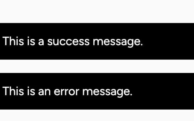
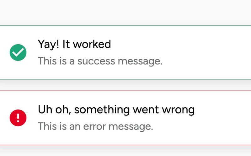
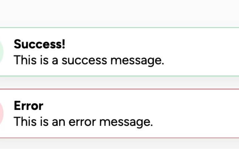
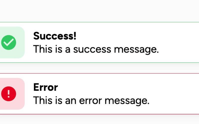
The Confirmation Error Status Card is a Webflow component designed to provide feedback to users regarding the status of their payment transactions. It features two distinct states: a successful payment confirmation and an error notification, allowing users to understand the outcome of their actions clearly. Key Features Two states: Successful payment confirmation with a message and a link to view the receipt.Error notification with a message prompting the user to try again.Responsive design that adjusts to various screen sizes.Includes visually distinct elements such as images and buttons to enhance user interaction. Design Elements Utilizes a grid layout for organizing content effectively, enhancing readability.Incorporates a color scheme that differentiates between success (green) and error (red) states.Features rounded corners and shadow effects for a modern card appearance.Text elements are styled for clarity and emphasis, using varying font sizes. Potential Use Cases E-commerce websites to confirm payment transactions.Subscription services to notify users of payment status.Online booking platforms to inform users about their transaction outcomes.Financial applications to display transaction confirmations or errors. Conclusion: The Confirmation Error Status Card is a practical component for any application that requires user feedback on payment transactions, making it a valuable addition to various web projects.

Dark Toast Messages
View Component
Error / Success

Dark Toast Messages

Dark Toast Messages is a notification component designed to display success and error messages in a visually appealing manner. It features a clean, dark design that enhances readability and user engagement. Key Features Displays success and error messages Customizable close button for user interaction Responsive design suitable for various screen sizes Fixed position for visibility across the page Includes icons for visual representation of message types Design Elements: Dark background with white text for high contrast Rounded corners for a modern look Flexbox layout for easy alignment of content and icons Icons for success and error messages Potential Use Cases: Web applications needing user feedback on actionsE-commerce sites for transaction notifications Content management systems for alerting users SaaS platforms for system status updates Blogs or news sites for alerting readers to important updates Conclusion: Dark Toast Messages is a versatile and visually appealing component that effectively communicates important information to users, making it an excellent addition to any web project.

Error and Success Boxes
View Component
Error / Success

Error and Success Boxes

The Error and Success Boxes component provides a visually appealing way to display feedback messages to users, indicating success or error states in a web application. Key Features Customizable success and error messages Includes icons for visual representation Responsive design suitable for various screen sizes Fixed position for consistent visibility Easy to integrate with forms and user interactions Design Elements Clean and modern aesthetic Color-coded borders for success (green) and error (red) messages Rounded corners and shadow effects for depth Flexbox layout for easy alignment of content Potential Use Cases Web applications requiring user feedback on form submissionsE-commerce sites to confirm order success or notify of errors Content management systems for alerting users of status changes Customer support portals for displaying ticket status updates Conclusion: The Error and Success Boxes component is versatile and user-friendly, making it an essential tool for enhancing user experience through clear feedback mechanisms.

Payment Status Card
View Component
Error / Success

Payment Status Card

The Payment Status Card is designed to inform users about the status of their payment transactions. It provides clear feedback on whether a payment was successful or failed, along with actionable buttons for users to retry or continue. This component is a free resource for Webflow developers to use in their projects. Key Features Displays payment status messages such as 'Successful payment' and 'Payment failed'.Includes buttons for user actions like 'Try again' and 'Continue'.Utilizes responsive design principles to ensure proper display on various devices. Design Elements Incorporates a clean layout with a focus on user feedback.Uses a color scheme that highlights success (green) and failure (red) states.Features images that enhance the visual appeal and context of the payment status. Potential Use Cases E-commerce websites to inform customers about their payment status.Subscription services to notify users of payment issues.Online marketplaces to provide transaction feedback to buyers and sellers. Conclusion: The Payment Status Card is an effective component for enhancing user experience during payment processes, providing essential feedback and options for further action.

Rounded Error & Success
View Component
Error / Success

Rounded Error & Success

The Rounded Error & Success component is designed to display success and error messages in a visually appealing manner, featuring rounded edges and distinct icons for each message type. Key Features Displays success and error messagesRounded design for a modern lookIncludes customizable iconsEasy to integrate with existing Webflow projects Design Elements Rounded corners for a softer appearance Color-coded messages: green for success and red for error Shadow effects for depth Responsive design suitable for various screen sizes Potential Use Cases Web applications needing user feedbackE-commerce sites for order confirmations or errors Forms that require validation messages Dashboard notifications for system alerts Conclusion: The Rounded Error & Success component is a versatile tool for enhancing user experience by providing clear and visually distinct feedback messages, making it suitable for a wide range of applications.

Success & Error Messages
View Component
Error / Success

Success & Error Messages

This component is designed to display success and error messages in a visually appealing manner, enhancing user feedback during interactions. It includes customizable icons and close buttons for user convenience. Key Features Displays both success and error messages Includes customizable icons for visual clarity Close button functionality for user interaction Responsive design suitable for various screen sizes Design Elements Fixed position for prominent visibility Color-coded messages: green for success, red for error Rounded corners and shadow effects for a modern look Flexbox layout for alignment of icons and text Potential Use Cases E-commerce websites for transaction notifications Form submissions on service-based websites User account management systems for feedback on actions Web applications requiring real-time user notifications Conclusion: The Success & Error Messages component is versatile and essential for improving user experience by providing clear feedback, making it suitable for a wide range of applications.

Success & Failure Board
View Component
Error / Success

Success & Failure Board

The Success & Failure Board is a Webflow component designed to visually represent outcomes of actions, showcasing success messages and failure notifications. It features a clean layout with distinct sections for positive and negative feedback, making it suitable for applications that require user interaction feedback. Key Features Two distinct sections for success and failure messages, each with its own styling.Responsive design that adjusts to various screen sizes, ensuring accessibility on mobile devices.Customizable text and images for each message, allowing users to personalize the component.Includes buttons for user actions, such as 'Go Back' and 'Retry', enhancing user engagement. Design Elements Utilizes a grid layout for organizing content, providing a structured appearance.Color-coded sections: green for success messages and red for failure notifications, aiding in quick visual recognition.Incorporates icons alongside text to enhance message clarity and visual interest.Employs a minimalistic design with ample white space, focusing user attention on the messages. Potential Use Cases E-commerce websites to inform users about order statuses.Web applications that require user input, providing feedback on form submissions.Customer support portals to communicate ticket resolutions or errors.Educational platforms to notify students of assignment submissions and results. Conclusion: The Success & Failure Board component is a practical solution for any web application needing to communicate user feedback effectively, with a clear design that enhances user experience.

Toast Notifications
View Component
Error / Success

Toast Notifications

Toast Notifications provide customizable success and error messages that can be integrated with Memberstack 2.0, allowing users to override default messages for a more personalized experience. Key Features Customizable success and error messages Integration with Memberstack 2.0Override default notifications Responsive design suitable for various screen sizes Design Elements Fixed position notifications Color-coded borders for success (green) and error (red) messages Rounded corners and shadow effects for a modern look Icons accompanying messages for visual clarity Potential Use Cases E-commerce websites for transaction confirmations Membership platforms for user actions feedback SaaS applications for alerting users about system statuses Event registration sites for success/error notifications Portfolio websites to showcase project submission results Conclusion: Toast Notifications are a versatile and visually appealing solution for providing immediate feedback to users, enhancing the overall user experience on any web platform.

Vibrant Status Cards
View Component
Error / Success

Vibrant Status Cards

Vibrant Status Cards display success and error states with simple, intuitive icons and clear action buttons. The green card signals success, while the red card alerts the user to retry. Key Features Customizable buttonsResponsive design suitable for various devicesEasy integration into existing Webflow projectsDesign Elements: Modern and clean visual styleVibrant color paletteRounded corners and subtle shadows for depthClear typographyPotential Use Cases: Surveys and feedback forms for businesses Event registration forms Interactive quizzes and assessments User preference settings in web applications Conclusion: Vibrant Status Cards is a highly adaptable component that enhances interactivity, making it an excellent choice for a variety of applications across different industries. ‍

Showing 19 of 9 componentstagged with Error / Success

No website yet? Check out our free & paid pre-built template websites!

View templates