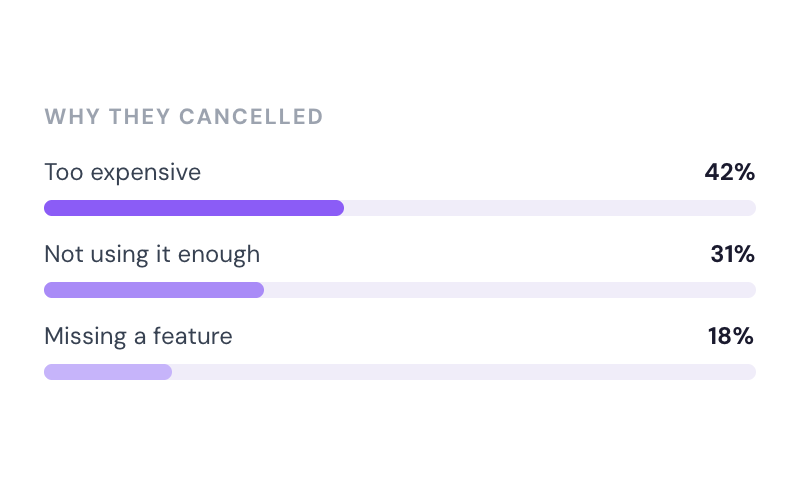
Cancellation Insights
Collection cancellation reasons from customers via Stripe's pre-built UI.
Break long forms into 2-3 steps. Members face 3 fields at a time instead of 10 all at once. Same information collected, but completion rates improve dramatically because the brain processes manageable chunks better than overwhelming lists.
Used by 50,000+ teams • Works on all devices • No code required
Typical completion:
650 out of 1,000 visitors abandon
Typical completion:
580 out of 1,000 visitors complete
Same 10 fields. Same information collected. Different presentation.
Result: 230 additional signups (66% improvement) just by breaking into manageable steps.
Check out this 2-minute video explaining how to set up a custom onboarding form and links to copy or clone an existing onboarding form which you can drop into your Webflow site.
Before you start
If you haven't set up a standard profile form, we recommend doing that first. The multi-step flow builds on your existing form configuration.
Multi-step forms don't just increase completion rates. They improve data quality, optimize mobile conversion, and create better member experiences. Here's what changes when you break long forms into manageable steps.
More visitors become members when you break long forms into manageable steps.
Multi-step reduces fake signups and improves profile completion — not just more signups, but better ones.
Break down the onboarding process into smaller, more manageable steps leading to higher completion rates and lower user frustration.
Collect more data without overwhelming customers. Easily highlight your form's important parts and keep customers engaged.
The expansion benefit: Members tolerate more questions when broken into steps. Same data, better experience.
Everything you need to know about Memberstack. Can't find what you're looking for? Reach out to our team.
No. More FIELDS frustrate users. More STEPS with fewer fields each reduce frustration. The counterintuitive truth: A single 10-field form averages 35% completion, while a 3-step form (3, 4, 3 fields) averages 60% completion. Seeing 10 fields triggers decision paralysis. Seeing 3 fields feels manageable. The progress bar provides dopamine with each completed step.
3 steps for most use cases. The data shows: 2 steps achieve 54% completion, 3 steps achieve 62% completion (optimal), 4 steps drop to 53% completion, and 5+ steps fall to 44% completion. Why 3 wins: It's enough to break up cognitive load, not so many that transitions frustrate, and provides clear progression (33% → 67% → 100%).
Yes, and you should. Set up Version A (single-step form with all fields) and Version B (multi-step form with 3 steps), then split traffic 50/50. Measure completion rate as your primary metric, plus mobile vs desktop completion and time to complete. Expected results: single-step achieves 32-38% completion while multi-step achieves 56-64% completion — a 1.7-2x improvement. Run the test for minimum 1,000 visitors or 2 weeks.
Yes, multi-step works BETTER on mobile. Single-step mobile forms achieve only 19-26% completion (terrible), while multi-step mobile forms achieve 58-67% completion (great). Why mobile benefits most: Small screens trigger overwhelm faster, each step fits on screen without scrolling, the progress bar is always visible, and there's less typing per screen. Mobile optimization tips: Maximum 3 fields per mobile step, large tap targets (44px minimum), auto-focus first field, and full-width continue button.
Don't include a visible back button, but allow browser back. Why no visible back button: It reduces forward momentum and completion drops 12% with a visible option. But allowing browser back means users who need it can use their browser, and you should save form data so they don't lose progress. Best approach: No visible 'Back' button on steps 1-2, then on the final step add a 'Need to change something?' link. This preserves forward momentum without punishing corrections.
Yes, be strategic about which steps are required. Recommended approach: Step 1 should be all required (email, password, name), Step 2 should be a mix (some required, some optional), and Step 3 should be mostly optional (preferences, personalization). The data: When all steps are required, you get 35% completion. When Step 1 is required but Steps 2-3 are optional, you get 71% completion — and of those, 64% complete the optional fields anyway because they're engaged. Rule: Only require what you truly can't proceed without.
Join the Memberstack community Slack and ask away! Expect a prompt reply from a team member, a Memberstack expert, or a fellow community member.
Join our SlackHow do I restrict content to specific membership plans?
Use the data-ms-content attribute! Set data-ms-content="!plan-id" on any element to show/hide based on plan access.
Just launched my membership site with Memberstack — hit 100 paying members in the first week! 🎉
Quick question — can I customize the login modal styling?
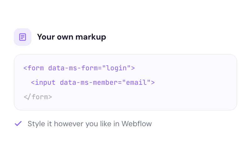
Absolutely! You can use custom CSS or build your own forms with our JavaScript SDK for full control.
The Stripe integration is seamless. Webhooks sync automatically and I didn't have to write any backend code.
This community is incredible. Got my question answered in under 5 minutes!



Join 50,000+ teams using Memberstack Multi-Step Onboarding to increase form completion, collect rich member data, and turn visitors into engaged members — all by breaking long forms into psychology-backed steps.