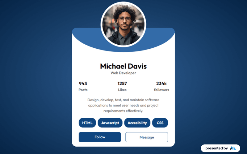
Blue Theme Public Profile
The Blue Theme Public Profile component features a page with a clean, modern design; features user details, posts, likes, followers, and options to follow or message. Key Features Blue-themed design for modern aestheticsResponsive layout suitable for various devicesCustomizable fields for user informationDesign Elements: Sleek, modern typography Rounded corners and soft shadows for depth Vibrant accent colors for buttons and links High-quality images with a focus on user profiles Potential Use Cases: Personal branding websites for freelancers Professional networking platforms Social media profiles for influencers Corporate team member profiles Conclusion: The Blue Theme Profile component is versatile and visually appealing, making it an excellent choice for anyone looking to create a modern online presence.