Back
Profile Dropdown

Component Description(Generated by AI)

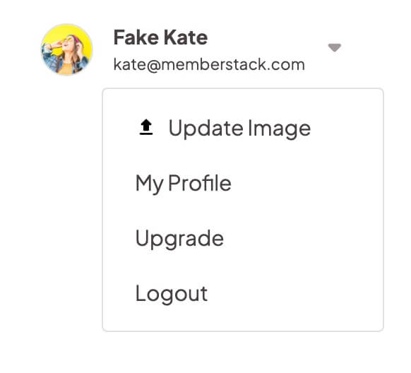
The Profile Dropdown is a navbar-ready component designed to provide users with quick access to their profile options in a sleek and organized manner.

Key Features

  • Dropdown menu for user profile options
  • Includes profile image, name, and email display
  • Links for updating profile, billing, and logout
  • Responsive design suitable for various screen sizes

Design Elements

  • Minimalistic and modern visual styleSoft color palette with a white backgroundCircular profile image with a borderHover effects for dropdown links

Potential Use Cases

  • Web applications with user accountsE-commerce platforms for customer account management
  • Social media websites for user profile access
  • Content management systems for user settings

Conclusion: The Profile Dropdown is a versatile and user-friendly component that enhances navigation and user experience, making it ideal for any web application requiring user account management.

Related Components

More components you might find useful

Unstyled Profile Form
View Component
ProfileUnstyled

Unstyled Profile Form

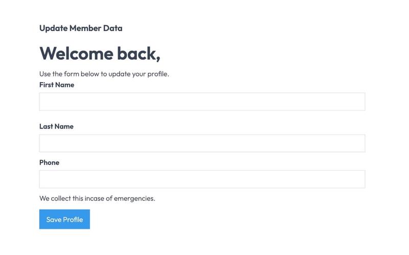
The Unstyled Profile Form is a simple and functional form designed for users to update their profile information. It includes fields for first name, last name, and phone number, along with success and error messages. Key Features Customizable fields for first name, last name, and phone number Success message upon successful submission Error message for submission failures Lightweight and easy to integrate into existing designs Design Elements Minimalist design with no predefined stylesFlexbox layout for form elementsResponsive design suitable for various screen sizes Potential Use Cases User profile management for web applications Membership sites requiring user information updatesE-commerce platforms for customer account management Community forums for user profile editing Conclusion: The Unstyled Profile Form offers a straightforward solution for user profile updates, making it versatile for various applications while allowing for easy customization to fit different design aesthetics.

Styled Mega Nav – Product Menu
View Component
NavbarsMarketing UI

Styled Mega Nav – Product Menu

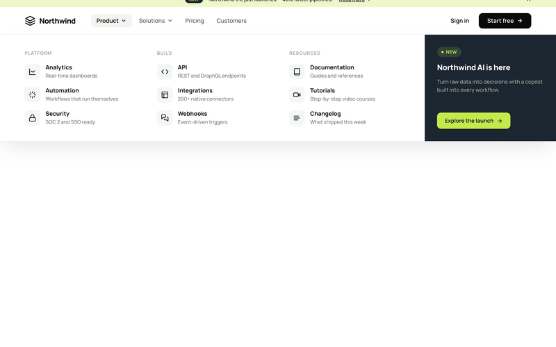
The Styled Mega Nav – Product Menu component provides a production-ready mega navigation bar with a full-width dropdown panel organized into three icon-led link columns. It pairs a dark featured promo panel (with badge and CTA) alongside categorized link groups for Platform, Build, and Resources. The navbar includes an announcement bar with a dismissible banner, a left-heavy layout with dropdown chevrons, and a compact mobile state. This component is a free resource for Webflow developers building SaaS, membership, or product sites. Key Features Three-column icon-led link grid with titles and descriptions per link row. Dark featured promo panel with "NEW" status badge and accent CTA button. Announcement bar with inline link, badge pill, and close icon. Left-heavy navbar layout with logo and nav links clustered together, CTA isolated right. Dropdown chevron indicators on trigger nav items with active pill state. Mobile-responsive hamburger menu state. Potential Use Cases SaaS platforms with multiple product areas needing organized navigation. Membership sites with documentation, tutorials, and resource sections. Product-led companies requiring a featured launch or announcement in the nav. Marketing sites that need an announcement banner above the navigation.

Styled Platform Nav – Mega Menu with CTA Card
View Component
NavbarsMarketing UI

Styled Platform Nav – Mega Menu with CTA Card

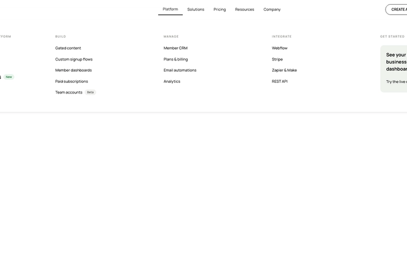
The Styled Platform Nav – Mega Menu with CTA Card component is a production-ready SaaS navigation bar with a five-column mega menu dropdown. The Platform dropdown organizes links into four categorized columns (The membership platform, Build, Manage, Integrate) plus a dark CTA card column with a live demo prompt. The navbar includes standard nav links (Solutions, Pricing, Resources, Company), member-aware auth buttons (Create account, Log in), a cart icon, and a Lottie-animated hamburger menu for mobile. Memberstack visibility attributes control auth button display based on login state. Key Features Five-column mega menu dropdown under the Platform nav item: Lead column: "The membership platform" with primary pages (About, How it works, Member portals) and a "New" badge. Build column: feature pages (Gated content, Custom signup flows, Member dashboards, Paid subscriptions, Team accounts) with a "Beta" badge. Manage column: operational pages (Member CRM, Plans & billing, Email automations, Analytics). Integrate column: integration pages (Webflow, Stripe, Zapier & Make, REST API). CTA column: dark card with headline ("See your membership business in one dashboard"), action label ("Try the live demo"), and arrow icon. Text-based logo ("stackly") on the left for brand-first hierarchy. Standard nav links (Solutions, Pricing, Resources, Company) alongside the mega dropdown. Right-side button group with Create account and Log in buttons, plus a cart icon with SVG. Memberstack data-ms-content="!members" attributes on auth buttons for conditional visibility. Lottie-animated hamburger icon with JSON-driven three-line animation for mobile. Mobile menu includes full-height nav with stacked links and dual CTA buttons. Potential Use Cases SaaS platforms with multiple product areas, integrations, and management features. Membership platforms built on Webflow + Memberstack needing organized feature navigation. Product-led companies with build, manage, and integrate sections in their information architecture. Marketplace or e-commerce membership sites needing a cart icon alongside auth controls. Any platform site that needs a mega menu with a promotional CTA card built into the dropdown.
Black And White Navbar
View Component
Navbars

Black And White Navbar

The Black And White Navbar is a sleek and modern navigation component designed for websites seeking a minimalist aesthetic. It features a sticky position and a clean layout that enhances user experience. Key Features Sticky positioning for consistent visibility Customizable links for easy navigation Includes a brand logo area Responsive design suitable for various screen sizes Animation effects for menu interactions Design Elements Monochrome color scheme with black and white Flexbox layout for alignment and spacing Rounded button styles for a modern touch Simple and clean typography Potential Use Cases Corporate websites looking for a professional look Personal portfolios that emphasize simplicityE-commerce sites needing straightforward navigation Blogs that prioritize content readability Landing pages for marketing campaigns Conclusion: The Black And White Navbar is a versatile and stylish component that can enhance the usability and aesthetic of various types of websites, making it an excellent choice for designers and developers alike.