Input with Shared Borders

Back

Component Description(Generated by AI)

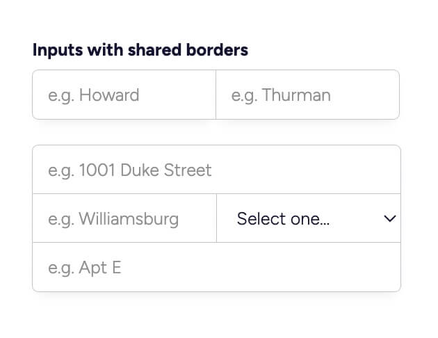
This component features a set of input fields designed with shared borders, providing a cohesive and modern look for forms. It is ideal for enhancing user experience in data entry scenarios.

Key Features

  • Includes multiple input fields with shared borders for a unified appearance.Responsive design that adapts to various screen sizes.Customizable placeholders and labels for each input.Supports various input types including text and select dropdowns.Easy integration into existing Webflow projects.

Design Elements

  • Minimalist style with a clean white background.Soft rounded corners for a modern aesthetic.Subtle box shadow for depth and emphasis.Color scheme primarily using shades of blue and gray.

Potential Use Cases

  • Contact forms for businesses and service providers.Registration forms for events or memberships.Surveys and feedback forms for customer insights.E-commerce checkout forms to streamline user input.Lead generation forms for marketing campaigns.

Conclusion: The Input with Shared Borders component is a versatile and visually appealing solution for any form-related needs, making it a valuable addition to any Webflow project.

Related Components

More components you might find useful

Unstyled Profile Form
View Component
ProfileUnstyled

Unstyled Profile Form

The Unstyled Profile Form is a simple and functional form designed for users to update their profile information. It includes fields for first name, last name, and phone number, along with success and error messages. Key Features Customizable fields for first name, last name, and phone number Success message upon successful submission Error message for submission failures Lightweight and easy to integrate into existing designs Design Elements Minimalist design with no predefined stylesFlexbox layout for form elementsResponsive design suitable for various screen sizes Potential Use Cases User profile management for web applications Membership sites requiring user information updatesE-commerce platforms for customer account management Community forums for user profile editing Conclusion: The Unstyled Profile Form offers a straightforward solution for user profile updates, making it versatile for various applications while allowing for easy customization to fit different design aesthetics.
Autocomplete Address Form
View Component
Input

Autocomplete Address Form

The Autocomplete Address Form is a user-friendly form component designed to streamline the process of entering address details by providing autocomplete suggestions. It enhances user experience by reducing input errors and speeding up form completion. Key Features Includes fields for Address, ZIP Code, City, Region, and Country.Provides success and error messages upon form submission.Responsive design suitable for various devices.Customizable input fields with placeholder options.Live preview available for testing. Design Elements Clean and modern layout with a flexible form structure.Utilizes a light color scheme with subtle borders and shadows.Labels are clearly defined with a margin for better readability.Input fields are styled with rounded corners and focus effects. Potential Use Cases E-commerce websites requiring shipping address collection.Real estate platforms for property inquiries.Event registration forms needing attendee address details.Subscription services that require user address verification.Contact forms for businesses that need location information. Conclusion: The Autocomplete Address Form is a versatile and efficient solution for any website needing address input, enhancing user experience while ensuring accurate data collection.

Increase & Decrease Select Value
View Component
Input

Increase & Decrease Select Value

This component allows users to easily increase or decrease a selected value from a dropdown menu using intuitive buttons. It enhances user experience by providing a visual and interactive way to select options. Key Features Interactive buttons to increase or decrease selection Responsive design suitable for various devices Includes success and error messages for form submissions Design Elements: Flexbox layout for alignment and spacing Rounded borders with a solid color scheme Custom styles for select dropdown and buttons Minimalistic design with clear visual cues Potential Use Cases: E-commerce websites for quantity selection Survey forms requiring numerical input Booking systems for selecting dates or times Educational platforms for quiz or test responses Conclusion: The Increase & Decrease Select Value component is a versatile tool that enhances user interaction on forms, making it ideal for various applications across different industries.

Distinct File Uploader
View Component
Input

Distinct File Uploader

The Distinct File Uploader is a Webflow component designed to facilitate the uploading of various file types, particularly images, by users. It features a user-friendly interface that allows for easy file selection and submission, making it suitable for websites that require user-generated content. Key Features Supports multiple file formats including png, jpeg, svg, webp, and heic.Includes a form for user submissions with success and error messages.Responsive design that adapts to different screen sizes.Customizable styles for a unique look and feel. Design Elements Utilizes a clean layout with a focus on usability and accessibility.Incorporates a dashed border around the upload area to indicate interactivity.Employs a centered alignment for content, enhancing visual balance.Features a modern color scheme with contrasting text for readability. Potential Use Cases Photography websites where users can upload and sell their images.Creative portfolios that allow artists to share their work.E-commerce platforms that accept user-generated content.Community-driven sites that encourage user submissions. Conclusion: The Distinct File Uploader is a practical component for any Webflow project that requires file uploads, offering flexibility and ease of use for both developers and end-users.