Split Screen Onboarding
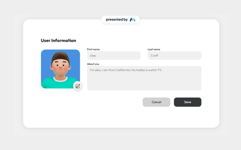
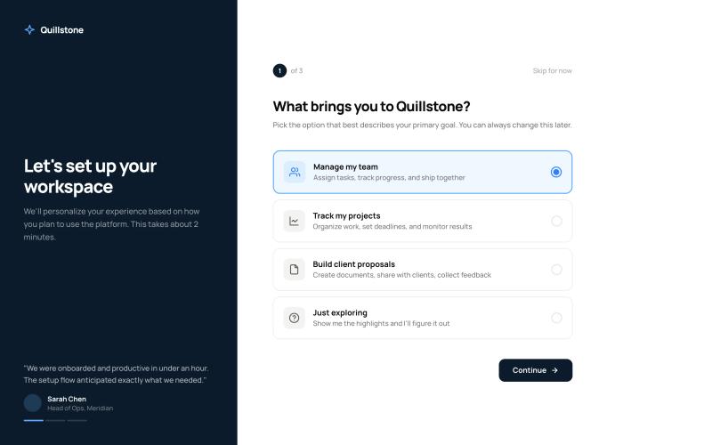
The Styled Onboarding – Split Screen Flow component is a 3-step onboarding experience using a split-screen layout. The left panel features brand messaging with rotating testimonials and progress dots that update across steps. The right panel contains the form content — goal selection, workspace setup, and profile completion. Each step is designed as a separate Webflow form that submits and redirects to the next step via URL hash, making it fully compatible with Webflow's native form handling and Memberstack custom fields. Key Features Step 1: Goal selection with four radio card options (Manage team, Track projects, Build proposals, Just exploring), each with icon tile, title, and description. Step 2: Workspace name text input, role dropdown selector, and team size pill buttons (Just me, 2–10, 11–50, 51–200, 200+). Step 3: Profile completion with circular avatar upload area, first/last name fields, company input, and short bio textarea with character counter. Left branded panel with rotating testimonials, author attribution, and step-synced progress dots. Back navigation on steps 2 and 3, "Skip for now" option on every step. Final step CTA changes from dark "Continue" to accent-colored "Launch workspace" to signal completion. Potential Use Cases Membership platforms requiring new member goal setting and personalization. SaaS products with workspace setup flows after registration. Client portals needing profile completion during onboarding. Course platforms collecting learner preferences before content delivery. Any Memberstack-powered site needing multi-step post-signup data collection.