Navbars With Social Links

Back

Component Description(Generated by AI)

This component features two navbars designed for both logged-in and logged-out members, providing easy access to social links and navigation options.

Key Features

  • Two distinct navbars for different user states (logged in and logged out)Includes social media links
  • Responsive design suitable for various screen sizes
  • Customizable links and icons
  • Easy integration with Memberstack for user management
  • Design Elements:
  • Clean and modern layout
  • Grid-based structure for social links
  • Flexible color scheme with options for branding
  • Hover effects for interactive elements
  • Use of icons
  • Potential Use Cases:
  • Membership websites requiring user authenticationE-commerce platforms with user accounts
  • Community forums or social networks
  • Blogs or content sites with member-only sections
  • Any website needing a professional navigation solution
  • Conclusion: The Navbars With Social Links component is a versatile solution for websites that require user authentication and social media integration, enhancing both functionality and user experience.

Related Components

More components you might find useful

Black And White Navbar
View Component
Navbars

Black And White Navbar

The Black And White Navbar is a sleek and modern navigation component designed for websites seeking a minimalist aesthetic. It features a sticky position and a clean layout that enhances user experience. Key Features Sticky positioning for consistent visibility Customizable links for easy navigation Includes a brand logo area Responsive design suitable for various screen sizes Animation effects for menu interactions Design Elements Monochrome color scheme with black and white Flexbox layout for alignment and spacing Rounded button styles for a modern touch Simple and clean typography Potential Use Cases Corporate websites looking for a professional look Personal portfolios that emphasize simplicityE-commerce sites needing straightforward navigation Blogs that prioritize content readability Landing pages for marketing campaigns Conclusion: The Black And White Navbar is a versatile and stylish component that can enhance the usability and aesthetic of various types of websites, making it an excellent choice for designers and developers alike.

Invest UI Navbar
View Component
Navbars

Invest UI Navbar

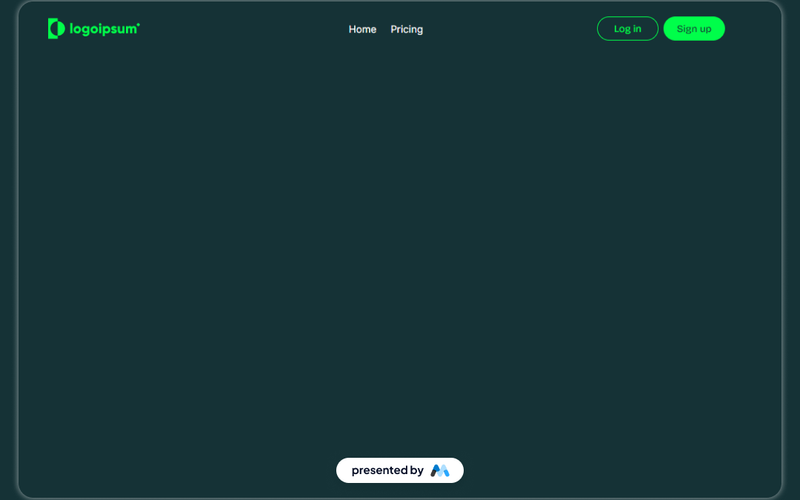
The Invest UI Navbar is a customizable navigation component designed for Webflow projects. It features a responsive layout with links for home, pricing, and user actions like login and sign up. This component is suitable for websites needing a clear and functional navigation system. Key Features Responsive design that adapts to various screen sizes.Includes links for Home, Pricing, Log in, and Sign up.Customizable styles for hover and active states.Fixed positioning for consistent visibility during scrolling.Includes a brand logo that can be easily replaced. Design Elements Dark color scheme with contrasting text for readability.Flexbox layout for easy alignment of navigation items.Hover effects that enhance user interaction.Use of SVG for the logo to ensure scalability without loss of quality. Potential Use Cases SaaS platforms looking to provide clear navigation for users.E-commerce websites needing a straightforward menu for product categories.Portfolio sites that require easy access to different sections.Blogs that want to highlight key areas like latest posts and categories.Corporate websites needing a professional navigation structure. Conclusion: The Invest UI Navbar is a practical and adaptable navigation solution for various types of websites, providing essential features and a user-friendly design.

Aerokit UI Navbar01 Links
View Component
Navbars

Aerokit UI Navbar01 Links

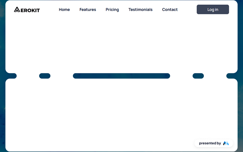
The Aerokit UI Navbar01 Links component is designed to provide a structured and customizable navigation bar for websites. It features a responsive layout with links to various sections such as Home, Features, Pricing, Testimonials, and Contact. This component can be easily integrated into any Webflow project, allowing developers to enhance their site's navigation experience. Key Features Responsive design that adapts to different screen sizes.Includes multiple navigation links for easy site navigation.Customizable styles for links and buttons.Focus state styles for improved accessibility.Supports logo integration with image elements. Design Elements Transparent background for the navbar to blend with the page content.Flexbox layout for aligning navigation items.Hover effects for links to enhance user interaction.Use of modern typography with the Manrope font.Padding and margin utilities for spacing adjustments. Potential Use Cases Corporate websites needing a clear navigation structure.E-commerce platforms to guide users through product categories.Portfolio sites showcasing work with easy access to different sections.Blogs requiring a straightforward navigation for articles and categories.Landing pages that need quick links to features and contact information. Conclusion: The Aerokit UI Navbar01 Links component is a practical solution for developers looking to implement a functional and stylish navigation bar in their Webflow projects.

AeroKit UI Navbar02 Dropdown
View Component
Navbars

AeroKit UI Navbar02 Dropdown

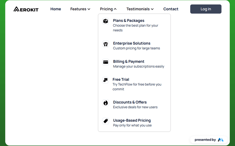
The AeroKit UI Navbar02 Dropdown is a customizable navigation component designed for Webflow projects. It features a dropdown menu that enhances user navigation, making it suitable for various types of websites. The component includes a brand logo, navigation links, and a dropdown toggle for additional options. Key Features Dropdown menu for easy navigation with a toggle button.Includes a brand logo and customizable navigation links.Responsive design that adapts to different screen sizes.Focus state styles for improved accessibility.CSS styles for text legibility and container alignment. Design Elements Utilizes a clean layout with a focus on usability.Incorporates a color scheme that can be customized to fit branding.Dropdown toggle includes an icon for visual indication.Responsive adjustments for mobile and tablet views. Potential Use Cases E-commerce websites needing a clear navigation structure.Corporate websites that require branding and easy access to services.Blogs or portfolios that benefit from organized content categories.Landing pages for marketing campaigns that need quick navigation.Educational platforms that require structured access to various resources. Conclusion: The AeroKit UI Navbar02 Dropdown is a functional and adaptable navigation solution that can enhance user experience across various website types.