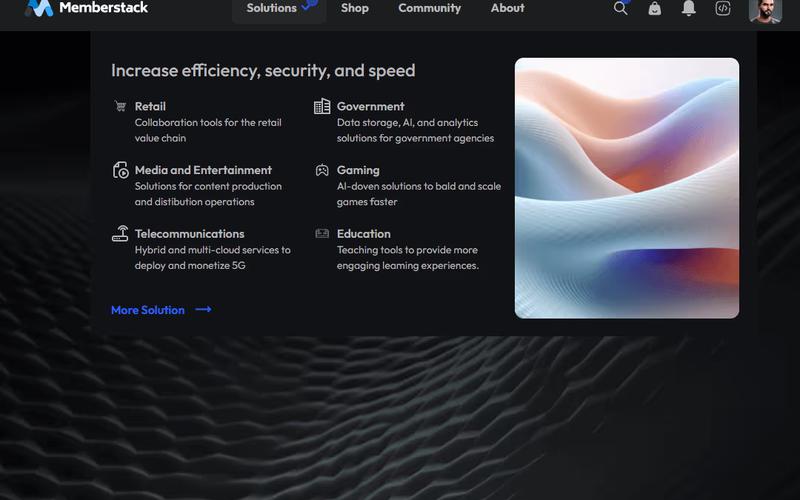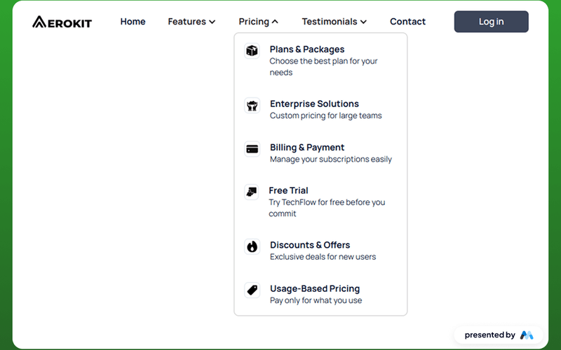
AeroKit UI Navbar02 Dropdown
The AeroKit UI Navbar02 Dropdown is a customizable navigation component designed for Webflow projects. It features a dropdown menu that enhances user navigation, making it suitable for various types of websites. The component includes a brand logo, navigation links, and a dropdown toggle for additional options. Key Features Dropdown menu for easy navigation with a toggle button.Includes a brand logo and customizable navigation links.Responsive design that adapts to different screen sizes.Focus state styles for improved accessibility.CSS styles for text legibility and container alignment. Design Elements Utilizes a clean layout with a focus on usability.Incorporates a color scheme that can be customized to fit branding.Dropdown toggle includes an icon for visual indication.Responsive adjustments for mobile and tablet views. Potential Use Cases E-commerce websites needing a clear navigation structure.Corporate websites that require branding and easy access to services.Blogs or portfolios that benefit from organized content categories.Landing pages for marketing campaigns that need quick navigation.Educational platforms that require structured access to various resources. Conclusion: The AeroKit UI Navbar02 Dropdown is a functional and adaptable navigation solution that can enhance user experience across various website types.