Aerokit UI Navbar01 Links

Back

Component Description(Generated by AI)

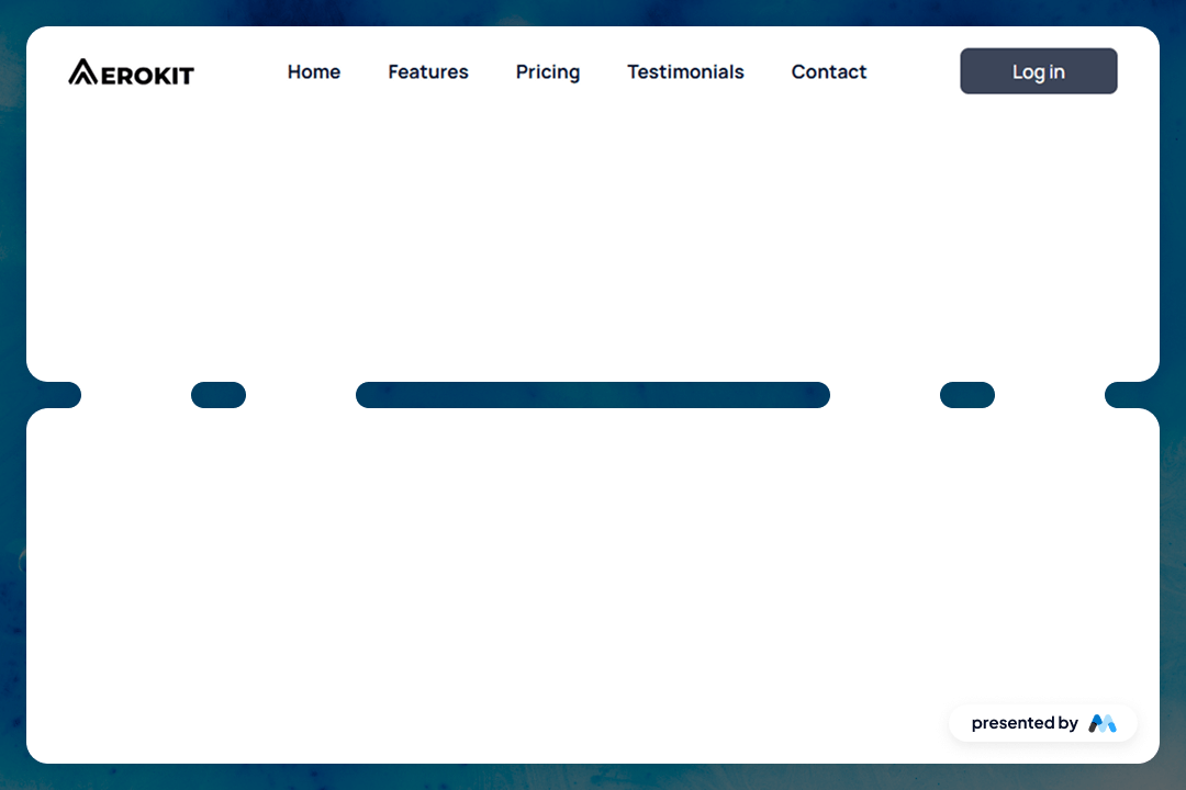
The Aerokit UI Navbar01 Links component is designed to provide a structured and customizable navigation bar for websites. It features a responsive layout with links to various sections such as Home, Features, Pricing, Testimonials, and Contact. This component can be easily integrated into any Webflow project, allowing developers to enhance their site's navigation experience.

Key Features

  • Responsive design that adapts to different screen sizes.Includes multiple navigation links for easy site navigation.Customizable styles for links and buttons.Focus state styles for improved accessibility.Supports logo integration with image elements.

Design Elements

  • Transparent background for the navbar to blend with the page content.Flexbox layout for aligning navigation items.Hover effects for links to enhance user interaction.Use of modern typography with the Manrope font.Padding and margin utilities for spacing adjustments.

Potential Use Cases

  • Corporate websites needing a clear navigation structure.E-commerce platforms to guide users through product categories.Portfolio sites showcasing work with easy access to different sections.Blogs requiring a straightforward navigation for articles and categories.Landing pages that need quick links to features and contact information.

Conclusion: The Aerokit UI Navbar01 Links component is a practical solution for developers looking to implement a functional and stylish navigation bar in their Webflow projects.

Related Components

More components you might find useful

Styled Mega Nav – Product Menu
View Component
NavbarsMarketing UI

Styled Mega Nav – Product Menu

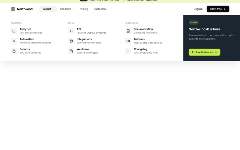
The Styled Mega Nav – Product Menu component provides a production-ready mega navigation bar with a full-width dropdown panel organized into three icon-led link columns. It pairs a dark featured promo panel (with badge and CTA) alongside categorized link groups for Platform, Build, and Resources. The navbar includes an announcement bar with a dismissible banner, a left-heavy layout with dropdown chevrons, and a compact mobile state. This component is a free resource for Webflow developers building SaaS, membership, or product sites. Key Features Three-column icon-led link grid with titles and descriptions per link row. Dark featured promo panel with "NEW" status badge and accent CTA button. Announcement bar with inline link, badge pill, and close icon. Left-heavy navbar layout with logo and nav links clustered together, CTA isolated right. Dropdown chevron indicators on trigger nav items with active pill state. Mobile-responsive hamburger menu state. Potential Use Cases SaaS platforms with multiple product areas needing organized navigation. Membership sites with documentation, tutorials, and resource sections. Product-led companies requiring a featured launch or announcement in the nav. Marketing sites that need an announcement banner above the navigation.

Styled Platform Nav – Mega Menu with CTA Card
View Component
NavbarsMarketing UI

Styled Platform Nav – Mega Menu with CTA Card

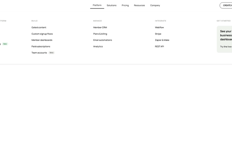
The Styled Platform Nav – Mega Menu with CTA Card component is a production-ready SaaS navigation bar with a five-column mega menu dropdown. The Platform dropdown organizes links into four categorized columns (The membership platform, Build, Manage, Integrate) plus a dark CTA card column with a live demo prompt. The navbar includes standard nav links (Solutions, Pricing, Resources, Company), member-aware auth buttons (Create account, Log in), a cart icon, and a Lottie-animated hamburger menu for mobile. Memberstack visibility attributes control auth button display based on login state. Key Features Five-column mega menu dropdown under the Platform nav item: Lead column: "The membership platform" with primary pages (About, How it works, Member portals) and a "New" badge. Build column: feature pages (Gated content, Custom signup flows, Member dashboards, Paid subscriptions, Team accounts) with a "Beta" badge. Manage column: operational pages (Member CRM, Plans & billing, Email automations, Analytics). Integrate column: integration pages (Webflow, Stripe, Zapier & Make, REST API). CTA column: dark card with headline ("See your membership business in one dashboard"), action label ("Try the live demo"), and arrow icon. Text-based logo ("stackly") on the left for brand-first hierarchy. Standard nav links (Solutions, Pricing, Resources, Company) alongside the mega dropdown. Right-side button group with Create account and Log in buttons, plus a cart icon with SVG. Memberstack data-ms-content="!members" attributes on auth buttons for conditional visibility. Lottie-animated hamburger icon with JSON-driven three-line animation for mobile. Mobile menu includes full-height nav with stacked links and dual CTA buttons. Potential Use Cases SaaS platforms with multiple product areas, integrations, and management features. Membership platforms built on Webflow + Memberstack needing organized feature navigation. Product-led companies with build, manage, and integrate sections in their information architecture. Marketplace or e-commerce membership sites needing a cart icon alongside auth controls. Any platform site that needs a mega menu with a promotional CTA card built into the dropdown.

Black And White Navbar
View Component
Navbars

Black And White Navbar

The Black And White Navbar is a sleek and modern navigation component designed for websites seeking a minimalist aesthetic. It features a sticky position and a clean layout that enhances user experience. Key Features Sticky positioning for consistent visibility Customizable links for easy navigation Includes a brand logo area Responsive design suitable for various screen sizes Animation effects for menu interactions Design Elements Monochrome color scheme with black and white Flexbox layout for alignment and spacing Rounded button styles for a modern touch Simple and clean typography Potential Use Cases Corporate websites looking for a professional look Personal portfolios that emphasize simplicityE-commerce sites needing straightforward navigation Blogs that prioritize content readability Landing pages for marketing campaigns Conclusion: The Black And White Navbar is a versatile and stylish component that can enhance the usability and aesthetic of various types of websites, making it an excellent choice for designers and developers alike.

Invest UI Navbar
View Component
Navbars

Invest UI Navbar

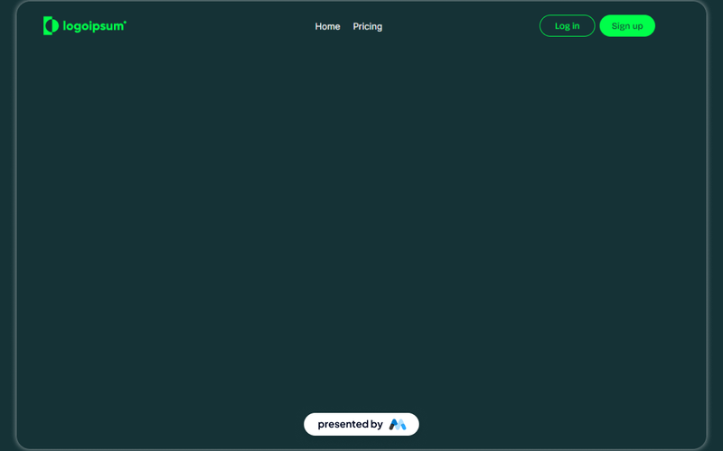
The Invest UI Navbar is a customizable navigation component designed for Webflow projects. It features a responsive layout with links for home, pricing, and user actions like login and sign up. This component is suitable for websites needing a clear and functional navigation system. Key Features Responsive design that adapts to various screen sizes.Includes links for Home, Pricing, Log in, and Sign up.Customizable styles for hover and active states.Fixed positioning for consistent visibility during scrolling.Includes a brand logo that can be easily replaced. Design Elements Dark color scheme with contrasting text for readability.Flexbox layout for easy alignment of navigation items.Hover effects that enhance user interaction.Use of SVG for the logo to ensure scalability without loss of quality. Potential Use Cases SaaS platforms looking to provide clear navigation for users.E-commerce websites needing a straightforward menu for product categories.Portfolio sites that require easy access to different sections.Blogs that want to highlight key areas like latest posts and categories.Corporate websites needing a professional navigation structure. Conclusion: The Invest UI Navbar is a practical and adaptable navigation solution for various types of websites, providing essential features and a user-friendly design.