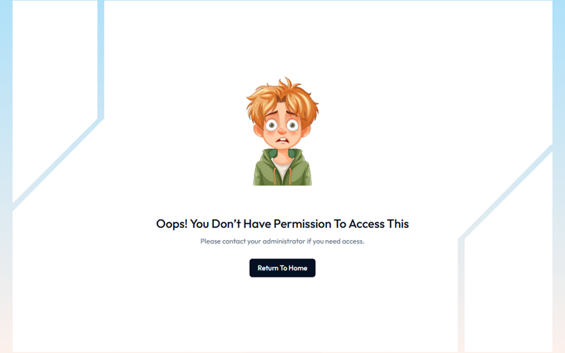
15 Components

Gated Content Components

15 Webflow native gated content components with 1-click copy & paste from a library of 807+. Built for Memberstack integration.

Copy & Paste
100% Free
Native Webflow
Access Denied Page
View Component
PaywallGated Content

Access Denied Page

The Access Denied Page is designed to inform users that they do not have permission to view certain content, encouraging them to upgrade their plan or log in to access restricted areas. Key Features Responsive design suitable for various devices Clear messaging for users about access restrictions Call-to-action buttons for upgrading or logging in Customizable layout and styles Design Elements Clean and modern layout with a white background Use of contrasting colors for text and buttons Incorporation of icons for visual appeal Flexible grid layout for content organization Potential Use Cases Membership websites requiring tiered accessE-commerce platforms with exclusive content Educational sites with course restrictions Corporate intranets for employee access control Conclusion: The Access Denied Page is a versatile component that enhances user experience by clearly communicating access limitations while providing pathways for users to gain access, making it ideal for various online platforms.

AeroKit UI Access Denied01 Dual Pane
View Component
Gated Content

AeroKit UI Access Denied01 Dual Pane

The AeroKit UI Access Denied01 Dual Pane component is designed to inform users that access to certain content is restricted. It features a dual-pane layout that effectively communicates the access denial message along with options for users to log in or sign up. This component is a free resource for Webflow developers to use in their projects. Key Features Dual-pane layout that separates the access denial message from action buttons.Customizable text elements to convey specific messages, such as 'Access Denied' and 'Access restricted to members only.'Includes buttons for user actions like 'Log in' and 'Create new account.'Responsive design with CSS classes for various screen sizes.Utilizes HTML embedding for custom styles and scripts. Design Elements Clean and modern layout with a focus on user interaction.Use of flexbox for alignment and spacing of elements.Incorporates a light color scheme with white backgrounds and subtle shadows.Typography is set to Manrope, providing a contemporary look.Includes icons for visual enhancement of buttons. Potential Use Cases Membership-based websites that require user authentication.E-commerce platforms where certain products or features are restricted to logged-in users.Online communities that need to manage access to exclusive content.Educational platforms that restrict course materials to enrolled students.Job portals that require users to log in to view job postings. Conclusion: The AeroKit UI Access Denied01 Dual Pane component is a practical solution for managing user access on websites, making it suitable for various industries that require user authentication.

AeroKit UI Access Denied02 Full Screen
View Component
Gated Content

AeroKit UI Access Denied02 Full Screen

The AeroKit UI Access Denied02 Full Screen component is designed to display an access denied message in a visually engaging manner. It features a prominent message indicating that the user does not have permission to view the content, along with a call-to-action button to log in. This component is suitable for applications requiring user authentication. Key Features Full-screen layout with a centered message and button.Customizable text for access denial and instructions.Responsive design that adapts to various screen sizes.Includes CSS for improved text legibility and focus states. Design Elements Background gradient with a subtle overlay for depth.Bold typography for the access denied message, enhancing visibility.Use of flexbox for centering content both vertically and horizontally.Color scheme featuring dark text on a light background for contrast. Potential Use Cases Web applications requiring user authentication.Membership sites that restrict content access.E-commerce platforms with user-specific content.Corporate intranets with restricted access areas. Conclusion: The AeroKit UI Access Denied02 Full Screen component effectively communicates access restrictions while providing a clear path for users to regain access, making it a valuable addition for any web application that requires user authentication.

Age Gate Popup
View Component
Gated Content

Age Gate Popup

The Age Gate Popup is a compliance tool designed to verify the age of users before granting access to content, enhancing user experience through local storage functionality. Key Features Attribute-based age verification Local storage support for user convenience Customizable design elements Responsive and mobile-friendly Easy integration into existing Webflow projects Design Elements Fixed position for full-screen coverage Modern and clean aesthetic with a backdrop filter User-friendly input fields for date of birth Error and success messages for user feedback Potential Use Cases E-commerce websites selling age-restricted products Content platforms with adult material Event registration for age-specific events Social media platforms requiring age verification Gaming websites with age restrictions Conclusion: The Age Gate Popup is a versatile and essential component for any website needing to enforce age restrictions, ensuring compliance while maintaining a smooth user experience.

Block Access
View Component
PaywallGated Content

Block Access

The Block Access component is designed to inform users that they do not have permission to access certain features, encouraging them to upgrade their plan or log in. It provides a clear and visually appealing message for restricted access. Key Features Responsive design suitable for various screen sizes Customizable text and links for user actions Includes visual elements such as icons and images Background image support for enhanced aesthetics User-friendly layout with clear call-to-action buttons Design Elements: Flexbox layout for centering content Soft color palette with a light background and dark text Use of icons for visual appeal Rounded button styles for a modern look Consistent typography with a focus on readability Potential Use Cases: Web applications requiring user authentication Membership sites with tiered access levelsE-commerce platforms with restricted product features SaaS products needing user upgrade prompts Educational platforms with course access limitations Conclusion: The Block Access component is a versatile solution for managing user access, effectively combining functionality with an appealing design to enhance user experience.

Denied Access Alert
View Component
Gated Content

Denied Access Alert

The Denied Access Alert component notifies users when they attempt to access restricted areas, prompting them to contact an administrator for access. Key Features User-friendly notification system for restricted access Encourages user engagement by prompting contact with administrators Responsive design suitable for various devices Includes visually appealing images and icons Design Elements Clean and modern layoutColor scheme featuring purple accentsUse of images to enhance visual communicationFlexbox layout for responsive design Potential Use Cases Web applications requiring user authentication Corporate intranets with restricted content Membership-based websites Educational platforms with tiered access levelsE-commerce sites with exclusive product sections Conclusion: The Denied Access Alert component is a versatile tool for enhancing user experience by clearly communicating access restrictions, making it ideal for various web applications.

Elegant Access Denied
View Component
Gated Content

Elegant Access Denied

The 'Elegant Access Denied' component is designed to inform users that access to a specific resource is restricted. It features a visually appealing layout with a call-to-action for users to request access, making it suitable for applications that require user permissions or waiting lists. Key Features Includes a form for users to request access with fields for name and email.Displays a success message upon form submission.Provides an error message if the form submission fails.Utilizes responsive design principles to ensure usability across devices. Design Elements Dark background with contrasting text for readability.Flexible layout that centers content and adapts to screen sizes.Incorporates gradient backgrounds and rounded borders for a modern aesthetic.Uses icons and images to enhance visual communication. Potential Use Cases Web applications requiring user authentication or permissions.Membership-based services that need to manage access requests.Educational platforms where course access is restricted.Event registration pages that require approval for attendance. Conclusion: The 'Elegant Access Denied' component effectively combines functionality with a visually engaging design, making it a valuable addition for any application needing to manage user access.

Free Trial Banner
View Component
TrialGated Content

Free Trial Banner

The Free Trial Banner is designed to inform users about their active free trial status, encouraging engagement and subscription conversion. It can be easily integrated into any Webflow project by copying and pasting the component. Key Features Displays a message for users currently on a free trial Includes customizable text and icons Responsive design suitable for various screen sizes Easy integration with Webflow projects Design Elements: Flexbox layout for alignment and spacing Light background color with contrasting text for visibility Incorporates graphics for visual appeal Potential Use Cases: SaaS companies wanting to promote trial subscriptionsE-commerce platforms offering trial periods for memberships Educational platforms providing trial access to courses Fitness apps allowing trial periods for premium features Conclusion: The Free Trial Banner is a versatile and visually appealing component that effectively communicates trial information, making it a valuable addition for businesses looking to enhance user engagement and conversion rates.

Gated Content Page
View Component
PaywallGated Content

Gated Content Page

The Gated Content Page is designed to restrict access to certain content, prompting users to either log in or upgrade their plan. It effectively communicates access limitations with a clear message and actionable links. Key Features User-friendly interface for restricted content access Clear messaging indicating access denial Links for upgrading plans or logging in Responsive design suitable for various devices Customizable visual elements Design Elements: Modern layout with a gradient background Bold typography for headings and messages Flexbox layout for button alignment Use of icons for visual appeal Color scheme featuring dark and light contrasts Potential Use Cases: Membership-based websites requiring user authenticationE-commerce platforms offering premium content Educational sites with gated course materials Blogs or news sites with subscription models Software services needing user account management Conclusion: The Gated Content Page is a versatile solution for any website looking to manage user access effectively, combining functionality with an appealing design.

Gated Content Section
View Component
Gated Content

Gated Content Section

The Gated Content Section is designed to restrict access to specific content until users provide certain information, such as an email address. This component is particularly useful for lead generation and can be integrated into various types of websites. For example, it can be used to offer exclusive articles, eBooks, or webinars in exchange for user information. Key Features Includes a visually appealing layout with a grid system for content organization.Features a Lottie animation to enhance user engagement.Responsive design that adapts to different screen sizes.Customizable text and button styles for branding purposes.Supports external links for navigation, such as 'Go Back Home' and 'Help' buttons. Design Elements Utilizes a radial gradient background for a modern aesthetic.Incorporates rounded corners and shadow effects for a soft appearance.Employs a flexbox layout for easy alignment and spacing of elements.Text styles include large headings and regular-sized body text for readability. Potential Use Cases Marketing websites looking to capture leads through gated content.Educational platforms offering exclusive resources to registered users.E-commerce sites providing special offers or discounts in exchange for user information.Blogs or news sites wanting to restrict access to premium articles. Conclusion: The Gated Content Section is a practical component for any website aiming to enhance user engagement and capture leads effectively.

Members-Only Video
View Component
Gated Content

Members-Only Video

The Members-Only Video component allows users to embed exclusive video content that is accessible only to registered members. It features a visually appealing layout with a call-to-action for account creation. Key Features Embedded video player using an iframe Responsive design for various screen sizes Overlay with a call-to-action to create an account Customizable styles and animations Design Elements: Clean and modern layoutOverlay with semi-transparent backgroundBold typography for calls to actionPotential Use Cases: Membership-based websites offering exclusive content Online courses or educational platforms Subscription services for video content Communities or forums with premium content access Conclusion: The Members-Only Video component is a versatile tool for any website looking to provide exclusive video content, making it ideal for businesses focused on membership and subscription models.

Purple Access Denied
View Component
Gated Content

Purple Access Denied

The 'Purple Access Denied' component is designed to inform users that they do not have the necessary permissions to access certain content. It features a clear message and a call-to-action link for users to return to the dashboard. This component serves as a user-friendly way to manage access restrictions on a website. Key Features Displays a prominent 'ACCESS DENIED' message to clearly communicate the restriction.Includes a secondary message prompting users to log in or upgrade their plan for access.Features a call-to-action link that directs users back to the dashboard. Design Elements Utilizes a purple background color (#26095d) to create a visually striking interface.Text is styled to be bold and legible, with a focus on accessibility through proper contrast.The layout is centered and responsive, ensuring it looks good on various screen sizes. Potential Use Cases Web applications that require user authentication for content access.Membership sites where certain features are gated behind a paywall.E-commerce platforms that restrict access to premium products or services. Conclusion: The 'Purple Access Denied' component effectively communicates access restrictions while providing a clear path for users to regain access, making it a practical addition for any site with gated content.

Restricted Entry UI
View Component
Gated Content

Restricted Entry UI

The Restricted Entry UI component is designed to provide a user-friendly interface for displaying restricted access messages, such as 'Page Not Found'. It features a visually engaging layout with customizable text and styles, making it suitable for various web applications. This component is a free resource for Webflow developers to use in their projects. Key Features Customizable error messages with options for different text sizes and styles.Responsive design that adapts to various screen sizes.Interactive elements such as a 'Back to home' link for user navigation.CSS animations for visual effects when scrolling into view. Design Elements Gradient backgrounds that enhance visual appeal, such as a linear gradient from #36cfc9 to white.Large, bold typography for error messages, utilizing classes like 'text-size-large'.Flexbox layout for centering content and ensuring proper alignment of elements. Potential Use Cases Websites that require a custom 404 error page.Applications needing a restricted access notification for users.E-commerce sites that want to inform users about unavailable products or pages.Blogs or content sites that may have moved or deleted articles. Conclusion: The Restricted Entry UI component is a practical solution for managing user navigation errors, offering both aesthetic and functional benefits for web developers.

Simple Gated Content Interface
View Component
Gated Content

Simple Gated Content Interface

The Simple Gated Content Interface is designed to restrict access to certain content, prompting users to take action for access. It features a clear message indicating restricted access and a call-to-action button for users to return to the homepage. This component is a free resource for Webflow developers to use in their projects. Key Features Gated content access with a clear message: 'Oops! You don’t have permission to access this.'Call-to-action button labeled 'Return To Home' for easy navigation.Responsive design with flexible layout options.Customizable styles for text and buttons, including hover effects. Design Elements Centered layout with a flexbox structure for alignment.Use of a specific color palette, primarily dark blue for buttons and grey for text.Incorporation of an illustrative image to enhance visual appeal.Typography styles that emphasize clarity and readability. Potential Use Cases Membership sites requiring user authentication for content access.Educational platforms offering exclusive resources to registered users.E-commerce websites with gated promotional content for subscribers.Corporate intranets where sensitive information is restricted to employees. Conclusion: The Simple Gated Content Interface effectively combines functionality and design, making it suitable for various applications where content access needs to be controlled.

Yellow Access Denied Page W/ Background Video
View Component
PaywallGated Content

Yellow Access Denied Page W/ Background Video

This component serves as an access denied page featuring a vibrant yellow design and a captivating background video. It effectively communicates restricted access while maintaining user engagement through visual elements. Key Features Background video support with autoplay and loop functionality Responsive design suitable for various screen sizes Customizable text and links for user guidance Includes icons for enhanced visual appeal Design Elements: Bright yellow color scheme for high visibility Flexible layout with grid display for organized content Rounded corners and borders for a modern aesthetic Use of icons Potential Use Cases: Websites requiring user authentication or membership Online services with restricted content accessE-commerce platforms for member-only promotions Educational sites with exclusive resources for enrolled students Corporate sites managing sensitive information Conclusion: The Yellow Access Denied Page with Background Video is a versatile and visually striking component that enhances user experience while clearly communicating access restrictions.

Showing 1–15 of 15 componentstagged with Gated Content

No website yet? Check out our free & paid pre-built template websites!

View templates