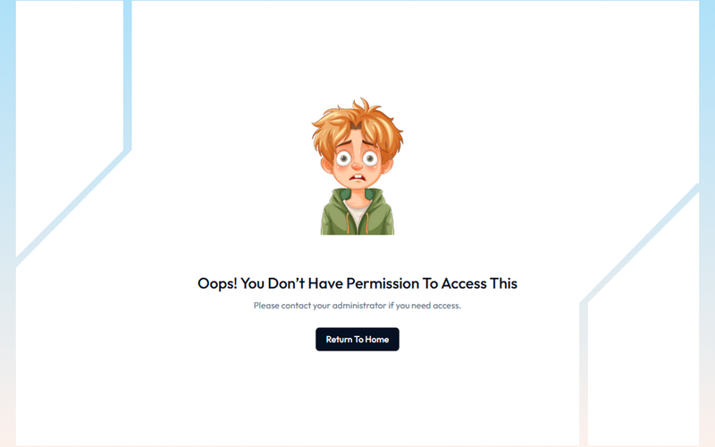
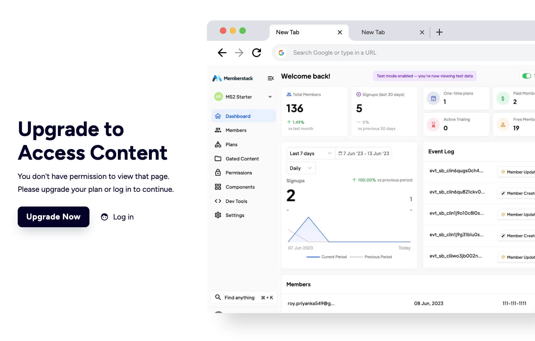
Access Denied Page

Back

Component Description(Generated by AI)

The Access Denied Page is designed to inform users that they do not have permission to view certain content, encouraging them to upgrade their plan or log in to access restricted areas.

Key Features

  • Responsive design suitable for various devices
  • Clear messaging for users about access restrictions
  • Call-to-action buttons for upgrading or logging in
  • Customizable layout and styles

Design Elements

  • Clean and modern layout with a white background
  • Use of contrasting colors for text and buttons
  • Incorporation of icons for visual appeal
  • Flexible grid layout for content organization

Potential Use Cases

  • Membership websites requiring tiered accessE-commerce platforms with exclusive content
  • Educational sites with course restrictions
  • Corporate intranets for employee access control

Conclusion: The Access Denied Page is a versatile component that enhances user experience by clearly communicating access limitations while providing pathways for users to gain access, making it ideal for various online platforms.

Features

gate-content

Component Info

Published:
July 13, 2025

Related Components

More components you might find useful

Block Access
View Component
PaywallGated Content

Block Access

The Block Access component is designed to inform users that they do not have permission to access certain features, encouraging them to upgrade their plan or log in. It provides a clear and visually appealing message for restricted access. Key Features Responsive design suitable for various screen sizes Customizable text and links for user actions Includes visual elements such as icons and images Background image support for enhanced aesthetics User-friendly layout with clear call-to-action buttons Design Elements: Flexbox layout for centering content Soft color palette with a light background and dark text Use of icons for visual appeal Rounded button styles for a modern look Consistent typography with a focus on readability Potential Use Cases: Web applications requiring user authentication Membership sites with tiered access levelsE-commerce platforms with restricted product features SaaS products needing user upgrade prompts Educational platforms with course access limitations Conclusion: The Block Access component is a versatile solution for managing user access, effectively combining functionality with an appealing design to enhance user experience.

Elegant Access Denied
View Component
Gated Content

Elegant Access Denied

The 'Elegant Access Denied' component is designed to inform users that access to a specific resource is restricted. It features a visually appealing layout with a call-to-action for users to request access, making it suitable for applications that require user permissions or waiting lists. Key Features Includes a form for users to request access with fields for name and email.Displays a success message upon form submission.Provides an error message if the form submission fails.Utilizes responsive design principles to ensure usability across devices. Design Elements Dark background with contrasting text for readability.Flexible layout that centers content and adapts to screen sizes.Incorporates gradient backgrounds and rounded borders for a modern aesthetic.Uses icons and images to enhance visual communication. Potential Use Cases Web applications requiring user authentication or permissions.Membership-based services that need to manage access requests.Educational platforms where course access is restricted.Event registration pages that require approval for attendance. Conclusion: The 'Elegant Access Denied' component effectively combines functionality with a visually engaging design, making it a valuable addition for any application needing to manage user access.

Simple Gated Content Interface
View Component
Gated Content

Simple Gated Content Interface

The Simple Gated Content Interface is designed to restrict access to certain content, prompting users to take action for access. It features a clear message indicating restricted access and a call-to-action button for users to return to the homepage. This component is a free resource for Webflow developers to use in their projects. Key Features Gated content access with a clear message: 'Oops! You don’t have permission to access this.'Call-to-action button labeled 'Return To Home' for easy navigation.Responsive design with flexible layout options.Customizable styles for text and buttons, including hover effects. Design Elements Centered layout with a flexbox structure for alignment.Use of a specific color palette, primarily dark blue for buttons and grey for text.Incorporation of an illustrative image to enhance visual appeal.Typography styles that emphasize clarity and readability. Potential Use Cases Membership sites requiring user authentication for content access.Educational platforms offering exclusive resources to registered users.E-commerce websites with gated promotional content for subscribers.Corporate intranets where sensitive information is restricted to employees. Conclusion: The Simple Gated Content Interface effectively combines functionality and design, making it suitable for various applications where content access needs to be controlled.

AeroKit UI Access Denied01 Dual Pane
View Component
Gated Content

AeroKit UI Access Denied01 Dual Pane

The AeroKit UI Access Denied01 Dual Pane component is designed to inform users that access to certain content is restricted. It features a dual-pane layout that effectively communicates the access denial message along with options for users to log in or sign up. This component is a free resource for Webflow developers to use in their projects. Key Features Dual-pane layout that separates the access denial message from action buttons.Customizable text elements to convey specific messages, such as 'Access Denied' and 'Access restricted to members only.'Includes buttons for user actions like 'Log in' and 'Create new account.'Responsive design with CSS classes for various screen sizes.Utilizes HTML embedding for custom styles and scripts. Design Elements Clean and modern layout with a focus on user interaction.Use of flexbox for alignment and spacing of elements.Incorporates a light color scheme with white backgrounds and subtle shadows.Typography is set to Manrope, providing a contemporary look.Includes icons for visual enhancement of buttons. Potential Use Cases Membership-based websites that require user authentication.E-commerce platforms where certain products or features are restricted to logged-in users.Online communities that need to manage access to exclusive content.Educational platforms that restrict course materials to enrolled students.Job portals that require users to log in to view job postings. Conclusion: The AeroKit UI Access Denied01 Dual Pane component is a practical solution for managing user access on websites, making it suitable for various industries that require user authentication.