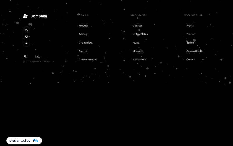
Styled Platform Nav – Mega Menu with CTA Card
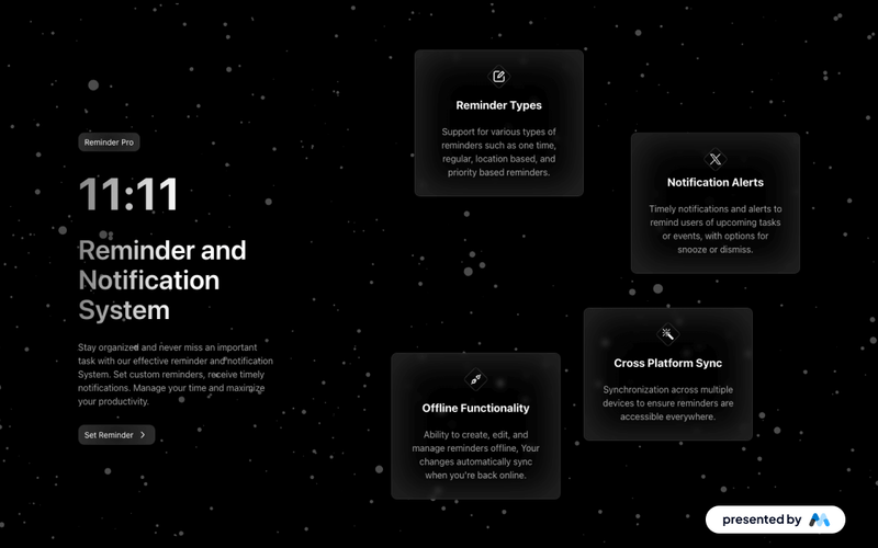
The Styled Platform Nav – Mega Menu with CTA Card component is a production-ready SaaS navigation bar with a five-column mega menu dropdown. The Platform dropdown organizes links into four categorized columns (The membership platform, Build, Manage, Integrate) plus a dark CTA card column with a live demo prompt. The navbar includes standard nav links (Solutions, Pricing, Resources, Company), member-aware auth buttons (Create account, Log in), a cart icon, and a Lottie-animated hamburger menu for mobile. Memberstack visibility attributes control auth button display based on login state. Key Features Five-column mega menu dropdown under the Platform nav item: Lead column: "The membership platform" with primary pages (About, How it works, Member portals) and a "New" badge. Build column: feature pages (Gated content, Custom signup flows, Member dashboards, Paid subscriptions, Team accounts) with a "Beta" badge. Manage column: operational pages (Member CRM, Plans & billing, Email automations, Analytics). Integrate column: integration pages (Webflow, Stripe, Zapier & Make, REST API). CTA column: dark card with headline ("See your membership business in one dashboard"), action label ("Try the live demo"), and arrow icon. Text-based logo ("stackly") on the left for brand-first hierarchy. Standard nav links (Solutions, Pricing, Resources, Company) alongside the mega dropdown. Right-side button group with Create account and Log in buttons, plus a cart icon with SVG. Memberstack data-ms-content="!members" attributes on auth buttons for conditional visibility. Lottie-animated hamburger icon with JSON-driven three-line animation for mobile. Mobile menu includes full-height nav with stacked links and dual CTA buttons. Potential Use Cases SaaS platforms with multiple product areas, integrations, and management features. Membership platforms built on Webflow + Memberstack needing organized feature navigation. Product-led companies with build, manage, and integrate sections in their information architecture. Marketplace or e-commerce membership sites needing a cart icon alongside auth controls. Any platform site that needs a mega menu with a promotional CTA card built into the dropdown.