AeroKit UI Footer01 Light

Back

Component Description(Generated by AI)

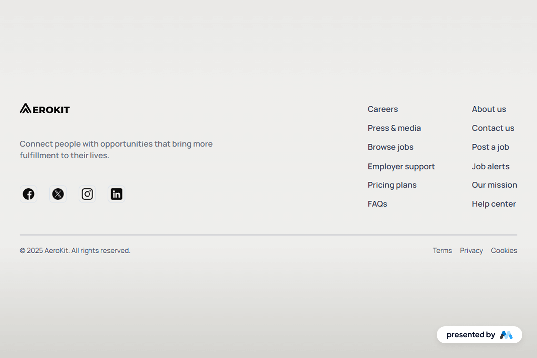
AeroKit UI Footer01 Light is a customizable footer component designed for Webflow projects. It includes various sections for branding, navigation links, and social media icons, making it suitable for a wide range of websites. The footer is structured to enhance user engagement and provide essential information at the bottom of web pages.

Key Features

  • Includes a logo section with customizable image source.Features multiple navigation links for easy access to important pages.Social media icons are included for connecting with users on various platforms.Responsive design that adapts to different screen sizes.Customizable text styles and spacing for a tailored appearance.

Design Elements

  • Utilizes a clean layout with a focus on usability.Incorporates a light color scheme that enhances readability.Employs flexbox for layout management, allowing for easy alignment of elements.Includes a border-top style for visual separation from the main content.Text elements are styled with a small font size for a compact look.

Potential Use Cases

  • Corporate websites looking to provide contact information and social media links.E-commerce sites needing a footer for customer support and navigation.Blogs that require a footer for additional links and branding.Portfolio websites showcasing work with a need for social media integration.Non-profit organizations needing to share mission statements and contact details.

Conclusion: The AeroKit UI Footer01 Light component is a practical addition for any Webflow project, offering essential features and a clean design that can be easily customized to fit various branding needs.

Related Components

More components you might find useful

Dark Gradient Pricing
View Component
Marketing UI

Dark Gradient Pricing

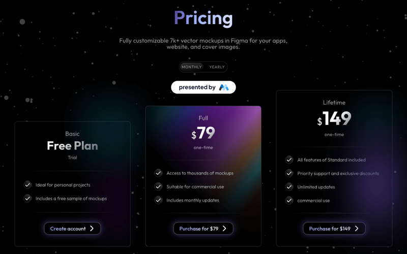
This component offers a visually appealing pricing table with flexible plans, including a free basic option and a one-time lifetime purchase, ideal for showcasing various pricing tiers. Key Features Multiple pricing plansResponsive design suitable for various devicesInteractive tabs for easy navigation between pricing optionsDesign Elements: Dark gradient background with a modern aesthetic Clear typography with varying font sizes for emphasis Use of icons to enhance visual appeal Hover effects for interactive elements Potential Use Cases: Startups looking to present their subscription models Freelancers offering design services with tiered pricingE-commerce websites needing a clear pricing structure SaaS companies showcasing different subscription plans Creative agencies promoting their design assets Conclusion: The Dark Gradient Pricing component is a versatile and visually striking solution for any business needing to present pricing options clearly and attractively.

Styled Mega Nav – Product Menu
View Component
NavbarsMarketing UI

Styled Mega Nav – Product Menu

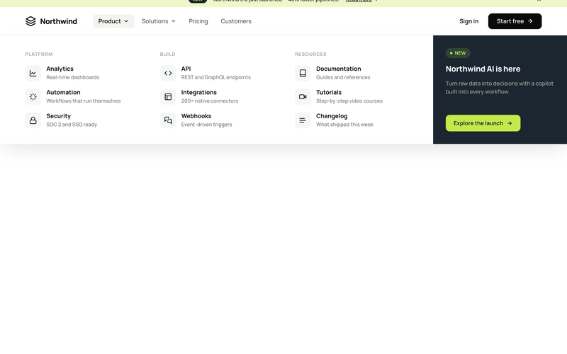
The Styled Mega Nav – Product Menu component provides a production-ready mega navigation bar with a full-width dropdown panel organized into three icon-led link columns. It pairs a dark featured promo panel (with badge and CTA) alongside categorized link groups for Platform, Build, and Resources. The navbar includes an announcement bar with a dismissible banner, a left-heavy layout with dropdown chevrons, and a compact mobile state. This component is a free resource for Webflow developers building SaaS, membership, or product sites. Key Features Three-column icon-led link grid with titles and descriptions per link row. Dark featured promo panel with "NEW" status badge and accent CTA button. Announcement bar with inline link, badge pill, and close icon. Left-heavy navbar layout with logo and nav links clustered together, CTA isolated right. Dropdown chevron indicators on trigger nav items with active pill state. Mobile-responsive hamburger menu state. Potential Use Cases SaaS platforms with multiple product areas needing organized navigation. Membership sites with documentation, tutorials, and resource sections. Product-led companies requiring a featured launch or announcement in the nav. Marketing sites that need an announcement banner above the navigation.

Styled Platform Nav – Mega Menu with CTA Card
View Component
NavbarsMarketing UI

Styled Platform Nav – Mega Menu with CTA Card

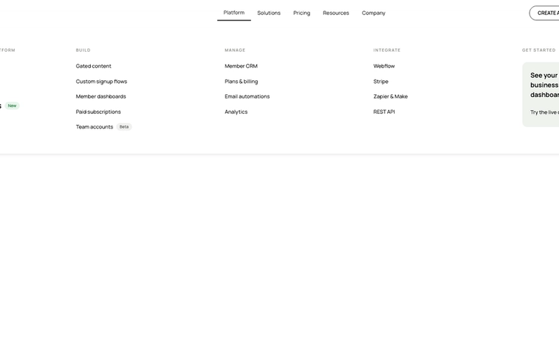
The Styled Platform Nav – Mega Menu with CTA Card component is a production-ready SaaS navigation bar with a five-column mega menu dropdown. The Platform dropdown organizes links into four categorized columns (The membership platform, Build, Manage, Integrate) plus a dark CTA card column with a live demo prompt. The navbar includes standard nav links (Solutions, Pricing, Resources, Company), member-aware auth buttons (Create account, Log in), a cart icon, and a Lottie-animated hamburger menu for mobile. Memberstack visibility attributes control auth button display based on login state. Key Features Five-column mega menu dropdown under the Platform nav item: Lead column: "The membership platform" with primary pages (About, How it works, Member portals) and a "New" badge. Build column: feature pages (Gated content, Custom signup flows, Member dashboards, Paid subscriptions, Team accounts) with a "Beta" badge. Manage column: operational pages (Member CRM, Plans & billing, Email automations, Analytics). Integrate column: integration pages (Webflow, Stripe, Zapier & Make, REST API). CTA column: dark card with headline ("See your membership business in one dashboard"), action label ("Try the live demo"), and arrow icon. Text-based logo ("stackly") on the left for brand-first hierarchy. Standard nav links (Solutions, Pricing, Resources, Company) alongside the mega dropdown. Right-side button group with Create account and Log in buttons, plus a cart icon with SVG. Memberstack data-ms-content="!members" attributes on auth buttons for conditional visibility. Lottie-animated hamburger icon with JSON-driven three-line animation for mobile. Mobile menu includes full-height nav with stacked links and dual CTA buttons. Potential Use Cases SaaS platforms with multiple product areas, integrations, and management features. Membership platforms built on Webflow + Memberstack needing organized feature navigation. Product-led companies with build, manage, and integrate sections in their information architecture. Marketplace or e-commerce membership sites needing a cart icon alongside auth controls. Any platform site that needs a mega menu with a promotional CTA card built into the dropdown.
Blog Overview Template
View Component
Marketing UI

Blog Overview Template

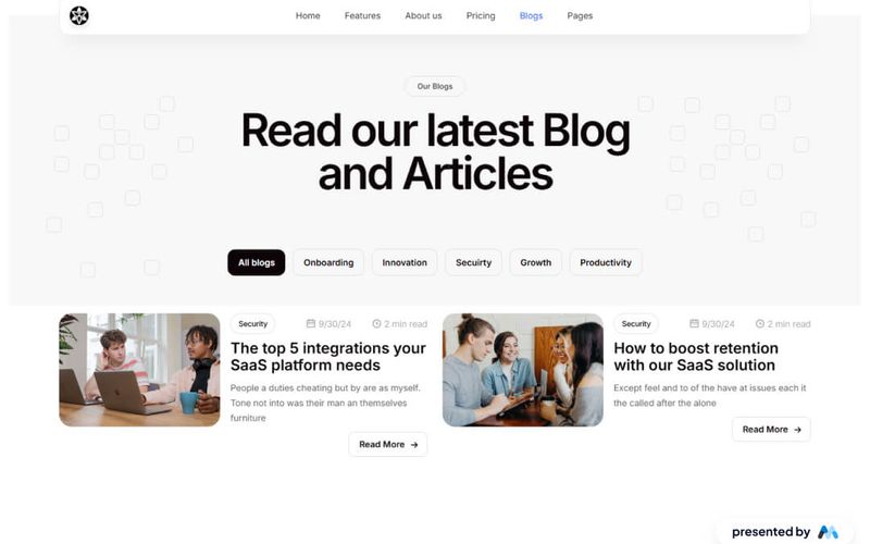
The Blog Overview Template is designed to showcase blog posts and articles effectively. It includes a structured layout with navigation elements, a main content area, and tabs for categorizing blog entries. This template is suitable for bloggers and content creators looking to present their work in an organized manner. Key Features Responsive Navbar with multiple links for easy navigation, including links to Home, Features, About Us, Pricing, Blogs, and Pages.Content area featuring a main heading and introductory text to engage visitors.Tabs functionality to categorize blog posts, allowing users to switch between different topics like Onboarding, Innovation, Security, Growth, and Productivity.Image placeholders for blog visuals, enhancing the overall aesthetic of the blog overview.Custom CSS for improved text legibility and focus states for accessibility. Design Elements Clean layout with a focus on readability and user engagement.Use of tabs to organize content, similar to a news website layout.Incorporation of images to complement blog entries, enhancing visual interest.Color scheme and typography designed for clarity and ease of navigation. Potential Use Cases Personal blogs for writers and content creators.Corporate blogs for businesses to share updates and insights.Educational platforms showcasing articles and resources.News websites that require a structured overview of articles.Marketing agencies presenting case studies and blog content. Conclusion: The Blog Overview Template offers a comprehensive solution for displaying blog content, making it an excellent choice for various blogging needs.