Expandable Animated Card Slider

Back

Component Description(Generated by AI)

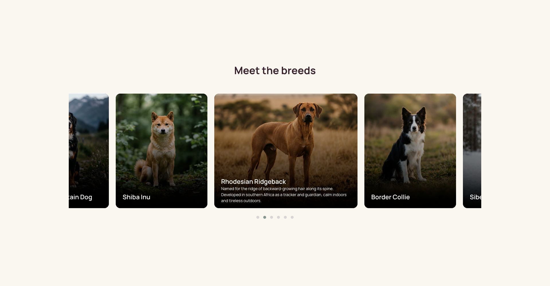
The Expandable Animated Card Slider turns a Collection List into an interactive row of cards. Each card shows only its title until it's clicked, at which point it widens and reveals its description while every other card returns to its collapsed state.

The expand animation is driven by width and transform transitions defined in Webflow, with the active state toggled by a single attribute rather than a class. Owl Carousel handles the horizontal scrolling and variable card widths, running on the jQuery that Webflow already loads.

Key Features

  • CMS-driven — bind any Collection List; card count adapts automatically
  • Click to expand, click again to collapse, one card open at a time
  • Attribute-based state (ms-code-slider-state) so class renames don't break it
  • Variable-width cards via Owl Carousel's autoWidth, which native Webflow sliders can't do
  • Responsive card sizing across desktop, tablet and mobile breakpoints
  • Gradient scrim keeps title and body text legible over any image
  • Respects prefers-reduced-motion
  • Pagination dots included; arrows available via a config flag

Setup Notes

  • Requires the head and footer code blocks from the component's custom code
  • The footer block must sit before </body> — Webflow loads jQuery there, and the script needs it
  • Delete the Collection List's empty state if you ever filter the list, or the carousel will render it as a stray card
  • Card and scrim need matching corner radii; mismatched radii cause square corners to bleed past the rounded card during the expand transition

Related Components

More components you might find useful

Upload File Drag and Drop
View Component
All

Upload File Drag and Drop

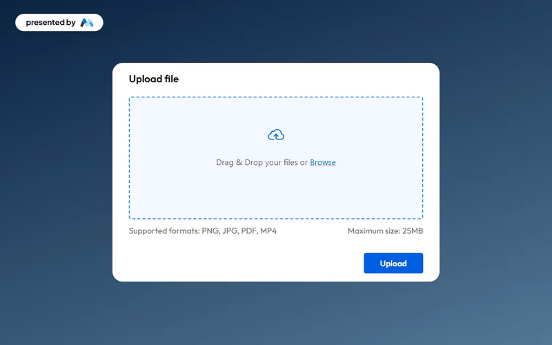
This component provides an elegant and functional interface for users to upload files seamlessly, enhancing both usability and aesthetics. Key Features Drag and drop functionality for easy file uploads Maximum file size limit of 25MBIncludes success and error messages for user feedback Customizable design elements Design Elements: Modern and clean interface Dashed border to indicate upload area Responsive design suitable for various devices Color scheme featuring soft backgrounds and contrasting button colors Potential Use Cases: Web applications requiring user file submissions Educational platforms for assignment uploads Corporate intranets for document sharingE-commerce sites for product file uploads Event registration forms requiring document attachments Conclusion: The Upload File Drag and Drop component is a versatile tool that enhances user experience while maintaining a professional appearance, making it suitable for a wide range of applications.

Trial Form Component
View Component
All

Trial Form Component

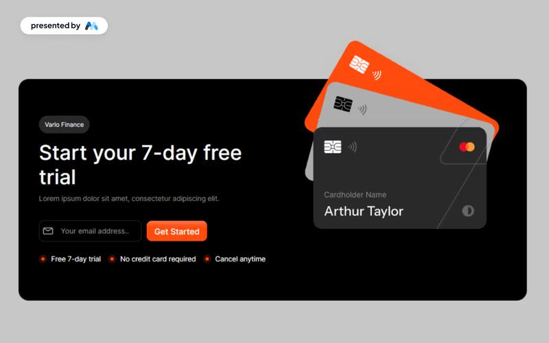
The Trial Form Component allows users to easily sign up for a free trial, enhancing user engagement and lead generation. Key Features User-friendly form for signing up for a free trial Responsive design suitable for various devices Includes success and error messages for form submissions Customizable fields for user input Design Elements: Modern and clean layout Flexible grid and flexbox structures for responsive design Use of icons to enhance visual appeal Color scheme featuring light and dark contrasts Rounded corners and subtle shadows for a polished look Potential Use Cases: SaaS companies offering free trials Educational platforms providing trial access to courses Fitness or wellness apps promoting trial memberships Software tools looking to increase user adoptionE-commerce sites offering trial products or services Conclusion: The Trial Form Component is a versatile tool that can significantly boost user acquisition for businesses across various industries by providing an intuitive and engaging sign-up experience.

Sign up with Email modal
View Component
LoginAll+1

Sign up with Email modal

This component provides a user-friendly modal for seamless account creation and login through email, enhancing the authentication process with intuitive forms. Key Features Intuitive email fields for easy sign-up and login Responsive design suitable for various devices Includes options for social sign-up via Google Success and error messages for user feedback Customizable styles and layout Design Elements Minimalistic layout with a clean aesthetic Soft color palette featuring light grey and dark grey tones Centered alignment for a balanced appearance Use of icons for visual appeal and clarity Potential Use Cases Startups looking to streamline user registrationE-commerce platforms needing quick account creation SaaS applications requiring user authentication Blogs or content platforms wanting to build a subscriber base Event management sites for attendee sign-ups Conclusion: The Sign up with Email modal is a versatile and visually appealing component that simplifies user registration and enhances the overall user experience.

Email verification modal
View Component
AllEmail Verification

Email verification modal

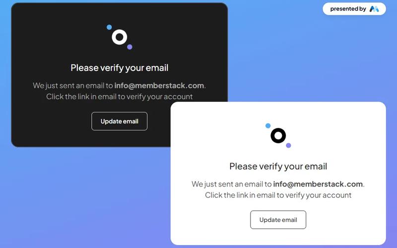
The Email Verification Modal is a stylish and versatile component designed for seamless email verification, available in both dark and light themes. Key Features Responsive design suitable for various devices Customizable themes (dark and light)Includes options to resend verification email or update email address User-friendly interface with clear instructions Integrates easily with existing web applications Design Elements Modern and clean layout Use of contrasting colors for visibility Incorporates icons for enhanced user experience Flexible container sizes for different screen resolutions Potential Use Cases Web applications requiring user email verificationE-commerce platforms needing account confirmation Membership sites for user registration and validation SaaS products that require user authentication Educational platforms for student account management Conclusion: The Email Verification Modal is a versatile and visually appealing component that enhances user experience by simplifying the email verification process, making it an excellent choice for various web applications.