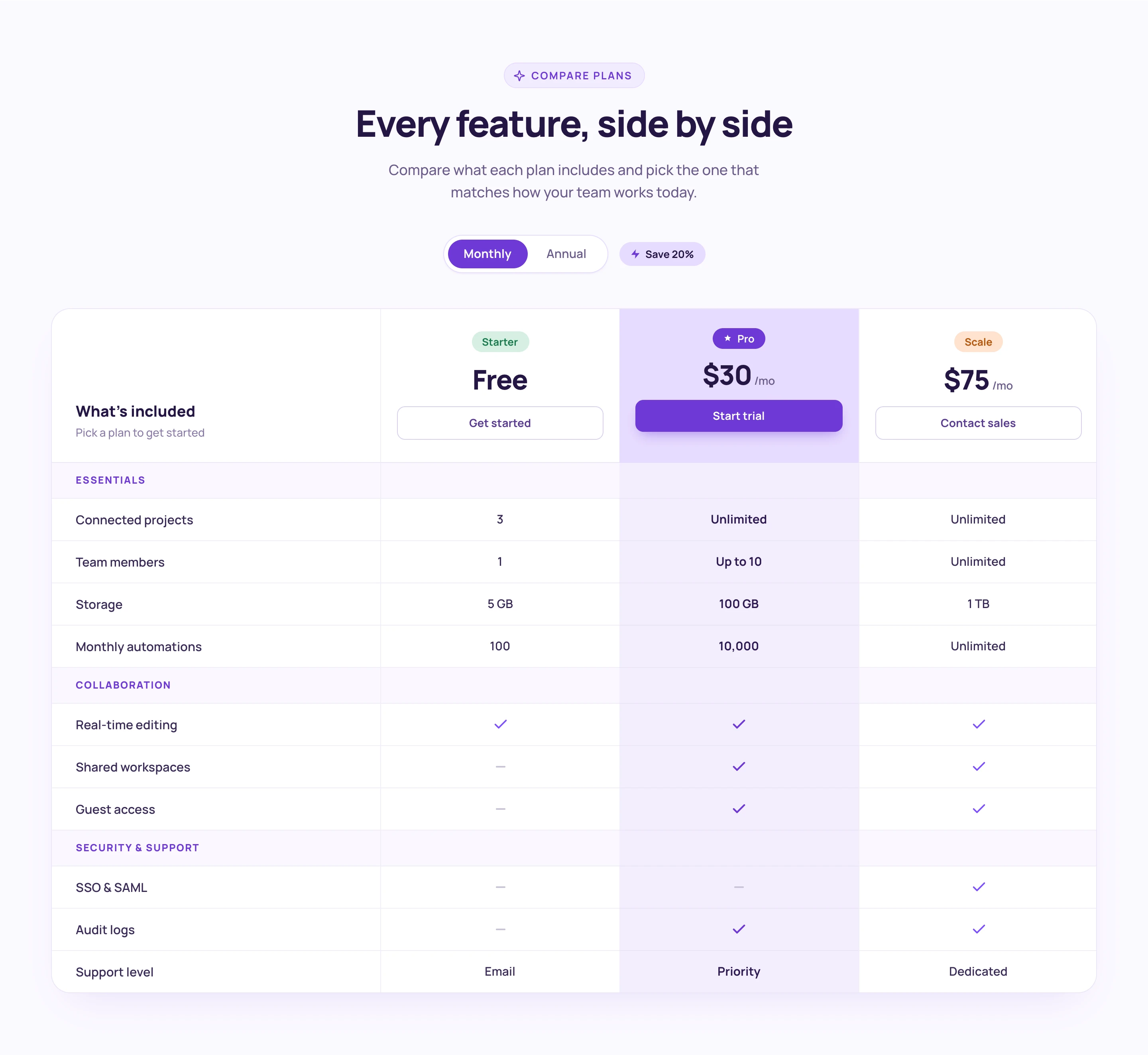

Interactive Pricing Tabs
This component features a clean and user-friendly interface designed to showcase pricing plans for tech products, including standard and enterprise options with detailed descriptions and upgrade prompts. Key Features Interactive tabs for easy navigation between pricing plans Detailed descriptions for each pricing tier Upgrade prompts to encourage users to consider higher tiers Responsive design suitable for various devices Visual elements including icons for clarity Design Elements Minimalist layout with a focus on usability Color scheme that enhances readability and engagement Use of icons to visually represent features Consistent typography for a professional appearance Potential Use Cases Tech startups looking to present their subscription models SaaS companies needing to display multiple pricing tiersE-commerce platforms offering different service levels Consulting firms that want to outline service packages Educational platforms with tiered membership options Conclusion: The Interactive Pricing Tabs component is a versatile tool that effectively communicates pricing options while enhancing user experience, making it ideal for various tech-related businesses.


