Success & Failure Board
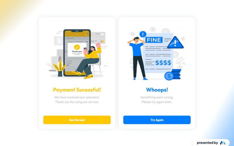
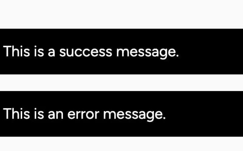
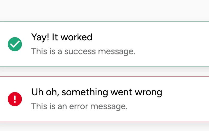
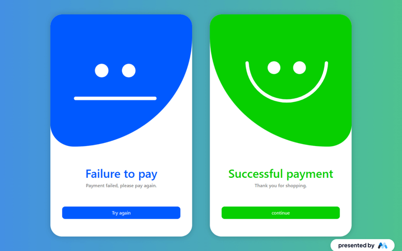
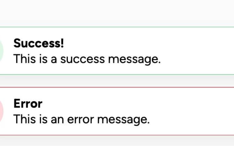
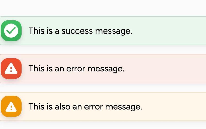
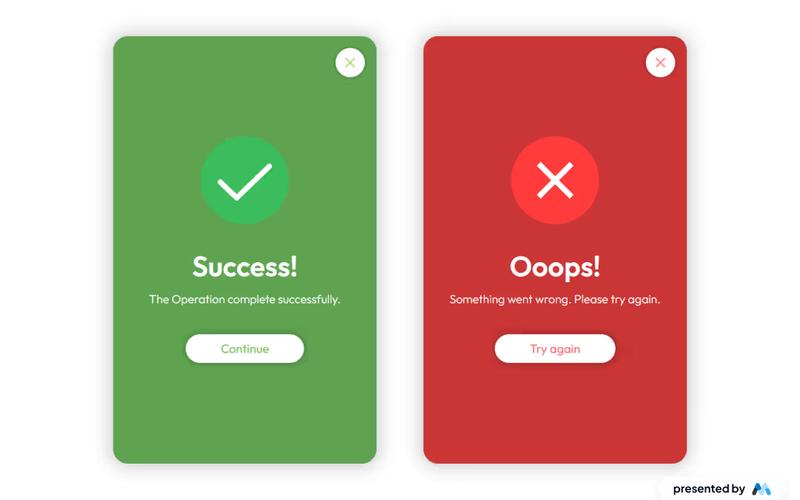
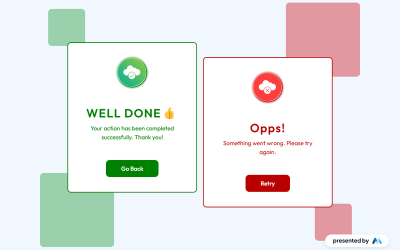
The Success & Failure Board is a Webflow component designed to visually represent outcomes of actions, showcasing success messages and failure notifications. It features a clean layout with distinct sections for positive and negative feedback, making it suitable for applications that require user interaction feedback. Key Features Two distinct sections for success and failure messages, each with its own styling.Responsive design that adjusts to various screen sizes, ensuring accessibility on mobile devices.Customizable text and images for each message, allowing users to personalize the component.Includes buttons for user actions, such as 'Go Back' and 'Retry', enhancing user engagement. Design Elements Utilizes a grid layout for organizing content, providing a structured appearance.Color-coded sections: green for success messages and red for failure notifications, aiding in quick visual recognition.Incorporates icons alongside text to enhance message clarity and visual interest.Employs a minimalistic design with ample white space, focusing user attention on the messages. Potential Use Cases E-commerce websites to inform users about order statuses.Web applications that require user input, providing feedback on form submissions.Customer support portals to communicate ticket resolutions or errors.Educational platforms to notify students of assignment submissions and results. Conclusion: The Success & Failure Board component is a practical solution for any web application needing to communicate user feedback effectively, with a clear design that enhances user experience.